Cloud-Based Remote Sensing with Google Earth Engine
Fundamentals and Applications

Part F6: Advanced Topics
Although you now know the most basic fundamentals of Earth Engine, there is still much more that can be done. The Part presents some advanced topics that can help expand your skill set for doing larger and more complex projects. These include tools for sharing code among users, scaling up with efficient project design, creating apps for non-expert users, and combining R with other information processing platforms.
Chapter F6.0: Advanced Raster Visualization
Authors
Gennadii Donchyts, Fedor Baart
Overview
This chapter should help users of Earth Engine to better understand raster data by applying visualization algorithms such as hillshading, hill shadows, and custom colormaps. We will also learn how image collection datasets can be explored by animating them as well as by annotating with text labels, using, for example, attributes of images or values queried from images.
Learning Outcomes
- Understanding why perceptually uniform colormaps are better to present data and using them efficiently for raster visualization.
- Using palettes with images before and after remapping values.
- Adding text annotations when visualizing images or features.
- Animating image collections in multiple ways (animated GIFs, exporting video clips, interactive animations with UI controls).
- Adding hillshading and shadows to help visualize raster datasets.
Assumes you know how to:
- Import images and image collections, filter, and visualize (Part F1).
- Write a function and map it over an ImageCollection (Chap. F4.0).
- Inspect an Image and an ImageCollection, as well as their properties (Chap. F4.1).
Github Code link for all tutorials
This code base is collection of codes that are freely available from different authors for google earth engine.
Introduction to Theory
Visualization is the step to transform data into a visual representation. You make a visualization as soon as you add your first layer to your map in Google Earth Engine. Sometimes you just want to have a first look at a dataset during the exploration phase. But as you move towards the dissemination phase, where you want to spread your results, it is good to think about a more structured approach to visualization. A typical workflow for creating visualization consists of the following steps:
- Defining the story (what is the message?)
- Finding inspiration (for example by making a moodboard)
- Choosing a canvas/medium (here, this is the Earth Engine map canvas)
- Choosing datasets (co-visualized or combined using derived indicators)
- Data preparation (interpolating in time and space, filtering/mapping/reducing)
- Converting data into visual elements (shape and color)
- Adding annotations and interactivity (labels, scales, legend, zoom, time slider)
A good standard work on all the choices that one can make while creating a visualization is provided by the Grammar of Graphics (GoG) by Wilkinson (1999). It was the inspiration behind many modern visualization libraries (ggplot, vega). The main concept is that you can subdivide your visualization into several aspects.
In this chapter, we will cover several aspects mentioned in the Grammar of Graphics to convert (raster) data into visual elements. The accurate representation of data is essential in science communication. However, color maps that visually distort data through uneven color gradients or are unreadable to those with color-vision deficiency remain prevalent in science (Crameri, 2020). You will also learn how to add annotation text and symbology, while improving your visualizations by mixing images with hillshading as you explore some of the amazing datasets that have been collected in recent years in Earth Engine.
Practicum
Section 1. Palettes
In this section we will explore examples of colormaps to visualize raster data. Colormaps translate values to colors for display on a map. This requires a set of colors (referred to as a “palette” in Earth Engine) and a range of values to map (specified by the min and max values in the visualization parameters).
There are multiple types of colormaps, each used for a different purpose. These include the following:
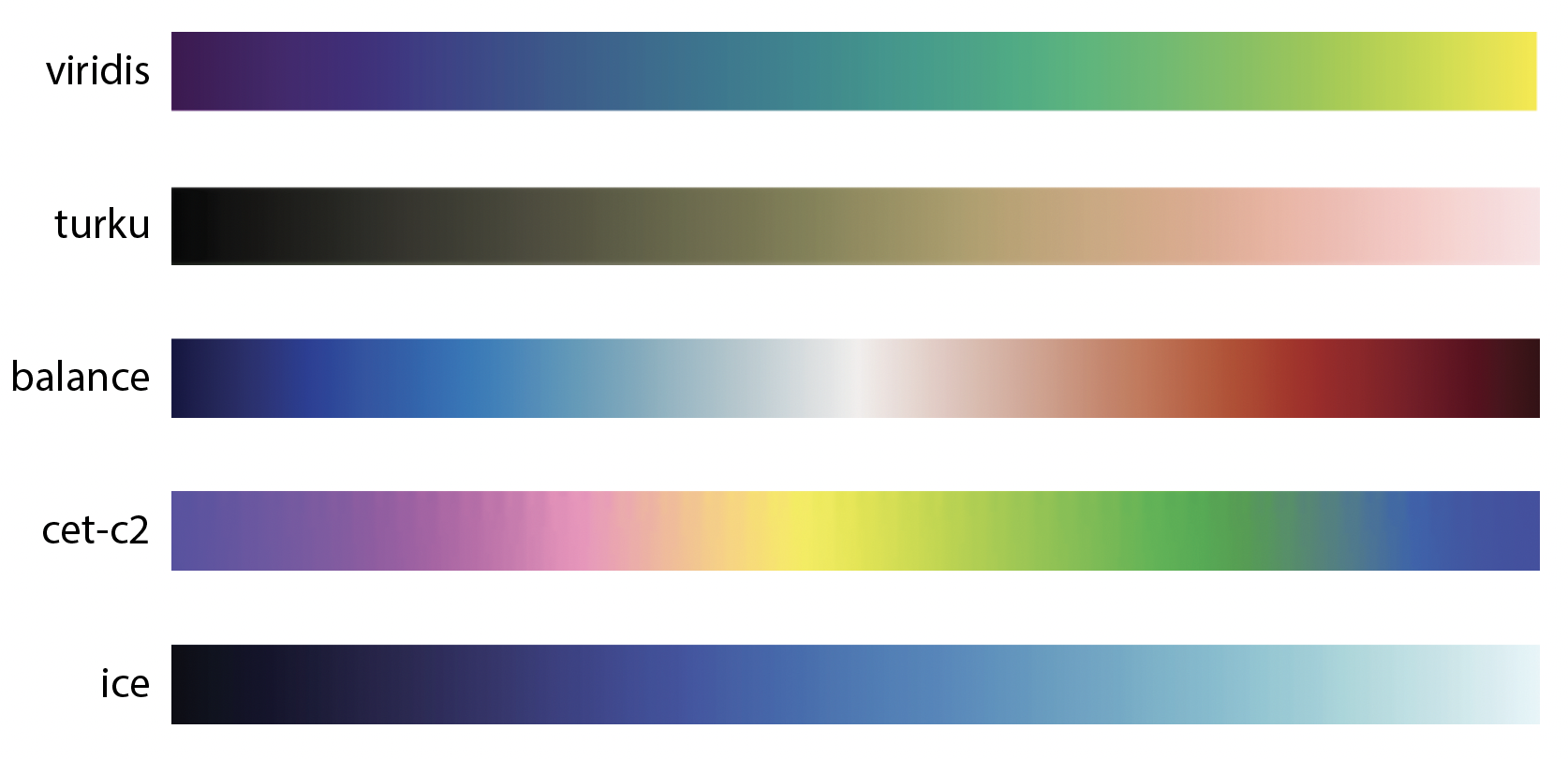
Sequential: These are probably the most commonly used colormaps, and are useful for ordinal, interval, and ratio data. Also referred to as a linear colormap, a sequential colormap looks like the viridis colormap (Fig. F6.0.1) from matplotlib. It is popular because it is a perceptual uniform colormap, where an equal interval in values is mapped to an equal interval in the perceptual colorspace. If you have a ratio variable where zero means nothing, you can use a sequential colormap starting at white, transparent, or, when you have a black background, at black—for example, the turku colormap from Crameri (Fig. F6.0.1). You can use this for variables like population count or gross domestic product.
Diverging: This type of colormap is used for visualizing data where you have positive and negative values and where zero has a meaning. Later in this tutorial, we will use the balance colormap from the cmocean package (Fig. F6.0.1) to show temperature change.
Circular: Some variables are periodic, returning to the same value after a period of time. For example, the season, angle, and time of day are typically represented as circular variables. For variables like this, a circular colormap is designed to represent the first and last values with the same color. An example is the circular cet-c2 colormap (Fig. F6.0.1) from the colorcet package.
Semantic: Some colormaps do not map to arbitrary colors but choose colors that provide meaning. We refer to these as semantic colormaps. Later in this tutorial, we will use the ice colormap (Fig. F6.0.1) from the cmocean package for our ice example.
Fig. F6.0.1 Examples of colormaps from a variety of packages: viridis from matplotlib, turku from Crameri, balance from cmocean, cet-c2 from colorcet and ice from cmocean |
Popular sources of colormaps include:
- cmocean (semantic perceptual uniform colormaps for geophysical applications)
- colorcet (set of perceptual colormaps with varying colors and saturation)
- cpt-city (comprehensive overview of colormaps,
- colorbrewer (colormaps with variety of colors)
- Crameri (stylish colormaps for dark and light themes)
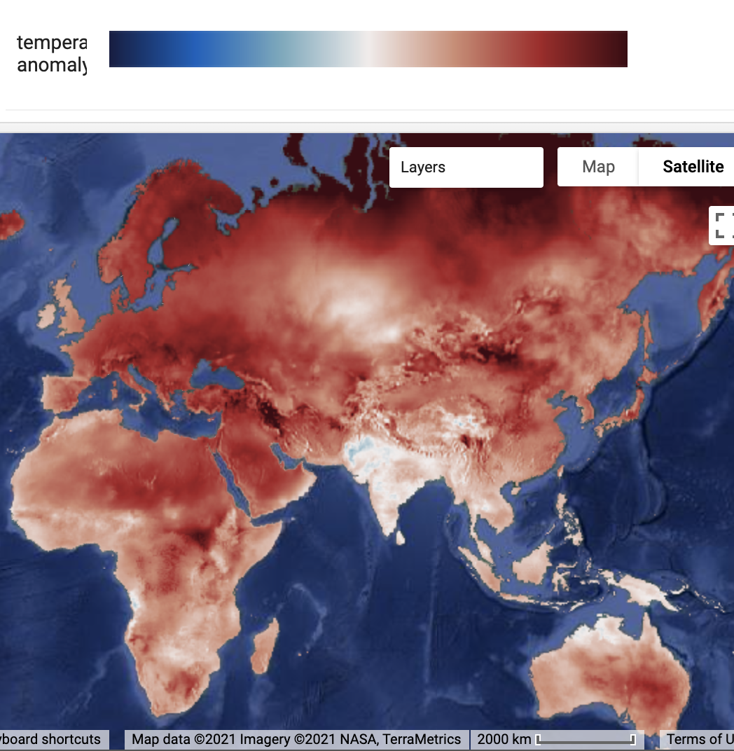
Our first example in this section applies a diverging colormap to temperature.
// Load the ERA5 reanalysis monthly means. |
Now we can visualize the data. Here we have a temperature difference. That means that zero has a special meaning. By using a divergent colormap we can give zero the color white, which denotes that there is no significant difference. Here we will use the colormap Balance from the cmocean package. The color red is associated with warmth, and the color blue is associated with cold. We will choose the minimum and maximum values for the palette to be symmetric around zero (-2, 2) so that white appears in the correct place. For comparison we also visualize the data with a simple ['blue', 'white', 'red'] palette. As you can see (Fig. F6.0.2), the Balance colormap has a more elegant and professional feel to it, because it uses a perceptual uniform palette and both saturation and value.
// Choose a diverging colormap for anomalies. |
Fig. F6.0.2 Temperature difference of ERA5 (2011–2020, 1981–1990) using the balance colormap from cmocean (right) versus a basic blue-white-red colormap (left) |

Code Checkpoint F60a. The book’s repository contains a script that shows what your code should look like at this point.
Our second example in this section focuses on visualizing a region of the Antarctic, the Thwaites Glacier. This is one of the fast-flowing glaciers that causes concern because it loses so much mass that it causes the sea level to rise. If we want to visualize this region, we have a challenge. The Antarctic region is in the dark for four to five months each winter. That means that we can’t use optical images to see the ice flowing into the sea. We therefore will use radar images. Here we will use a semantic colormap to denote the meaning of the radar images.
Let’s start by importing the dataset of radar images. We will use the images from the Sentinel-1 constellation of the Copernicus program. This satellite uses a C-band synthetic-aperture radar and has near-polar coverage. The radar senses images using a polarity for the sender and receiver. The collection has images of four different possible combinations of sender/receiver polarity pairs. The image that we’ll use has a band of the Horizontal/Horizontal polarity (HH).
// An image of the Thwaites glacier. |
For the next step, we will use the palette library. We will stylize the radar images to look like optical images, so that viewers can contrast ice and sea ice from water (Lhermitte, 2020). We will use the Ice colormap from the cmocean package (Thyng, 2016).
// Use the palette library. |
If you zoom in (F6.0.3) you can see how long cracks have recently appeared near the pinning point (a peak in the bathymetry that functions as a buttress, see Wild, 2022) of the glacier.
Fig. F6.0.3. Ice observed in Antarctica by the Sentinel-1 satellite. The image is rendered using the ice color palette stretched to backscatter amplitude values [-15; 1]. |

Code Checkpoint F60b. The book’s repository contains a script that shows what your code should look like at this point.
Section 2. Remapping and Palettes
Classified rasters in Earth Engine have metadata attached that can help with analysis and visualization. This includes lists of the names, values, and colors associated with class. These are used as the default color palette for drawing a classification, as seen next. The USGS National Land Cover Database (NLCD) is one such example. Let’s access the NLCD dataset, name it nlcd, and view it (Fig. F6.0.4) with its built-in palette.
// Advanced remapping using NLCD. |
Fig. F6.0.4 The NLCD visualized with default colors for each class |
But suppose you want to change the display palette. For example, you might want to have multiple classes displayed using the same color, or use different colors for some classes. Let’s try having all three urban classes display as dark red ('ab0000').
// Now suppose we want to change the color palette. |
However, if you map this, you will see an unexpected result (Fig. F6.0.5).
Fig. F6.0.5 Applying a new palette to a multi-class layer has some unexpected results |
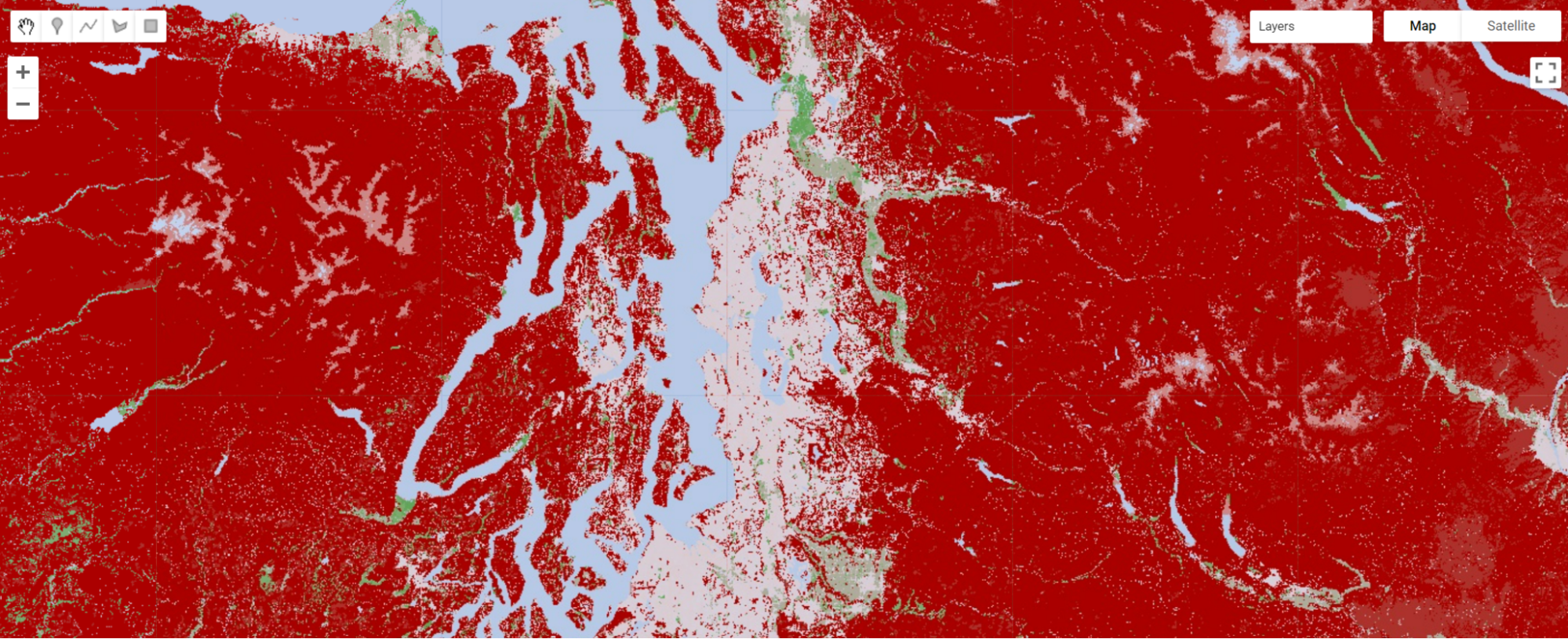
This is because the numeric codes for the different classes are not sequential. Thus, Earth Engine stretches the given palette across the whole range of values and produces an unexpected color palette. To fix this issue, we will create a new index for the class values so that they are sequential.
// Extract the class values and save them as a list. |
Using this remapping approach, we can properly visualize the new color palette (Fig. F6.0.6).
Fig. F6.0.6 Expected results of the new color palette. All urban areas are now correctly showing as dark red and the other land cover types remain their original color. |

Code Checkpoint F60c. The book’s repository contains a script that shows what your code should look like at this point.
Section 3. Annotations
Annotations are the way to visualize data on maps to provide additional information about raster values or any other data relevant to the context. In this case, this additional information is usually shown as geometries, text labels, diagrams, or other visual elements. Some annotations in Earth Engine can be added by making use of the ui portion of the Earth Engine API, resulting in graphical user interface elements such as labels or charts added on top of the map. However, it is frequently useful to render annotations as a part of images, such as by visualizing various image properties or to highlight specific areas.
In many cases, these annotations can be mixed with output images generated outside of Earth Engine, for example, by post-processing exported images using Python libraries or by annotating using GIS applications such as QGIS or ArcGIS. However, annotations could also be also very useful to highlight and/or label specific areas directly within the Code Editor. Earth Engine provides a sufficiently rich API to turn vector features and geometries into raster images which can serve as annotations. We recommend checking the ee.FeatureCollection.style function in the Earth Engine documentation to learn how geometries can be rendered.
For textual annotation, we will make use of an external package 'users/gena/packages:text' that provides a way to render strings into raster images directly using the Earth Engine raster API. It is beyond the scope of the current tutorials to explain the implementation of this package, but internally this package makes use of bitmap fonts which are ingested into Earth Engine as raster assets and are used to turn every character of a provided string into image glyphs, which are then translated to desired coordinates.
The API of the text package includes the following mandatory and optional arguments:
|
|
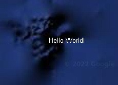
To demonstrate how to use this API, let’s render a simple 'Hello World!' text string placed at the map center using default text parameters. The code for this will be:
// Include the text package. |
Running the above script will generate a new image containing the 'Hello World!' string placed in the map center. Notice that before calling the text.draw() function we configure the map to be centered at specific coordinates (0,0) and zoom level 10 because map parameters such as center and scale are passed as arguments to that text.draw() function. This ensures that the resulting image containing string characters is scaled properly.
When exporting images containing rendered text strings, it is important to use proper scale to avoid distorted text strings that are difficult to read, depending on the selected font size, as shown in Fig. 6.0.7.
Code Checkpoint F60d. The book’s repository contains a script that shows what your code should look like at this point.
Fig. 6.0.7 Results of the text.draw call, scaled to 1x: var scale=Map.getScale()*1; (left), 2x: var scale=Map.getScale()*2; (center), and 0.5x: var scale=Map.getScale()*0.5; (right) |


These artifacts can be avoided to some extent by specifying a larger font size (e.g., 32). However, it is better to render text at the native 1:1 scale to achieve best results. The same applies to the text color and outline: They may need to be adjusted to achieve the best result. Usually, text needs to be rendered using colors that have opposite brightness and colors when compared to the surrounding background. Notice that in the above example, the map was configured to have a dark background ('HYBRID') to ensure that the white text (default color) would be visible. Multiple parameters listed in the above API documentation can be used to adjust text rendering. For example, let’s switch font size, font type, text, and outline parameters to render the same string, as below. Replace the existing one-line text.draw call in your script with the following code, and then run it again to see the difference (Fig. F6.0.8):
var image=text.draw('Hello World!', pt, scale,{ |
Code Checkpoint F60e. The book’s repository contains a script that shows what your code should look like at this point.
Fig. 6.0.8 Rendering text with adjusted parameters (font type: Consolas, fontSize: 32, textColor: 'black', outlineWidth: 1, outlineColor: 'white', outlineOpacity: 0.8) |

Of course, non-optional parameters such as pt and scale, as well as the text string, do not have to be hard-coded in the script; instead, they can be acquired by the code using, for example, properties coming from a FeatureCollection. Let's demonstrate this by showing the cloudiness of Landsat 8 images as text labels rendered in the center of every image. In addition to annotating every image with a cloudiness text string, we will also draw yellow outlines to indicate image boundaries. For convenience, we can also define the code to annotate an image as a function. We will then map that function (as described in Chap. F4.0) over the filtered ImageCollection. The code is as follows:
var text=require('users/gena/packages:text'); |
The result of defining and mapping this function over the filtered set of images is shown in Fig. F6.0.9. Notice that by adding an outline around the text, we can ensure the text is visible for both dark and light images. Earth Engine requires casting properties to their corresponding value type, which is why we’ve used ee.Number (as described in Chap. F1.0) before generating a formatted string. Also, we have shifted the resulting text image 25 pixels to the left. This was necessary to ensure that the text is positioned properly. In more complex text rendering applications, users may be required to compute the text position in a different way using ee.Geometry calls from the Earth Engine API: for example, by positioning text labels somewhere near the corners.
Fig. F6.0.9 Annotating Landsat 8 images with image boundaries, border, and text strings indicating cloudiness |

Because we render text labels using the Earth Engine raster API, they are not automatically scaled depending on map zoom size. This may cause unwanted artifacts; To avoid that, the text labels image needs to be updated every time the map zoom changes. To implement this in a script, we can make use of the Map API—in particular, the Map.onChangeZoom event handler. The following code snippet shows how the image containing text annotations can be re-rendered every time the map zoom changes. Add it to the end of your script.
// re-render (rescale) annotations when map zoom changes. |
Code Checkpoint F60f. The book’s repository contains a script that shows what your code should look like at this point.
Try commenting that event handler and observe how annotation rendering changes when you zoom in or zoom out.
Section 4. Animations
Visualizing raster images as animations is a useful technique to explore changes in time-dependent datasets, but also, to render short animations to communicate how changing various parameters affects the resulting image—for example, varying thresholds of spectral indices resulting in different binary maps or the changing geometry of vector features.
Animations are very useful when exploring satellite imagery, as they allow viewers to quickly comprehend dynamics of changes of earth surface or atmospheric properties. Animations can also help to decide what steps should be taken next to designing a robust algorithm to extract useful information from satellite image time series. Earth Engine provides two standard ways to generate animations: as animated GIFs, and as AVI video clips. Animation can also be rendered from a sequence of images exported from Earth Engine, using numerous tools such as ffmpeg or moviepy. However, in many cases it is useful to have a way to quickly explore image collections as animation without requiring extra steps.
In this section, we will generate animations in three different ways:
- Generate animated GIF
- Export video as an AVI file to Google Drive
- Animate image collection interactively using UI controls and map layers
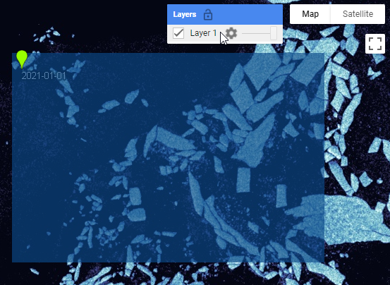
We will use an image collection showing sea ice as an input dataset to generate animations with visualization parameters from earlier. However, instead of querying a single Sentinel-1 image, let’s generate a filtered image collection with all images intersecting with our area of interest. After importing some packages and palettes and defining a point and rectangle, we’ll build the image collection. Here we will use point geometry to define the location where the image date label will be rendered and the rectangle geometry to indicate the area of interest for the animation. To do this we will build the following logic in a new script. Open a new script and paste the following code into it:
// Include packages. |
As you see from the last last lines of the above code, it is frequently useful to print the number of images in an image collection: an example of what’s often known as a “sanity check.”
Here we have used two custom geometries to configure animations: the green pin named point, used to filter image collection and to position text labels drawn on top of the image, and the blue rectangle rect, used to define a bounding box for the exported animations. To make sure that the point and rectangle geometries are shown under the Geometry Imports in the Code Editor, you need to click on these variables in the code and then select the Convert link.
Notice that in addition to the bounds and date filter, we have also used a less known isContained filter to ensure that we get only images that fully cover our region. To better understand this filter, you could try commenting out the filter and compare the differences, observing images with empty (masked) pixels in the resulting image collection.
Code Checkpoint F60g. The book’s repository contains a script that shows what your code should look like at this point.
Next, to simplify the animation API calls, we will generate a composite RGB image collection out of satellite images and draw the image’s acquisition date as a label on every image, positioned within our region geometry.
// Render images. |
In addition to printing the size of the ImageCollection, we also often begin by adding a single image to the map from a mapped collection to see that everything works as expected—another example of a sanity check. The resulting map layer will look like F6.0.10.
Fig. F6.0.10 The results of adding the first layer from the RGB composite image collection showing Sentinel-1 images with a label blended on top at a specified location. The blue geometry is used to define the bounds for the animation to be exported. |
Code Checkpoint F60h. The book’s repository contains a script that shows what your code should look like at this point.
Animation 1: Animated GIF with ui.Thumbnail
The quickest way to generate an animation in Earth Engine is to use the animated GIF API and either print it to the Console or print the URL to download the generated GIF. The following code snippet will result in an animated GIF as well as the URL to the animated GIF printed to Console. This is as shown in Fig. F6.0.11:
// Define GIF visualization parameters. |
Earth Engine provides multiple options to specify the size of the resulting video. In this example we specify 600 as the size of the maximum dimension. We also specify the number of frames per second for the resulting animated GIF as well as the target projected coordinate system to be used (EPSG:3857 here, which is the projection used in web maps such as Google Maps and the Code Editor background).
Fig. F6.0.11 Console output after running the animated GIF code snippet, showing the GIF URL and an animation shown directly in the Console |

Animation 2: Exporting an Animation with Export.video.toDrive
Animated GIFs can be useful to generate animations quickly. However, they have several limitations. In particular, they are limited to 256 colors, become large for larger animations, and most web players do not provide play controls when playing animated GIFs. To overcome these limitations, Earth Engine provides export of animations as video files in MP4 format. Let’s use the same RGB image collection we have used for the animated GIF to generate a short video. We can ask Earth Engine to export the video to the Google Drive using the following code snippet:
Export.video.toDrive({ |
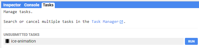
Here, many arguments to the Export.video.toDrive function resemble the ones we’ve used in the ee.Image.getVideoThumbURL code above. Additional arguments include description and fileNamePrefix, which are required to configure the name of the task and the target file of the video file to be saved to Google Drive. Running the above code will result in a new task created under the Tasks tab in the Code Editor. Starting the export video task (F6.0.12) will result in a video file saved in the Google Drive once completed.
Fig. F6.0.12 A new export video tasks in the Tasks panel of the Code Editor |
Animation 3: The Custom Animation Package
For the last animation example, we will use the custom package 'users/gena/packages:animation', built using the Earth Engine User Interface API. The main difference between this package and the above examples is that it generates an interactive animation by adding Map layers individually to the layer set, and providing UI controls that allow users to play animations or interactively switch between frames. The animate function in that package generates an interactive animation of an ImageCollection, as described below. This function has a number of optional arguments allowing you to configure, for example, the number of frames to be animated, the number of frames to be preloaded, or a few others. The optional parameters to control the function are the following:
- maxFrames: maximum number of frames to show (default: 30)
- vis: visualization parameters for every frame (default:{})
- Label: text property of images to show in the animation controls (default: undefined)
- width: width of the animation panel (default: '600px')
- compact: show only play control and frame slider (default: false)
- position: position of the animation panel (default: 'top-center')
- timeStep: time step (ms) used when playing animation (default: 100)
- preloadCount: number of frames (map layers) to preload (default: all)
Let’s call this function to add interactive animation controls to the current Map:
// include the animation package |
Before using the interactive animation API, we need to include the corresponding package using require. Here we provide our pre-rendered image collection and two optional parameters (label and maxFrames). The first optional parameter label indicates that every image in our image collection has the 'label' text property. The animate function uses this property to name map layers as well as to visualize in the animation UI controls when switching between frames. This can be useful when inspecting image collections. The second optional parameter, maxFrames, indicates that the maximum number of animation frames that we would like to visualize is 50. To prevent the Code Editor from crashing, this parameter should not be too large: it is best to keep it below 100. For a much larger number of frames, it is better to use the Export video or animated GIF API. Running this code snippet will result in the animation control panel added to the map as shown in Fig. F6.0.13.
It is important to note that the animation API uses asynchronous UI calls to make sure that the Code Editor does not hang when running the script. The drawback of this is that for complex image collections, a large amount of processing is required. Hence, it may take some time to process all images and to visualize the interactive animation panel. The same is true for map layer names: they are updated once the animation panel is visualized. Also, map layers used to visualize individual images in the provided image collection may require some time to be rendered.
Fig. F6.0.13 Interactive animation controls when using custom animation API |
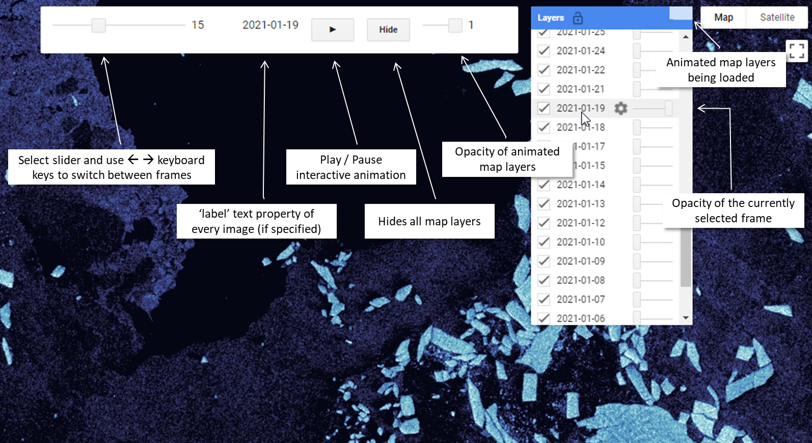
The main advantage of the interactive animation API is that it provides a way to explore image collections at frame-by-frame basis, which can greatly improve our visual understanding of the changes captured in sets of images.
Code Checkpoint F60i. The book’s repository contains a script that shows what your code should look like at this point.
Section 5. Terrain Visualization
This section introduces several raster visualization techniques useful to visualize terrain data such as:
- Basic hillshading and parameters (light azimuth, elevation)
- Combining elevation data and colors using HSV transform (Wikipedia: HSL and HSV)
- Adding shadows
One special type of raster data is data that represents height. Elevation data can include topography, bathymetry, but also other forms of height, such as sea surface height can be presented as a terrain.
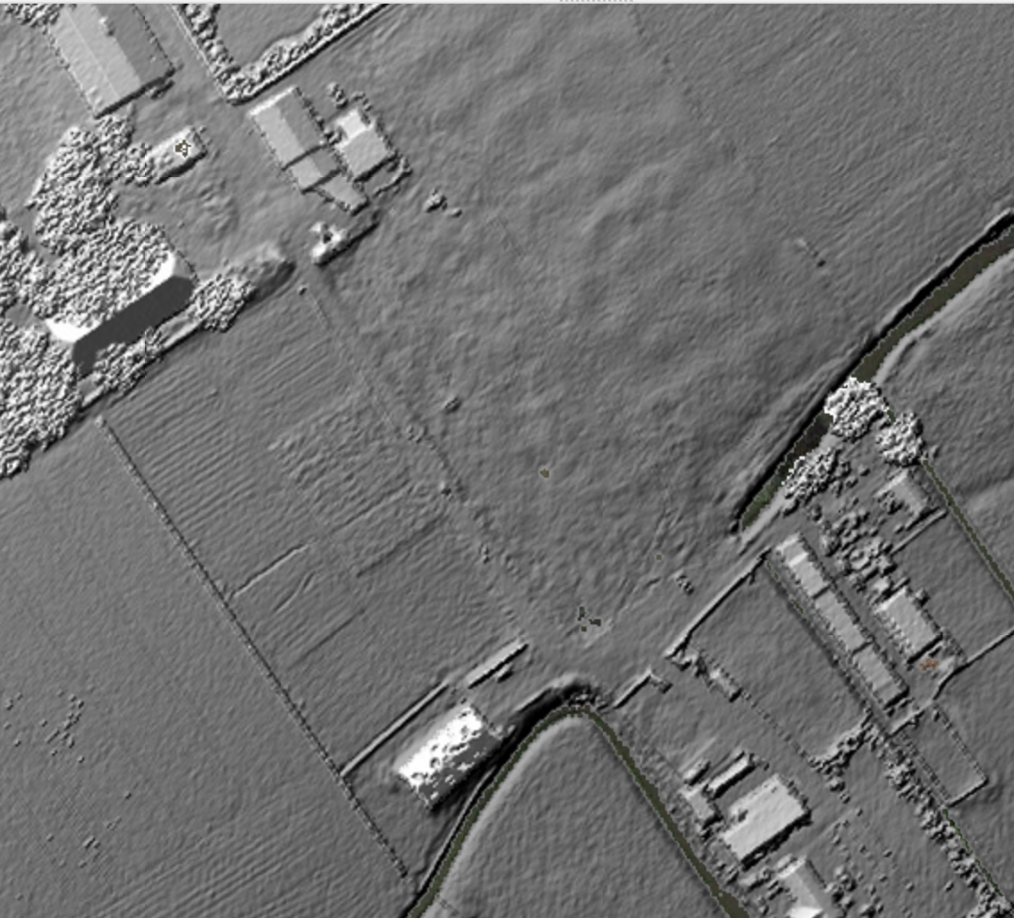
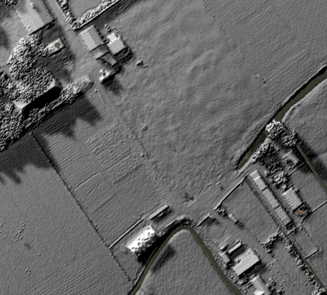
Height is often visualized using the concept of directional light with a technique called hillshading. Because height is such a common feature in our environment, we also have an expectancy of how height is visualized. If height is visualized using a simple grayscale colormap, it looks very unnatural (Fig. F6.0.14, top left). By using hillshading, data immediately looks more natural (Fig. F6.0.14, top middle).
We can further improve the visualization by including shadows (Fig. F6.0.14, top right). A final step is to replace the simple grayscale colormap with a perceptual uniform topographic colormap and mix this with the hillshading and shadows (Fig. F6.0.14, bottom). This section explains how to apply these techniques.
We’ll focus on elevation data stored in raster form. Elevation data is not always stored in raster formats. Other data formats include Triangulated Irregular Network (TIN), which allows storing information at varying resolutions and as 3D objects. This format allows one to have overlapping geometries, such as bridges with a road below it. In raster-based digital elevation models, in contrast, there can only be one height recorded for each pixel.
Let’s start by loading data from a digital elevation model. This loads a topographic dataset from the Netherlands (Algemeen Hoogtebestand Nederland). It is a Digital Surface Model, based on airborne LIDAR measurements regridded to 0.5 m resolution. Enter the following code in a new script.
var dem=ee.Image('AHN/AHN2_05M_RUW'); |
We can visualize this dataset using a sequential gradient colormap from black to white. This results in Fig. F6.0.14. One can infer which areas are lower and which are higher, but the visualization does not quite “feel” like a terrain.
// Change map style to HYBRID and center map on the Netherlands |
An important step to visualize terrain is to add shadows created by a distant point source of light. This is referred to as hillshading or a shaded relief map. This type of map became popular in the 1940s through the work of Edward Imhoff, who also used grayscale colormaps (Imhoff, 2015). Here we’ll use the 'gena/packages:utils' library to combine the colormap image with the shadows. That Earth Engine package implements a hillshadeRGB function to simplify rendering of images enhanced with hillshading and shadow effects. One important argument this function takes is the light azimuth—an angle from the image plane upward to the light source (the Sun). This should always be set to the top left to avoid bistable perception artifacts, in which the DEM can be misperceived as inverted.
var utils=require('users/gena/packages:utils'); |
Standard hillshading only determines per pixel if it will be directed to the light or not. One can also project shadows on the map. That is done using the ee.Algorithms.HillShadow algorithm. Here we’ll turn on castShadows in the hillshadeRGB function. This results in a more realistic map, as can be seen in Figure F6.0.14.
var castShadows=true; |
The final step is to add a topographic colormap. To visualize topographic information, one often uses special topographic colormaps. Here we’ll use the oleron colormap from crameri. The colors get mixed with the shadows using the hillshadeRGB function. As you can see in Fig. F6.0.14, this gives a nice overview of the terrain. The area colored in blue is located below sea level.
var palettes=require('users/gena/packages:palettes'); |
Steps to further improve a terrain visualization include using light sources from multiple directions. This allows the user to render terrain to appear more natural. In the real world light is often scattered by clouds and other reflections.
One can also use lights to emphasize certain regions. To use even more advanced lighting techniques one can use a raytracing engine, such as the R rayshader library, as discussed earlier in this chapter. The raytracing engine in the Blender 3D program is also capable of producing stunning terrain visualizations using physical-based rendering, mist, environment lights, and camera effects such as depth of field.
Figure F6.0.14 Hillshading with shadows Steps in visualizing a topographic dataset:
|


Code Checkpoint F60j. The book’s repository contains a script that shows what your code should look like at this point.
Synthesis
To synthesize what you have learned in this chapter, you can do the following assignments.
Assignment 1. Experiment with different color palettes from the palettes library. Try combining palettes with image opacity (using ee.Image.updateMask call) to visualize different physical features (for example, hot or cold areas using temperature and elevation).
Assignment 2. Render multiple text annotations when generating animations using image collection. For example, show other image properties in addition to date or image statistics generated using regional reducers for every image.
Assignment 3. In addition to text annotations, try blending geometry elements (lines, polygons) to highlight specific areas of rendered images.
Conclusion
In this chapter we have learned about several techniques that can greatly improve visualization and analysis of images and image collections. Using predefined palettes can help to better comprehend and communicate Earth observation data, and combining with other visualization techniques such as hillshading and annotations can help to better understand processes studied with Earth Engine. When working with image collections, it is often very helpful to analyze their properties through time by visualizing them as animations. Usually, this step helps to better understand dynamics of the changes that are stored in image collections and to develop a proper algorithm to study these changes.
Feedback
To review this chapter and make suggestions or note any problems, please go now to bit.ly/EEFA-review. You can find summary statistics from past reviews at bit.ly/EEFA-reviews-stats.
References
Cloud-Based Remote Sensing with Google Earth Engine. (n.d.). CLOUD-BASED REMOTE SENSING WITH GOOGLE EARTH ENGINE. https://www.eefabook.org/
Cloud-Based Remote Sensing with Google Earth Engine. (2024). In Springer eBooks. https://doi.org/10.1007/978-3-031-26588-4
Burrough PA, McDonnell RA, Lloyd CD (2015) Principles of Geographical Information Systems. Oxford University Press
Crameri F, Shephard GE, Heron PJ (2020) The misuse of colour in science communication. Nat Commun 11:1–10. https://doi.org/10.1038/s41467-020-19160-7
Imhof E (2015) Cartographic Relief Presentation. Walter de Gruyter GmbH & Co KG
Lhermitte S, Sun S, Shuman C, et al (2020) Damage accelerates ice shelf instability and mass loss in Amundsen Sea Embayment. Proc Natl Acad Sci USA 117:24735–24741. https://doi.org/10.1073/pnas.1912890117
Thyng KM, Greene CA, Hetland RD, et al (2016) True colors of oceanography. Oceanography 29:9–13
Wikipedia (2022) Terrain cartography. https://en.wikipedia.org/wiki/Terrain_cartography#Shaded_relief. Accessed 1 Apr 2022
Wikipedia (2022) HSL and HSV. https://en.wikipedia.org/wiki/HSL_and_HSV. Accessed 1 Apr 2022
Wild CT, Alley KE, Muto A, et al (2022) Weakening of the pinning point buttressing Thwaites Glacier, West Antarctica. Cryosphere 16:397–417. https://doi.org/10.5194/tc-16-397-2022
Wilkinson L (2005) The Grammar of Graphics. Springer Verlag