Cloud-Based Remote Sensing with Google Earth Engine

Fundamentals and Applications

Part A1: Human Applications
This Part covers some of the many Human Applications of Earth Engine. It includes demonstrations of how Earth Engine can be used in agricultural and urban settings, including for sensing the built environment and the effects it has on air composition and temperature. This Part also covers the complex topics of human health, illicit deforestation activity, and humanitarian actions.
Chapter A1.2: Urban Environments
Authors
Michelle Stuhlmacher and Ran Goldblatt
Overview
Urbanization has dramatically changed Earth’s surface. This chapter starts with a qualitative look at the impact urban expansion has on the landscape, covering three existing urban classification schemes that have been created by other remote sensing scientists. We look at how these classifications can be used to quantify urban areas, and close with instructions on how to perform per-pixel supervised image classification to map built-up land cover at any location on Earth and at any point in time using Landsat 7 imagery.
Learning Outcomes
- Creating an animated GIF.
- Implementing quantitative and qualitative analyses with pre-existing urban classifications.
- Running your own classification of built-up land cover.
- Quantifying and mapping the extent of urbanization across space and time.
Helps if you know how to:
- Import images and image collections, filter, and visualize (Part F1).
- Use drawing tools to create points lines and polygons (Chap. F2.1).
- Perform a supervised image classification (Chap. F2.1).
- Use reduceRegions to summarize an image with zonal statistics in irregular shapes (Chap. F5.0, Chap. F5.2).
Github Code link for all tutorials
This code base is collection of codes that are freely available from different authors for google earth engine.
Introduction to Theory
Urbanization and its consequences have expanded rapidly over the last several decades. In 1950, only 30% of the world’s population lived in urban areas, but that figure is expected to be 68% by 2050 (United Nations 2018). Already, over 50% of the world’s population lives in urban areas (United Nations 2018). This shift to urban dwelling has helped lift millions of people out of poverty, but it is also creating complicated socio-environmental challenges, such as habitat loss, urban heat islands, flooding, and greater greenhouse gas emissions (Bazaz et al. 2018, United Nations 2018).
An important part of addressing these challenges is understanding urbanization trajectories and their consequences. Satellite imagery provides a rich source of historic and current information on urbanization all over the globe, and it is increasingly being leveraged to contribute to research on urban sustainability (Goldblatt et al. 2018, Prakash et al. 2020). In this chapter, we will cover several methods for visualizing and quantifying urbanization’s impact on the landscape.
Practicum
Section 1. Time Series Animation
To start our examination of urban environments, we’ll create a time series animation (GIF) for a qualitative depiction of the impact of urbanization. We’ll use Landsat imagery to visualize how the airport northwest of Bengaluru, India, grew between 2010 and 2020.
First, search for “Gangamuthanahalli” in the Code Editor search bar and click on the city name to navigate there. Gangamuthanahalli is home to Kempegowda International Airport. Use the Geometry Tools, as shown in Chap. F2.1, to draw a rectangle around the airport.
Now search for “landsat 8 level 2” and import the “USGS Landsat 8 Level 2, Collection 2, Tier 1” ImageCollection. Name the import L8. Filter the collection by the geometry you created and the date range of interest, 2010–2020. Limit cloud cover on land to 3%.
// Filter collection. |
Next, set up the parameters for creating a GIF. We want to visualize the three visible bands over the airport region and cycle through the images at 15 frames per second.
// Define GIF visualization arguments. |
Last, render the GIF in the Console.
// Render the GIF animation in the console. |
Code Checkpoint A12a. The book’s repository contains a script that shows what your code should look like at this point.
The GIF gives a qualitative sense of the way the airport has changed. To quantify urban environment change (i.e., summing the area of total new impervious surfaces), we often turn to classifications. Section 2 covers pre-existing classifications you can leverage to quantify urban extent.
Section 2. Pre-Existing Urban Classifications
There are several publicly accessible land cover classifications that include urban areas as one of their classes. These classifications are a quick way to qualify urban extent. In this section, we’ll cover three from the Earth Engine Data Catalog and show you how to visualize and quantify the urban classes: (1) the MODIS Land Cover Type Yearly Global; (2) the Copernicus CORINE Land Cover; and (3) the United States Geological Survey (USGS) National Land Cover Database (NLCD). These three classifications vary in their spatial and temporal resolution. For example, MODIS is a global dataset, while the NLCD covers only the United States, and CORINE covers only the European Union. We’ll explore more of these differences later.
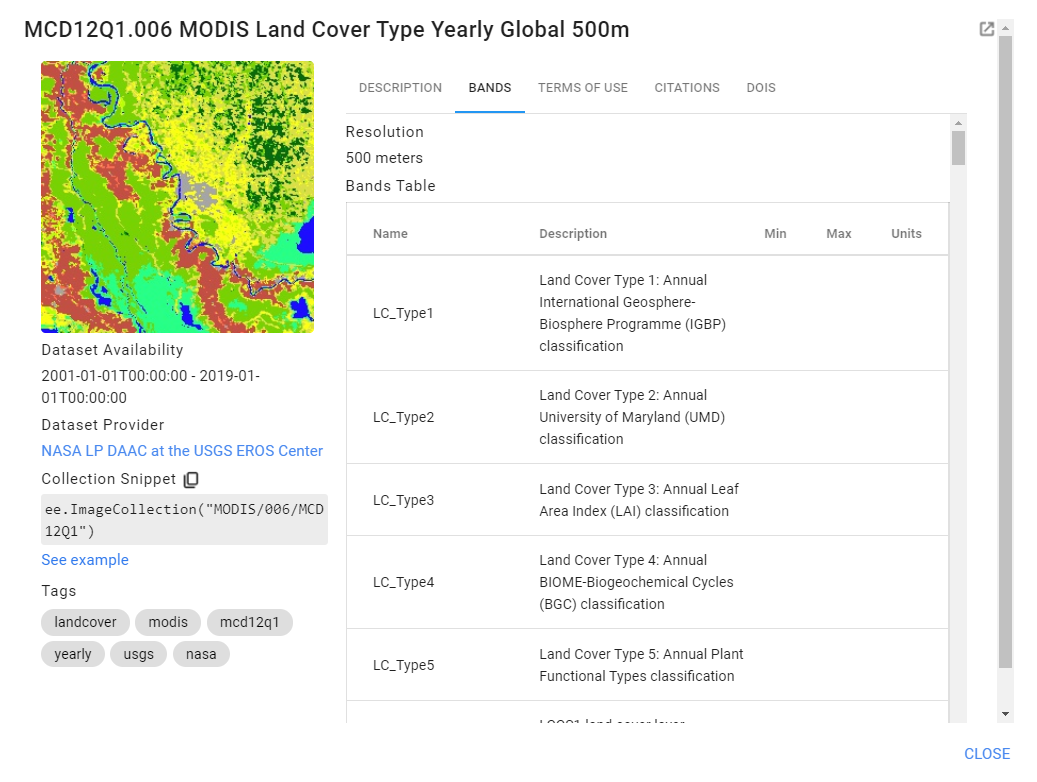
First, start a new code and search for “MODIS land cover.” Find the ImageCollection titled “MCD12Q1.006 MODIS Land Cover Type Yearly Global 500m,” import it, and rename it to MODIS. We will first look at the MODIS land cover classification over Accra, Ghana.:
// MODIS (Accra) |
The Land Cover Type Yearly Global dataset contains multiple classifications (Fig. A1.2.1). We will use LC_Type1, the annual classification using the International Geosphere-Biosphere Programme (IGBP) categories, in this example.
Fig. A1.2.1 Metadata of the MODIS Land Cover classification types |
Select the LC_Type1 band, copy and paste the visualization parameters for the classification, and visualize the full classification.
// Visualize the full classification. |
Press Run and view the output with the classification visualization. Use the Inspector tab to click on the different colors and determine the land cover classes they represent.
Next, we’re going to visualize only the urban class at points almost two decades apart: from 2001 and 2019. We’ll start by filtering for 2019 dates.
// Visualize the urban extent in 2001 and 2019. |
Fig. A1.2.2 Classes for the LC_Type1 classification |
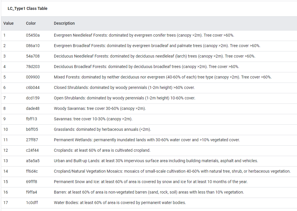
Looking at the metadata shows us that the urban class has a value of 13 (Fig. A1.2.2), so we’ll select only the pixels with this value and visualize them for 2019. To show only the urban pixels, mask the urban image with itself in the Map.addLayer command.
var M_urb_2019=MODIS_2019.mosaic().eq(13); |
Repeat the same steps for 2001, but give it a gray palette to contrast with the red palette of 2019.
var MODIS_2001=MODIS_lc.filterDate(ee.Date('2001-01-01')); |
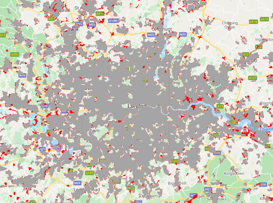
The result is a visualization showing the extent of Accra in 2002 in gray and the new urbanization between 2001 and 2019 in red (Fig. A1.2.3).
Fig. A1.2.3 Output of MODIS visualization |

Code Checkpoint A12b. The book’s repository contains a script that shows what your code should look like at this point.
Next, we’ll look at CORINE. Open a new script, search for “CORINE,” select the Copernicus CORINE Land Cover dataset to import, rename it to CORINE, and center it over London, England.
// CORINE (London) |
Conducting a similar process to the one we used with MODIS, first select the image for 2018, the most recent classification year.
// Visualize the urban extent in 2000 and 2018. |
Why filter by 2017 and not 2018? The description section of CORINE’s metadata shows that the time period covered by the 2018 asset includes both 2017 and 2018. To select the 2018 asset in the code above, we filter by the date of the first year. (If you’re curious, you can test what happens when you filter using 2018 as the date.)
The metadata for CORINE show that the built-up land cover classes range from 111 to 133, so we’ll select all classes less than or equal to 133 and visualize them in red.
var C_urb_2018=CORINE_2018.mosaic().lte(133); //Select urban areas |
Repeat the same steps for 2000, but visualize the pixels in gray.
// 2000 (1999-2001) |
The output shows the extent of London’s built-up land in 2000 in gray, and the larger extent in 2018 in red (Fig. A1.2.4).
Fig. A1.2.4 Output of CORINE visualization |
Code Checkpoint A12c. The book’s repository contains a script that shows what your code should look like at this point.
Last, we’ll look at NLCD for 2016. Open a new script, search for “NLCD,” import the NLCD: USGS National Land Cover Database, rename it to NLCD, and center it over Chicago, Illinois, USA.
// NLCD (Chicago) |
Select the landcover classification band and filter it to the 2016 classification. Previously, we have done so using the filterDate command, but you can also filter on the system:index.
// Select the land cover band. |
Hit Run and view the classification visualization. Use the Inspector tab to explore the classification values. The shades of red represent different levels of development. Dark red is “Developed, High Intensity” and the lightest pink is “Developed, Open Space.” You can look at the metadata description of this dataset to learn about the rest of the classes and their corresponding colors.
One of the benefits of classifications is that you can use them to calculate quantitative information such as the area of a specific land cover. Now we’ll cover how to do so by summing the high-intensity urban development land cover in Chicago. Import a boundary of the city of Chicago and clip the NLCD classification to its extent.
// Calculate the total area of the 'Developed high intensity' class (24) in Chicago. |
Select the “Developed, High Intensity” class (24), and mask the class with itself (to ensure that we calculate the area of only the highly developed pixels and no surrounding ones), then visualize the output.
// Set class 24 pixels to 1 and mask the rest. |
Multiply the pixels by their area, and use reduceRegions to sum the area of the pixels.
// Area calculation. |
Code Checkpoint A12d. The book’s repository contains a script that shows what your code should look like at this point.
If everything worked correctly, you should see “203722704.70588234” printed to the Console. This means that highly developed land covered about 204,000,000 m2 (204 km2) in the city of Chicago in 2016. Let’s roughly check this answer by looking up the area of the city of Chicago. Chicago is about 234 square miles (~606 km2), which means highly developed areas cover about a third of the city, which visually matches what we see in the Map viewer.
Question 1. Return to your MODIS classification visualization of Accra and look at the pixels that became urban between 2002 and 2019. What land cover classes were they before they became urbanized? Hint: you will need to change the date of your full classification visualization to 2002 in order to answer this question.
Question 2. Return to your NLCD area calculation. Write new code to calculate the area of the highly developed class in Chicago in 2001. How much did the highly developed class change between 2001 and 2016? Report your answer in square meters.
Question 3. Fill out Table A1.2.1 on the spatial and temporal extents of the three classifications that we’ve just experimented with (some entries are filled in as an example). Based on your table, what are the benefits and the limitations of each of the classifications for studying urban areas?
Table A1.2.1 Spatial and temporal extents of three classifications
Pixel Size (m) | Years Available | Coverage | Number of Urban Classes | |
MODIS | 500 m | |||
CORINE | European Union | |||
NLCD | 4 |
Section 3. Classifying Urban Areas
In the previous section, we relied on several LULC classifications to estimate the distribution of built-up land cover and its change over time. While for many applications these products would be sufficient, for others their temporal or spatial granularity may be a limiting factor. For example, your research question may require tracking monthly changes in the distribution of built-up land cover or depicting granular intra-city spatial patterns of built-up areas.
Luckily, with emerging and more accessible machine learning tools—like those available in Earth Engine—you can now create your own classification maps, including maps that depict the distribution of built-up land cover (Goldblatt et al. 2016). Machine learning deals with how machines learn rules from examples and generalize these rules to new examples. In this section, we will use one of the most common supervised machine learning classifiers: Random Forests (Breiman 2001).
You will use Landsat 7 imagery to classify built-up land cover in the city of Ahmedabad, Gujarat, India, at two points in time, 2020 and 2010. You will hand draw polygons (rectangles) representing areas of built-up and not built-up land cover, and then build a Random Forest classifier and train it to predict whether a pixel is “built-up” or not.
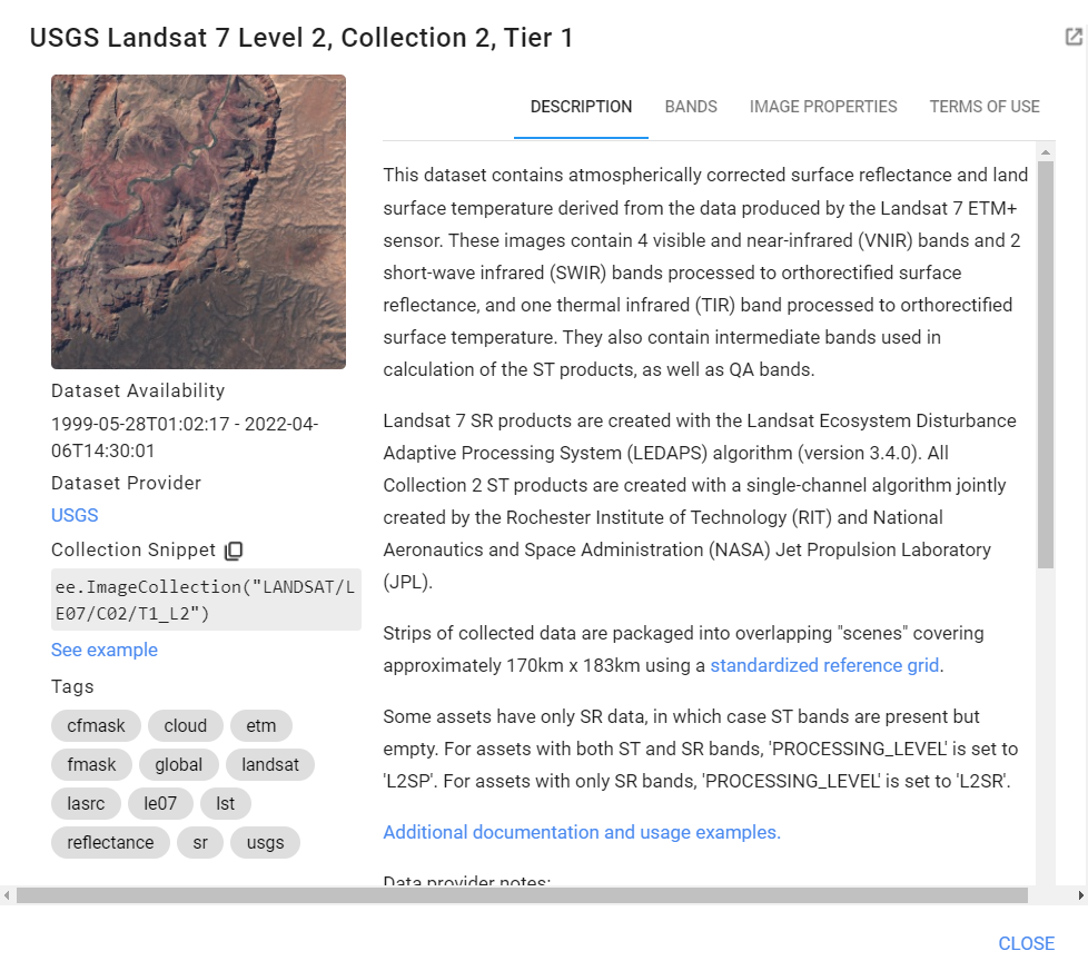
First, start a new script. In the search bar, search for “USGS Landsat 7 Collection 2 Tier 1”. Of the similarly named datasets that come up, select the one with the data set specifier “LANDSAT/LE07/C02/T1_L2”. The metadata shows that this is an ImageCollection of images collected since 1999 (Fig. A1.2.5, left) and that each pixel is characterized by 11 spectral bands (Fig. A1.2.5, right) . In this exercise, we will work only with bands 1–6. Import this ImageCollection and change the name of the variable to L7.
Fig. A1.2.5 Metadata for the “USGS Landsat 7 Collection 2 Tier 1” dataset | |

Next, you will create an annual composite for the year 2020 using the Google example Landsat457 Surface Reflectance script, located in the Cloud Masking Examples folder at the bottom of your Scripts section (Fig. A1.2.6).
Fig. A1.2.6 Location of the surface reflectance code in the Examples repository |

This function computes surface reflectance. To create a composite for the year 2020, use the ee.FilterDate method to identify the images captured between January 1, 2020 and December 31, 2020, then map the function over that collection.
// Surface reflectance function from example: |
Now, in the search bar, search for and navigate to Ahmedabad, India. Add the landsat7_2020 composite to the map. Specify the red, green, and blue bands to achieve a natural color visualization, noting that in Landsat 7, band 3 (B3) is red, band 2 (B2) is green, and band 1 (B1) is blue. Also specify the colors’ stretch parameters. In this case, we stretch the values between 0 and 0.3, but feel free to experiment with other stretches.
Map.addLayer(landsat7_2020,{ |
Code Checkpoint A12e. The book’s repository contains a script that shows what your code should look like at this point.
The next step is probably the most time consuming in this exercise. In supervised classification, a classifier is trained with labeled examples to predict the labels of new examples. In our case, each training example will be a pixel, labeled as either built-up or not-built-up. Rather than selecting pixels for the training set one at a time as was done in Chap. F2.2, you will hand-draw polygons (rectangles) and label them as built-up or not-built-up, and assign to each pixel with the label of the spatially overlapping polygon. You will create two feature collections: one with 50 rectangles over built-up areas (labeled as “1”) and one with 50 examples of rectangles over not-built-up areas (labeled as “0”). To do this, follow these steps:
Fig. A1.2.7 To hand-draw examples of not-built-up rectangles, click on the rectangle icon in the upper-left corner of the screen |

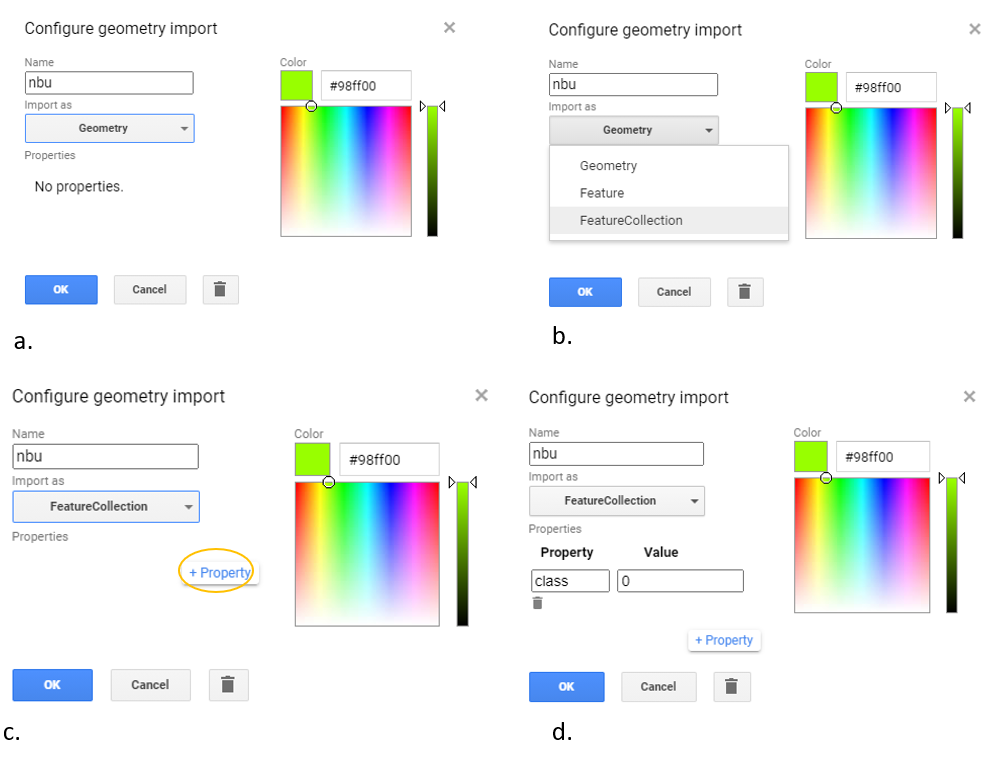
Start by hand-drawing the not-built-up examples. Click on the rectangle icon in the upper-left corner of the screen (Fig. A1.2.7). Clicking on this icon will create a new variable (called geometry). Click on the gear-shaped icon of this imported variable. Change the name of the variable to nbu (stands for “not-built-up”) (Fig. A1.2.8a). Change the Import as parameter from Geometry to FeatureCollection (Fig. A1.2.8b). Click on the +Property button (Fig. A1.2.8c), to create a new property called “class,” and assign it with a value of 0 (Fig. A1.2.8d). You have just created a new empty FeatureCollection, where each feature will have a property called “class”, with a value of 0 assigned to it.
Fig. A1.2.8 Creating a new FeatureCollection for examples of not-built-up areas: (a), change the name of the variable to nbu; (b), change the parameter Import as parameter from Geometry to FeatureCollection; (c), click on the +Property button; (d) to create a new property called “class,” and assign to it the value 0. |
The nbu FeatureCollection is now initialized, and empty. You now need to populate it with features:. In this exercise, you will draw 50 rectangles drawn over areas representing not-built-up locations. To identify these areas, you can use either the 2020 Landsat 7 scene (landsat7_2020) as the background reference, or use the high-resolution satellite basemap (provided in Earth Engine) as reference. Note, however, that you can use the basemap as reference only if you classify the current land cover, since Earth Engine’s satellite background is continually updated.
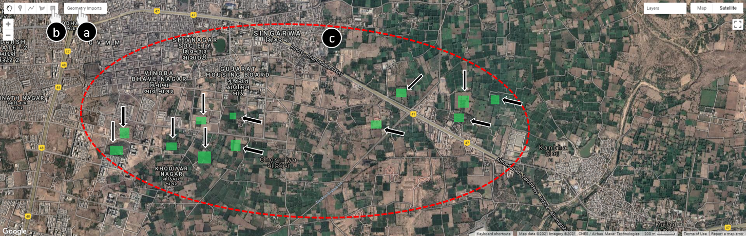
For this exercise, we define “not-built-up” land cover as any type of land cover that is not built-up (this includes vegetation, bodies of water, bare land, etc.). Click on the nbu layer you created under Geometry Imports (Fig. A1.2.9a) to select it (the rectangle button will be highlighted; see Fig. A1.2.9b) and draw 50 rectangles representing examples of areas that are not-built-up (Fig. A1.2.9c). It is important to select diverse and representative examples. To avoid exceeding the user memory limit, draw relatively small rectangles (see examples in Fig. A1.2.9).
Tip: To delete a feature, simply click on Esc, select the feature you want to delete, and click Delete. You can also click on Esc if you want to navigate (zoom in, zoom out, pan). If you’d like to re-draw a rectangle, click again on the name nbu layer under Geometry Imports and modify the geometry. When done, click on the Exit button or Esc.
Note that while adding more examples may improve the accuracy of your classification, creating too many examples could potentially improve the accuracy of the classification of your specific area of interest—but it may not fit well in other geographical areas. That is an example of a type of “overfitting,” in which samples used to train a model are overly specific to one area and not generalizable to other locations.
Fig. A1.2.9 Rectangles representing example locations of not-built-up areas |
Now that you created 50 examples of not-built-up areas, it is time to create a second additional FeatureCollection of 50 examples of built-up areas. As with the not-built-up examples, you will first create an empty FeatureCollection and then populate it with example features.
Important: you will need to create a new layer. Make sure that you do not add these new examples to the not-built-up FeatureCollection. To create a new layer, click on +new layer (Fig. A1.2.10). This will create a new variable called geometry.
Fig. A1.2.10 Creating a new layer for the built-up FeatureCollection To create a new empty feature collection of built up examples, click on the +new layer (at the bottom of the Geometry Imports) |

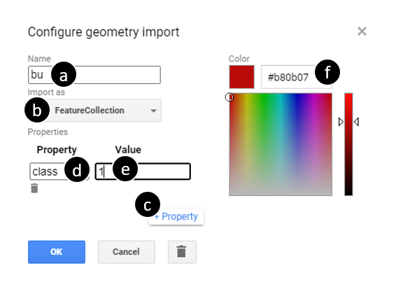
Click on the gear-shaped icon () next to the new variable you just created. Change the name of the variable from geometry to bu (stands for built-up) (Fig. A1.2.11a). Change the Import as parameter from geometry to FeatureCollection (Fig. A1.2.11b). Click on +Property (Fig. A1.2.11c), and create a property called class (Fig. A1.2.11d), and assign to it a value of 1. (Fig. A1.2.11e). Recall that this is the same property name you used for the nbu examples. Assign the features with a value “1” (Fig. A1.2.11e). Also change the color of the bu examples to red (Fig. A1.2.11f), representing built-up areas. Click OK.

Fig. A1.2.11 Creating a new FeatureCollection for examples of built-up areas: (a), change the name of the variable to “bu”; (b), change the parameter Import as parameter from Geometry to FeatureCollection; (c), click on the +Property button; (d) to create a new property called “class,” and assign to it the value 1. |
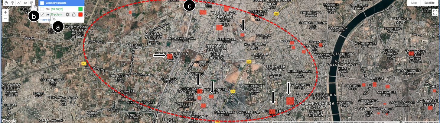
The bu FeatureCollection is now initialized, and empty. To populate it with examples of built-up areas, hover over the bu FeatureCollection (Fig. A1.2.12a), select the rectangle tool (Fig. A1.2.12b), and draw 50 rectangles over built-up areas. Keep (keep the size of the rectangles similar to the not-built-up examples) (Fig. A1.2.12, location ‘c’).
Fig. A1.2.12 Rectangles representing examples of built-up areas. To create these examples, hover over the new “bu” feature collection you just created (a), select the rectangle tool (b), and draw 50 examples of rectangles over built-up areas (c). |
You’ve now created two feature collections: 50 features representing built-up areas (the variable is called bu), and 50 features representing not-built-up areas (the variable is called nbu). Next, you will merge these two feature collections to create one collection of 100 features. Remember that in both collections you added a property called class; features in the FeatureCollection nbu were assigned a value of 0 and features in the FeatureCollection bu were assigned a value of 1. The merged FeatureCollection will also include the property class: 50 features with a value of 1 and 50 with a value of 0. To merge the feature collections, use the method merge. Call the merged FeatureCollection with the variable lc.
var lc=nbu.merge(bu); |
Code Checkpoint A12f. The book’s repository contains a script that shows what your code should look like at this point.
List the properties that the classifier will use to determine whether a pixel is built-up or not-built-up. Recall that Landsat 7 has 11 bands; two of them are QA Bitmask bands, which likely do not vary by land cover. Create a new variable called bands with a list of the bands to be used by the classifier.
var bands=['SR_B1', 'SR_B2', 'SR_B3', 'SR_B4', 'SR_B5', 'ST_B6', 'SR_B7']; |
Next, you will create the labeled examples (pixels) that will serve as the training set of the classifier. Remember that, at this point, the pixels are not yet labeled; you labeled only the rectangles (stored in the lc variable), which are not associated with the bands of the Landsat pixels. To associate the Landsat pixels with a label, you will sample the pixels that overlap with these rectangles and assign them with the class of the overlapping rectangle.
This can be done with the method sampleRegions. Define a new variable and call it training. Under this variable, call the 2020 Landsat composite (landsat7_2020), select the relevant bands (the variable bands), and sample the overlapping pixels. You will sample the landsat7_2020 pixels that overlap with the FeatureCollection lc and copy the property class from each feature to the overlapping pixel (each pixel will now include the 9 properties and a class, either 1 or 0). Set the argument scale to 30 (30 m— Landsat 7’s spatial resolution—is the scale of the projection to sample in). These steps are shown in the code block below and were described in Section F2.1.
var training=landsat7_2020.select(bands).sampleRegions({ |
Now it is time to create the classifier. Create an empty Random Forest classifier using the method ee.Classifier.smileRandomForest. You can keep most of the arguments’ values as default and only set the number of decision trees in the forest (the argument numberOfTrees) to 20. Use the method train to train the classifier. This method trains a classifier on a collection of features, using the specified numeric properties of each feature as training data. The collection to train on is called training and the name of the property containing the class value is called 'class'. The list of properties (inputProperties) to be considered by the classifier is stored in the bands variable. Note that, by default, the classifier predicts the class of the pixel (in this case, “1,” built-up, or “0,” not-built-up). You could also set the mode of the classifier to PROBABILITY, which will result in the probability that a pixel has the value “1”. In this example, we used the default CLASSIFIER mode).
// Create a random forest classifier with 20 trees. |
In the previous step, you trained a classifier. Next, you will use the trained model to predict that class on new pixels, using the method classify. You’ll define a new variable, classified20, which will take the Landsat composite; select the relevant bands (the variable bands); and classify this image using the trained classifier (called 'classifier').
// Apply the classifier on the 2020 image. |
You can visualize the classification by adding the classified image to the map. In our case, we have only two classes (built-up and not-built-up); thus, the classifier’s prediction is binary (either “1” for built-up, or “0” for not-built-up). To show only the pixels with a value of 1, use the mask method to mask out the pixels with a value of 0. Set the visualization parameters to visualize the remaining pixels as red, with a transparency of 60%.
Map.addLayer(classified20.mask(classified20), { |
Code Checkpoint A12g. The book’s repository contains a script that shows what your code should look like at this point.
Lastly, many applications require mapping the extent of built-up land cover at more than one point in time (e.g., to understand urbanization processes). As you recall, Landsat 7 has been collecting imagery from every location on Earth since 1999. We can use our trained classifier—which was trained based on Landsat 7 2020 imagery—to predict the extent of built-up land cover in any year collected (with the assumption that the characteristics of a built-up pixel did not change over time). In this exercise, you will use the trained classifier to map the built-up land cover in 2010.
First, create a composite for 2010 using the simpleComposite method.:
var landsat7_2010=L7.filterDate('2010-01-01', '2010-12-31') |
Now, you can use the classifier to classify the 2010 image using the classify method. Classify the 2010 image (landsat7_2010) and add it to the map, this time in a yellow color.
// Apply the classifier to the 2010 image. |
The result should be something like what is presented in Fig. A1.2.13. Built-up land cover in 2020 is presented in red, and in 2010 in yellow.
Fig. A1.2.13 The classified built-up land cover in 2020 (red) and in 2010 (yellow) |

Want to see which areas were developed in the period between 2010 and 2020? Create a new variable and call it difference. In this variable, subtract the values of 2010 from 2020. Any pixel that changed from “0” in 2010 to “1” in 2020 will be assigned with a value of 1. You can then visualize this difference on the map in blue.
var difference=classified20.subtract(classified10); |
Code Checkpoint A12h. The book’s repository contains a script that shows what your code should look like at this point.
If your code worked as expected, you should be able to see the three layers you classified: the built-up land cover in 2010, in 2020, and the difference between the two.
Question 4. Calculate the total built-up land cover in Ahmedabad in 2010 and in 2020. How much built-up area was added to the city? What is the percent increase of this growth?
Note: Use this FeatureCollection, filtered to Ahmedabad, to bound your area calculation.:
var indiaAdmin3=ee.FeatureCollection( |
Question 5. Add two lines to your code to visualize the built-up area that was added between 2010 and 2020.
Synthesis
Assignment 1. In this exercise, we mapped built-up land cover with Landsat 7 imagery. Now try to repeat this exercise using Sentinel-2 as an input to the classifier. Calculate the total area of built-up land cover in Ahmedabad in 2020, and answer the following questions.
Note, that you can create an annual Sentinel-2 composite by calculating the median value of all cloud-free scenes captured in a given year (see an example of how to filter by cloud values in Sect. 1 of this chapter). Note that the property that stores the cloudy pixel percentage in the Sentinel-2 ImageCollection is 'CLOUDY_PIXEL_PERCENTAGE'.
Question 6. How do the area totals differ from each other? (Use the Ahmedabad FeatureCollection boundary from Question 4)?
Question 7. Why do you think that is the case? Think about spatial and spectral resolutions.
Question 8. What is the area of the MODIS urban classification in 2019?
Question 9. Is it larger or smaller than Landsat/Sentinel? Why?
- How do the area totals differ from each other? (Use the Ahmedabad FeatureCollectionfeature collection boundary from Question 4 above.)
- Why do you think that is the case? Think about spatial and spectral resolutions.
- What is the area of the MODIS urban classification in 2019?
- Is it larger or smaller than Landsat/Sentinel? Why?
Conclusion
In this chapter, you have learned how to visualize and quantify the magnitude and pace of urbanization anywhere in the world. Combined with your knowledge from other chapters, you’re now equipped to look at urban heat islands, food and water system stresses, and many other socio-environmental impacts of urbanization (Bazaz et al. 2018). As more and higher-resolution remote sensing data become available, the scope of questions we can answer about urban areas will widen and the accuracy of our predictions will improve. This knowledge can be used for policy and decision-making, in particular in the context of the United Nations Sustainable Development Goals (United Nations 2020, Prakash et al. 2020).
Feedback
To review this chapter and make suggestions or note any problems, please go now to bit.ly/EEFA-review. You can find summary statistics from past reviews at bit.ly/EEFA-reviews-stats.
References
Cloud-Based Remote Sensing with Google Earth Engine. (n.d.). CLOUD-BASED REMOTE SENSING WITH GOOGLE EARTH ENGINE. https://www.eefabook.org/
Cloud-Based Remote Sensing with Google Earth Engine. (2024). In Springer eBooks. https://doi.org/10.1007/978-3-031-26588-4
Bazaz A, Bertoldi P, Buckeridge M, et al (2018) Summary for Urban Policymakers – What the IPCC Special Report on 1.5°C Means for Cities. IIHS Indian Institute for Human Settlements
Breiman L (2001) Random forests. Mach Learn 45:5–32. https://doi.org/10.1023/A:1010933404324
Goldblatt R, Stuhlmacher MF, Tellman B, et al (2018) Using Landsat and nighttime lights for supervised pixel-based image classification of urban land cover. Remote Sens Environ 205:253–275. https://doi.org/10.1016/j.rse.2017.11.026
Goldblatt R, You W, Hanson G, Khandelwal AK (2016) Detecting the boundaries of urban areas in India: A dataset for pixel-based image classification in Google Earth Engine. Remote Sens 8:634. https://doi.org/10.3390/rs8080634
Prakash M, Ramage S, Kavvada A, Goodman S (2020) Open Earth observations for sustainable urban development. Remote Sens 12:1646. https://doi.org/10.3390/rs12101646
United Nations Department of Economic and Social Affairs (2019) World Urbanization Prospects: The 2018 Revision
United Nations Department of Economic and Social Affairs (2020) The Sustainable Development Goals Report 2020