Cloud-Based Remote Sensing with Google Earth Engine
Fundamentals and Applications

Part A3: Terrestrial Applications
Earth’s terrestrial surface is analyzed regularly by satellites, in search of both change and stability. These are of great interest to a wide cross-section of Earth Engine users, and projects across large areas illustrate both the challenges and opportunities for life on Earth. Chapters in this Part illustrate the use of Earth Engine for disturbance, understanding long-term changes of rangelands, and creating optimum study sites.
Chapter A3.8: Detecting Land Cover Change in Rangelands
Authors
Ginger Allington, Natalie Kreitzer
Overview
The purpose of this chapter is to familiarize you with the unique challenges of detecting land cover change in arid rangeland systems, and to introduce you to an approach for classifying such change that provides us with a better understanding of these systems. You will learn how to extract meaningful data about changes in vegetation cover from satellite imagery, and how to create a classification based on trajectories over time.
Learning Outcomes
- Visualizing and explaining the challenges of utilizing established land cover data products in arid rangelands.
- Applying a temporal segmentation algorithm to a time series of information about vegetation productivity.
- Classifying pixels based on similarities in their temporal trajectories.
- Extracting and visualizing data on the new trajectory classes.
- Comparing trajectory classes to information from traditional land cover data.
Helps if you know how to:
- Import images and image collections, filter, and visualize (Part F1).
- Perform pixel-based supervised or unsupervised classification (Chap. F2.1).
- Use expressions to perform calculations on image bands (Chap. F3.1).
- Write a function and map it over an ImageCollection (Chap. F4.0).
- Interpret the outputs from the LandTrendr algorithm implementation in Earth Engine (Chap. F4.5).
- Write a function and map it over a FeatureCollection (Chap. F5.1, Chap. F5.2).
- Use the require function to load code from existing modules (Chap. F6.1).
Github Code link for all tutorials
This code base is collection of codes that are freely available from different authors for google earth engine.
Introduction to Theory
Arid and semi-arid rangelands cover approximately 41% of the global land surface (Asner et al. 2004) and provide livelihoods for 38% of the human population (Millennium Ecosystem Assessment 2005) and forage for three-quarters of the world’s livestock (Derner et al. 2017). Rangelands are located in regions of the world that are experiencing some of the most rapid changes in climate (Huang et al. 2015, Melillo et al. 2014), which can affect ecosystem productivity and resilience (Briske 2017). Land conversion to agriculture (Lambin and Meyfroidt 2014), urbanization and development (Fan et al. 2016, Sleeter et al. 2013), and afforestation (Cao et al. 2011) are increasing in many rangeland regions globally. Uncertainties about socioeconomic and sociopolitical forces such as land tenure security (Campbell et al. 2005, Li et al. 2007, Liu et al. 2015, Reid et al. 2000), rural out-migrations and urbanization (Lang et al. 2013), and changes in human demography and dietary preferences (Alexandratos and Bruinsma 2012) limit our ability to predict the future sustainability of rangeland systems. In order to understand the causes and consequences of land cover change in rangelands, we must first classify and quantify the change.
There are several readily available datasets commonly used to assess changes in land cover over large regions. The three most prominent global inventories are the annual MODIS 12Q land cover product (500 m) (Friedl et al. 2010), the 300 m GlobCover data from the European Space Agency (ESA) (Arino et al. 2008, Bontemps et al. 2011), and the new 10 m WorldCover data, also from the ESA (Zanaga et al. 2020), the latter two of which are available for single nominal dates. National-level data products typically are available at finer spatial resolutions and tend to use more categories to classify the surface (e.g., NLCD in the US, Homer et al. 2015)-- though they are not available for all countries. While these global and national land cover data products have been useful for documenting a number of important surface phenomena such as forest loss, urbanization, and habitat conversion in a variety of ecosystems (Schneider et al. 2010, Presetele et al. 2016), they generally have poor accuracy in arid portions of the globe (Friedl et al. 2002, Ganguly et al. 2010, García-Mora et al. 2012).
Additionally, traditional methods for change detection are derived from categorical land cover classifications, which can identify change only when a pixel crosses a threshold to a new state (e.g., from Grassland to Barren), and therefore can identify change only after it has occurred, not when it begins. In systems with long time lags in vegetation response (such as has been shown for recovery in arid grasslands), this can create uncertainty about the efficacy of environmental policies and the response of landscapes to large-scale management changes (Fig. A3.8.1).
Fig. A3.8.1 Time series of NDVI in Naiman Banner, Inner Mongolia. Line represents the median value calculated over the region. Overlaid colored bars represent the corresponding land cover classes for the years 2001–2016, according to the MODIS-derived MCD12Q1 data. |

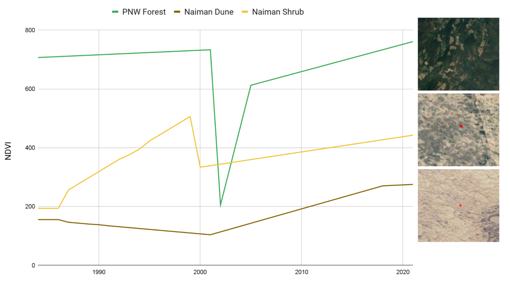
As an alternative to classification-based change detection, new methods have emerged that identify unique features in time series of remotely sensed data to pinpoint disturbance events such as logging, wildfires, and flooding. These time series-based methods, such as CCDC (see Chap. F4.7) and LandTrendr (see Chap. F4.5), are typically calibrated and executed to detect abrupt changes in spectral reflectance or derived index values associated with those disturbances. This is extremely useful for detecting change events like deforestation or the defoliation resulting from an insect outbreak where the disturbance is punctuated in time and where the difference in spectral index is significant, and regreening occurs on the order of years (Fig. A3.8.2).
For these reasons, contemporary classification approaches are extremely limited in their ability to provide reliable information about landscape change and dynamics in rangeland systems. Current pressures from climate change, land use intensification, and urban expansion create an urgent need for methods to more accurately map and track land cover status in a way that is useful for arid-systems research, land use change detection, and the monitoring and management of rangelands.
Fig. A3.8.2 Comparison of predicted NDVI for representative pixels from three regions: a forested area in southern British Columbia and two regions in Naiman Banner, Inner Mongolia, one dominated by woody shrubs and perennial forbs, the other by annual grasses and forbs |
Forest land cover changes are stark in terms of the change in indices such as NDVI and NBR (Kennedy et al. 2016). A forest pixel might suddenly drop from an NDVI over 0.6 to 0.15, which is easily detectable and a relatively straightforward transition to select for when coding a to-from change detection algorithm. Additionally, the visual change is stark, so a visual interpreter can easily create a training dataset without ancillary information to identify conversion from forest to burned, cleared, or developed.
In contrast, vegetation degradation and recovery in rangelands are typically characterized by more gradual changes over longer periods of time. Unlike with forest change, a trained interpreter using only satellite imagery cannot visually identify a rangeland land cover class transition until years after it has begun, if at all.
However, there is potential to utilize the information generated from temporal segmentation to characterize other aspects of change. Here, we will employ the LandTrendr time series segmentation algorithm (as described in Chap. F4.5) to derive information about how pixels are changing over time, and use that to generate a new land cover classification for a region of northern China.
To truly understand how rangelands are changing in space and time, and to provide adequate monitoring to support sustainable rangeland management, we need tools to help us capture and quantify those changes at landscape scales. Further, we need new ways of measuring changes within land cover types and interpreting those changes in ways that reflect rangeland dynamics and ecological processes. This necessitates rethinking the framework we use to categorize these lands in the first place. Approaches making use of greater temporal information on forest (Healey et al. 2018) and wetland systems (Dronova et al. 2015) show promise for deployment on rangeland systems.
We present a hybrid approach to rangeland classification that categorizes observable dynamic patterns in vegetation cover to classify pixels based on similarities in trajectory history. These new classes reveal much more meaningful information about the current status of a given pixel than a class based on cover type, and also yield information about the potential of a given pixel to respond to stressors in the future.
Practicum
Section 1. Inspecting Information about the Study Area
In this section, we will load and explore data sets that illustrate the area, and form the basis for the analysis.
Section 1.1 Inspect the Study Area
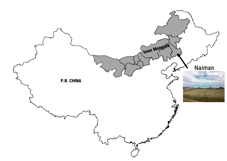
Naiman Banner (Fig. A3.8.3) is located in the southeastern portion of the Inner Mongolia Autonomous Region of northern China. Historically, this region was occupied by ethnic Mongolian pastoralists, and the primary vegetation was perennial grasses with some shrub cover. The region has undergone significant intensification of land uses over the past 60 years. Heavy grazing and conversion to crops has removed vegetation, exposing soils to erosion and resulting in extensive desertification. Since the early 1990s, a series of environmental policies and restoration programs, including grazing restriction and afforestation, have been implemented to halt the spread of desertification and promote revegetation of the rangelands. At the same time, cropland has continued to expand, and the use of irrigation has eliminated almost all of the surface water sources and severely lowered the groundwater table.
In this exercise, we will focus on a portion of central Naiman Banner that spans from the extensive Horqin Sandy Lands in the west to the dense agricultural area in the east.
Fig. A3.8.3 Location of the Horqin Sandy Lands within Naiman Banner, Inner Mongolia, People’s Republic of China |
Our first step is to load a shapefile for our area of interest (AOI) and explore the landscape using the default satellite basemap.
// Load the shapefile asset for the AOI as a Feature Collection |
Fig. A3.8.4 Location of the study region, within the Horqin Sandy Lands |

Switch the basemap to Satellite (Fig. A3.8.4). Turn the layer with the AOI boundary on and off and pan around the study area. Inspect the difference in land uses and cover types between the far western and eastern edges of the AOI. Mark them with pointer markers so you can revisit them later.
Question 1. List four potential land use or land cover classes that you observe in the image.
Section 1.2 Inspect Existing Land Use Data
Next, we will explore two different sources of land cover data to get a sense of how this landscape is typically categorized by these kinds of classified products.
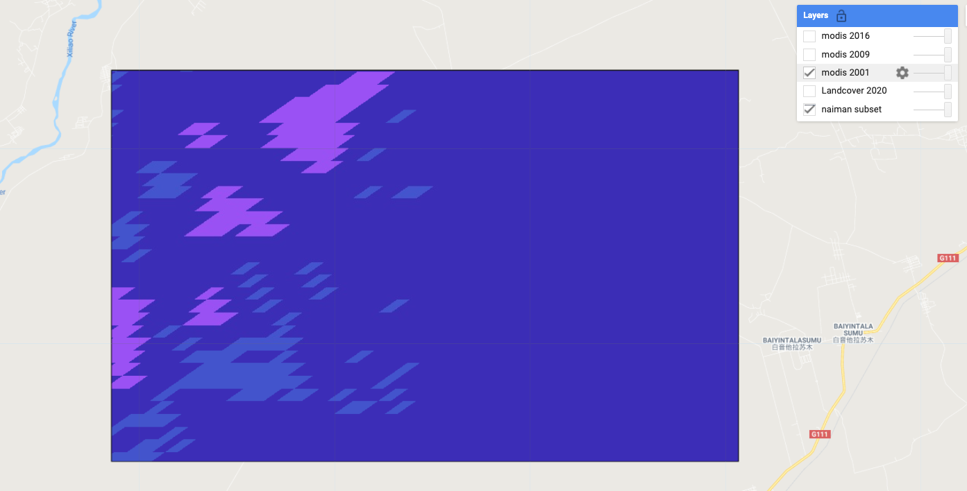
First, we will explore the MODIS MCD12Q1 Land Cover Type dataset. These global layers are available annually from 2001 to the present, at a resolution of 500 m. We will filter and visualize data for 2001, 2009, and 2016 in order to compare how MODIS captures change over this period.
Next, we will define and execute several different functions in this lesson. These functions will help us to execute the same logic across multiple images within different image collections.
// Filter the MODIS Collection |
Now that we have loaded all three datasets, let’s take a look at them and see how they compare. The randomVisualizer code below assigns random colors to each class in each layer.
Map.addLayer(modis01.randomVisualizer(),{}, 'modis 2001', false); |
You should end up with something that looks like Fig. A3.8.5. (The colors assigned to classes in your map may differ.)
Fig. A3.8.5 Land cover classes identified in 2001 from MODIS MCD12Q1 |
Use the slider bar in the Layer menu to turn the data on and off to compare classifications across the three years. Use the Inspector tool to select a few pixels around the AOI to pull information on the specific classes. Compare the pixel values reported in the Inspector to the land cover codes and descriptions listed in Table A3.8.1.
Table A3.8.1 Subset of the 17 IGBP Classes that appear within the study area in the MODIS MCD12Q1 land cover dataset.
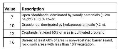
Fig. A3.8.6 Land cover classes assigned to a single pixel in the study area in 2001, 2009, and 2016 from MODIS MCD12Q1 |

Question 2. What are the four land cover types identified in this region, as classified by the MODIS data? Be sure to check all three time periods.
Next, we will add the WorldCover dataset from the ESA. This dataset was generated for 2020 only, and has a resolution of 10 m.
// Add and clip the WorldCover data |
The WorldCover dataset includes palette information in the 'Map' band, so you should end up with something that looks like Fig. A3.8.7. (The colors assigned to classes in your map may differ.)
Fig. A3.8.7 Land cover classes identified in 2020 in the ESA WorldCover dataset |

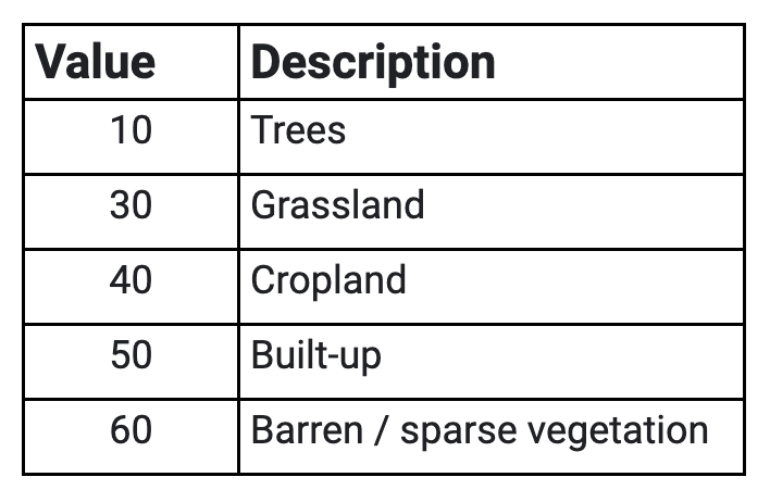
Table A3.8.2 Subset of the 11 land cover classes that appear within the study area in the ESA WorldCover dataset
Code Checkpoint A38a. The book’s repository contains a script that shows what your code should look like at this point.
Question 3. Spend a few minutes turning the different land cover layers on and off and using the Inspector to identify the classes for different pixels. How do the MODIS and WorldCover datasets differ? In what ways are they similar?
Question 4. Return to the points that you flagged in Section 1. Do your estimations of land cover correspond to the classifications from the two different data sources?
Question 5. Qualitatively compare change over time according to the MODIS data. What do you observe from these data? Approximately how much of the AOI has changed between 2001 and 2020, according to these data? Where are the regions of changing classification located? What regions seem to be fairly stable?
Section 2. Compile the Time Series of Vegetation Cover
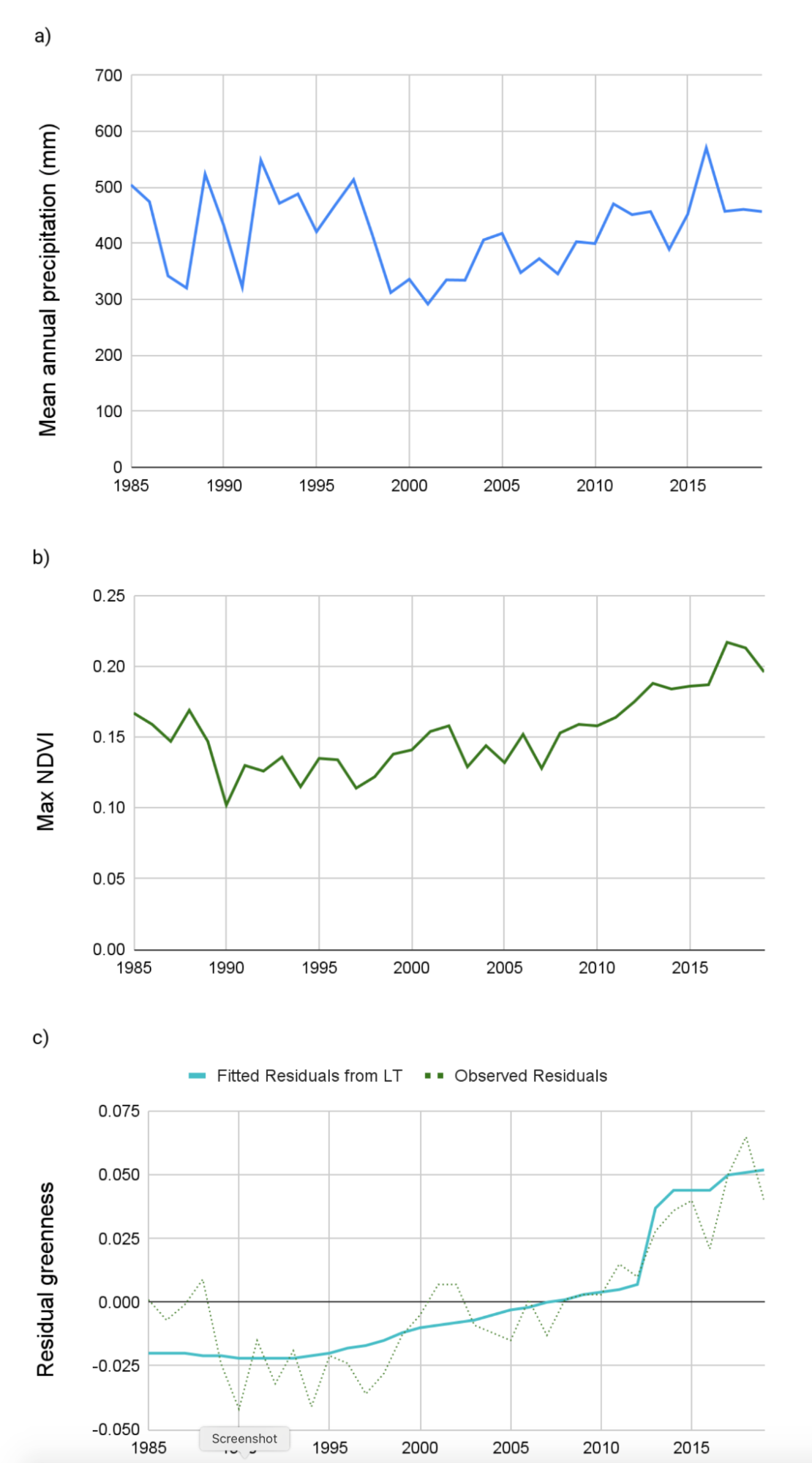
The Normalized Difference Vegetation Index (NDVI) is an index of vegetative productivity derived from the relationship between the red (approx. 650 nm) spectra and the near-infrared (750–2500 nm) spectra. NDVI is a consistently good proxy for productivity in this region (de Beurs et al. 2015). It is also highly correlated with precipitation (John et al. 2016). This relationship has the potential to introduce short-term responses of increased vegetation productivity that could be falsely identified as land cover change (Fig. A3.8.8 a and b). In order to account for this effect, we need to remove the main effect of precipitation on NDVI for a given year so that we can assess changes in greenness outside of that variability. To do this, we will derive individual regression models for each pixel (as detailed in Chap. F4.6) for the relationship between total annual water-year precipitation and maximum greenness in each year. We will then predict greenness for each pixel in each year based on observed precipitation, and use the residual values of greenness from the predicted model as an input to LandTrendr. We can think of the residuals as the remaining annual primary productivity, after we have removed the effect of precipitation (Fig. A3.8.8 c).
Fig. A3.8.8 Comparison of the variation over time in a) mean annual precipitation and b) maximum NDVI for the AOI; and a time series of residual greenness from a regression of precipitation and NDVI. |
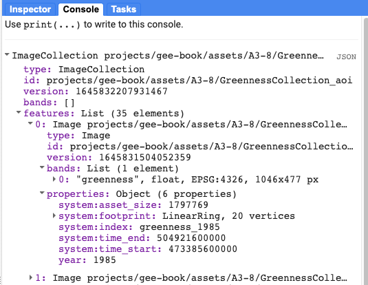
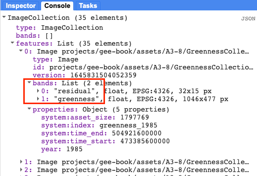
Before we go any further, let’s add two pre-generated image collection assets for greenness and precipitation (greennessColl and precipColl) and explore them. Print each of them to the Console to inspect the contents (Fig. A3.8.9).
var greennessColl=ee.ImageCollection( |
Fig. A3.8.9 Properties of the pre-generated Image Collection of maximum annual greenness values, generated from NDVI |
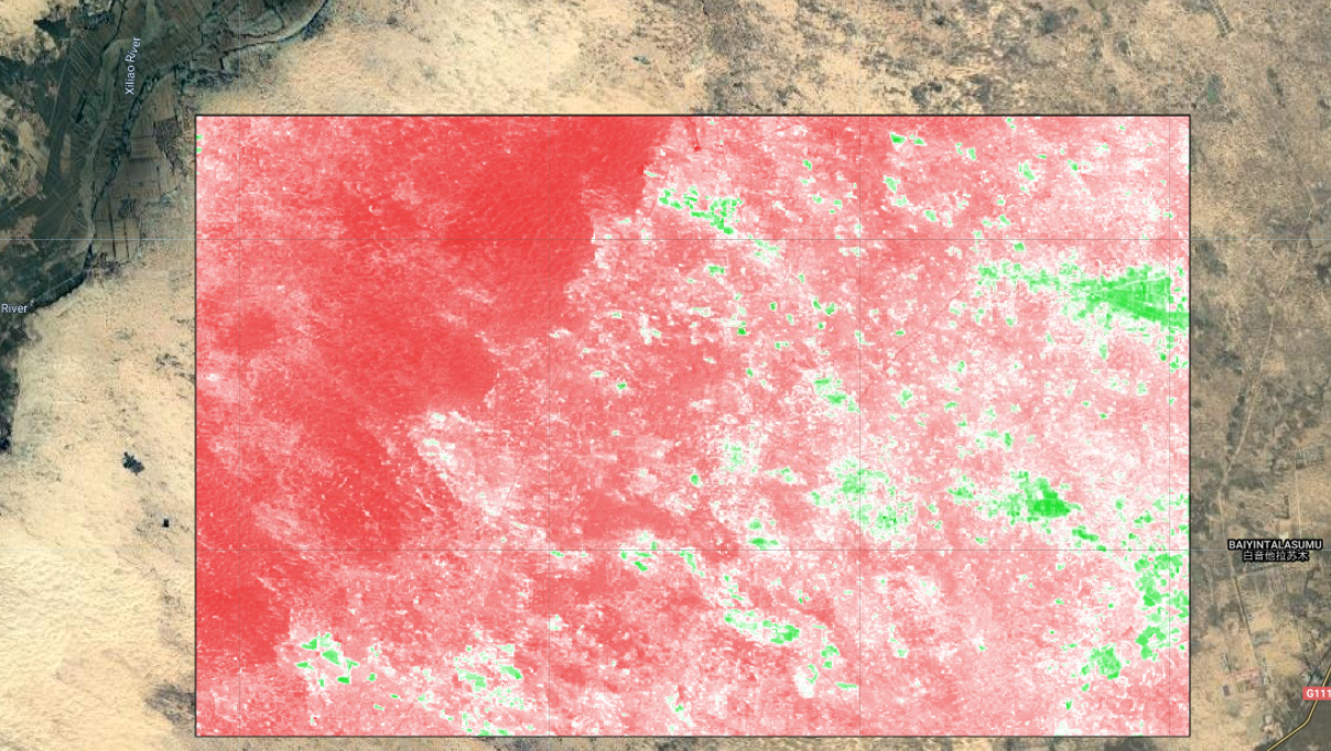
We saw in the plots above (Figs. A3.8.1 and A3.8.2) how NDVI can vary significantly over time in this region. We can also select out a few years to visualize how NDVI (“greenness”) varies spatially as well.
var greennessParams={ |
Turn the layers for the different years on and off to compare the range and spatial distribution of NDVI (Fig. A3.8.10).
Question 6. What do you observe about the similarities and differences in the distribution of NDVI across the selected years?
Fig. A3.8.10 Observed greenness (NDVI) in the study region in 2019. The values range from a minimum of 0.07 to a maximum of 0.5. |
Combining the greenness and precipitation collections and calculating the model to generate residuals is a relatively long process. To speed things along, we will employ a function that has been defined in a script module called residFunctions.
// Load a function that will combine the Precipitation and Greenness collections, run a regression, then predict NDVI and calculate the residuals. |
Print the resulting ImageCollection and inspect the bands and properties in the Console (Fig. A3.8.11).
Fig. A3.8.11 Each image in the residualColl image collection contains two bands, residual and greenness. The residual band for will be passed to LandTrendr. |
Next, you will filter the residualColl collection to map the same years we explored for the observed NDVI (greenness). The code chunk below will pull the image for 1985 (the first year). Use filterDate to select the other years you want to view. Add each to the map as new layers.
var resids=residualColl.first(); |
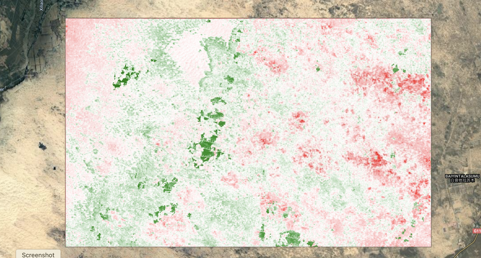
Map and compare the residuals versus greenness for a few different years (Fig. A3.8.12).
Fig. A3.8.12 Residual greenness in 1985, after removing the effect of precipitation. Models were fit on a per-pixel basis. |
Code Checkpoint A38b. The book’s repository contains a script that shows what your code should look like at this point.
Question 7. Compare the layers for residual greenness to the observed greenness values from Question 6. Why are we passing residuals to LandTrendr rather than the beginning NDVI values?
Section 3. Time Series Segmentation
Now you are ready to apply the LandTrendr time series segmentation algorithm to your Image Collection of residual greeness for the years 1985-2019. This will generate information for each pixel in the study area about how it has changed over time. In order to execute the code, you need to first define pertinent parameters in a dictionary, which you will provide to the LandTrendr algorithm along with your data. Chap. F4.5 gives an explanation of the LandTrendr algorithm and its parameters. That chapter showed an interface for LandTrendr; below, we utilize JavaScript functions to execute LandTrendr functions directly in the code editor.
//---- DEFINE RUN PARAMETERS---// |
Follow the next steps to combine the dictionary of parameter settings with the image collection and apply LandTrendr with the API functionality ee.Algorithms.TemporalSegmentation.LandTrendr. Then print and explore the output.
// Append the image collection to the LandTrendr run parameter dictionary |
The implementation of the LandTrendr Algorithm in GEE generates a multidimensional array containing subarrays for the observation year, observed residual, fitted residual, and Boolean vertex layer that tells the user if a change in pixel trajectory occured in a given observation year. In order to analyze the outputs year over year, we first must slice out the subarrays of the output multidimensional array, and transform them into Image collections. We will not go into detail about slicing arrays in this lesson. For your purposes here, you can just follow along with the provided code. If you wish to learn more about array indexing and slicing, you can refer back to Chap. F4.6).
//---- SLICING OUT DATA -----------------// |
Next, we will extract fitted residual values for each pixel in each year from the array slice and convert them to an image with one band per year. First we need to define a few parameters that we will need to call in future steps.
// Define a few params we'll need next: |
And now we can use the following code block to create a multi-band Image of the residual greeness predicted by LandTrendr for each pixel, with one band per year.
// Extract fitted residual value per year, per pixel and aggregate into an Image with one band per year |
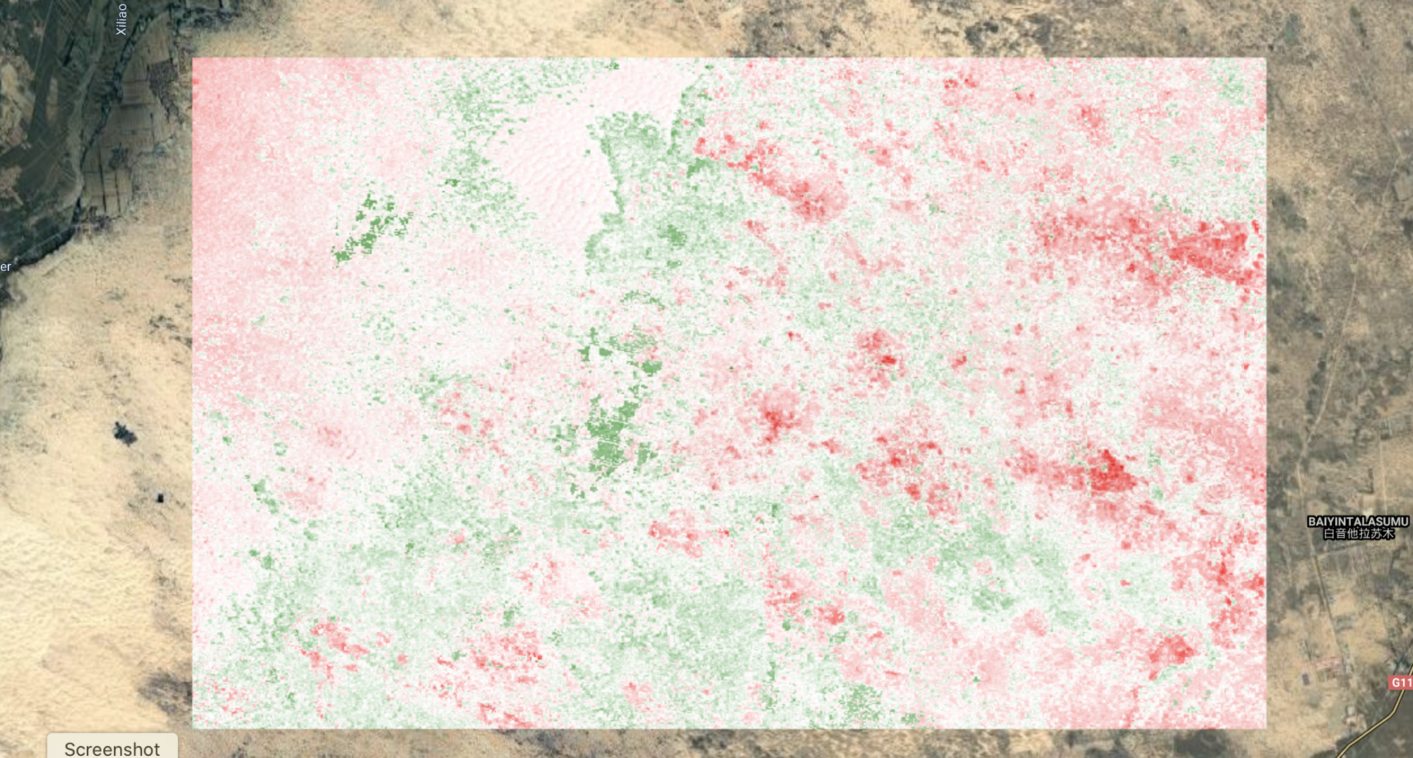
Add the fitted residuals for 1985 as a layer and compare them to the observed values you mapped previously. Notice how the range of values is more constrained than the observed values shown in Fig. A3.8.13. This is because the values are predicted from the best-fit model for the series, and thus do not contain the outliers and extreme values we might capture in the observed data.
Map.addLayer(fittedStack,{ |
Fig. A3.8.13 Fitted values for residual greenness in 1985, as predicted by the model fit via LandTrendr |
One of the very useful outputs from LandTrendr is information on whether the algorithm assigned a vertex to a given pixel in a given year. We can generate a raster with a band for each year, which indicates whether or not a pixel had a vertex identified in that year with a Boolean no/yes (0/1). We can use that information to assess how much of the AOI changed in a given year by assessing the prevalence of pixels with a value of 1 (indicating that a vertex was identified). To do this, we need to slice the Boolean information out of the LandTrendr output array, and then assign a year to each band.
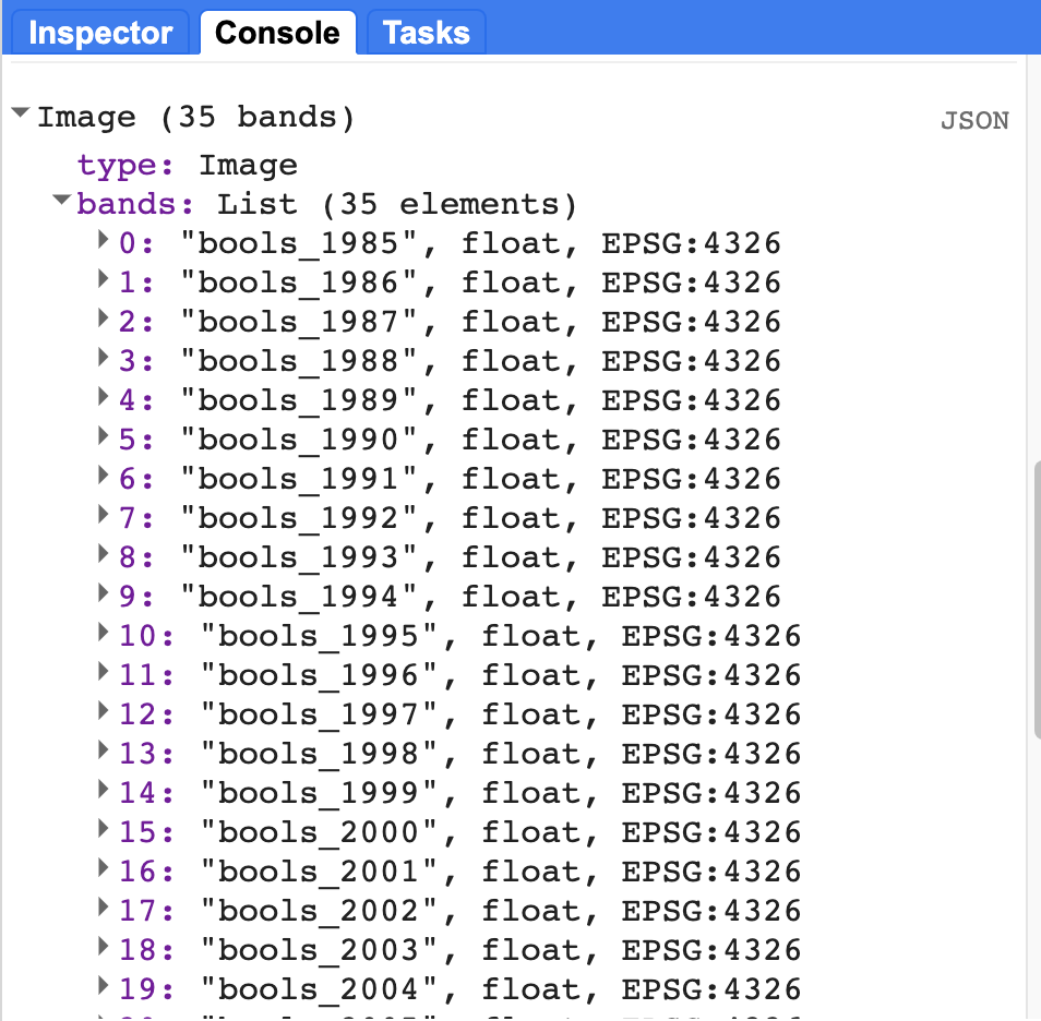
// Extract Boolean 'Is Vertex?' value per year, per pixel and aggregate into image w/ Boolean band per year |
If you print the resulting image, you should see something like Fig. A3.8.13 in your Console. You’ll notice that again we have a band for each year, but this time each band is a binary raster, where a value of one (1) indicates that the pixel had a vertex in that year.
Fig. A3.8.13 This is how the Boolean value binary rasters should appear in your Console once they are sliced out of the LandTrendr. Notice that the observation year has been appended to the name of each raster. |
In this next step, we will inspect a plot of the mean value of the Boolean (vertex) layers for each year in order to identify which years had the most change. We will estimate the proportion of the AOI that has a vertex identified in each year by mapping a Reducer over a collection to calculate the mean pixel values for each year. A mean of zero would indicate that no vertices were identified in that year, and a mean of one would indicate that all the pixels changed. Of course, neither of these values are likely; most years will have a relatively small number of pixels that change, and thus the value will be low, but not zero.
Charting functions in Earth Engine requires an ImageCollection. In the interest of time, we will load this for you as a new asset. If you would like to see an example script for transforming a multi-band image to an ImageCollection, you can find it in script A38s1 - Supplemental in the book's repository.
// Load an Asset that has the Booleans converted to Collection |
Now that we have our Boolean bands in an ImageCollection with one image per year, we can run a Reducer over it and create a chart of our results.
var chartBooleanMean=ui.Chart.image |
You should end up with a plot in the Console that looks something like Fig. A3.8.14.
Fig. A3.8.14 Average pixel value across the study area in each year. A value of one would indicate that all pixels in the image had a vertex identified in that year. The maximum proportion of landscape that changed in a given year was approximately twenty percent, in 1997. |
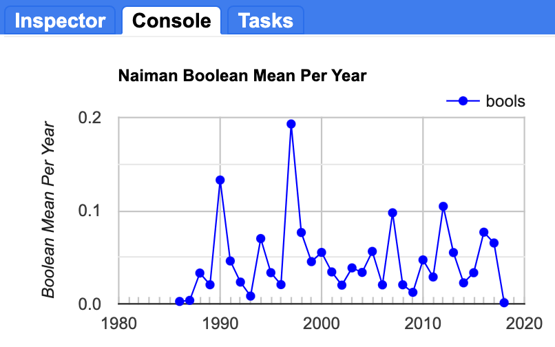
Question 9. Which years had the greatest number of pixels with a vertex (indicating a change in the trajectory of the timeseries)?
Now that you have identified those years, let’s inspect the spatial patterns and locations of those pixels for the major change years. For this, we can use our vertexStack image. Set the visualization parameters using the code provided below, then edit the specific year in the bands setting to match the year you want to visualize. Figure A3.8.14 displays the pixels that changed in 1997.
// Plot individual years to see the spatial patterns in the vertices. |
Fig. A3.8.14 Location of pixels with a vertex identified in 1997 |

Run the script several times, changing the year in the bands parameter to match the top change years you identified in the previous step. Take a screenshot of each one and store it so that you can compare them.
Question 10. Do you notice any differences in the spatial patterns of pixels across the top four change years, either in where they are located or their relative patch sizes or aggregation?
Code Checkpoint A38c. The book’s repository contains a script that shows what your code should look like at this point.
Section 4. Classify Pixels Based on Similarities In Time Series Trajectories
In the vertexStack object that we created, we have information about every time there was a change in trajectory of the time series of residuals for every pixel in the AOI. In this next step, we are going to look for patterns or similarities in those trajectories to characterize different trajectory archetypes, representing unique pixel histories, as the basis for a classification.
In the visualizations above, we focused on the timing and spatial patterns for the top four years of change. If we extract the time series of residual greenness for every pixel in Fig. A3.8.14 above, we get something like the plots shown in Fig. A3.8.15. If we extract the time series of all pixels that changed in 1990, we get something like Fig. A3.8.15a. If we compare these plots back to our screenshots of the locations of the vertex pixels in those years, we can see that there are distinct patterns both in the spatial location and the shape of the time series over time between pixels that had a vertex in 1990 and those that changed in 1997 (Fig. A3.8.15b), or even 2012 (Fig. A3.8.15c). Notice the differences in the trajectory of greenness prior to the vertex across the three plots, and that the scale of the y-axis varies across the plots as well.
Fig. A3.8.15 Median residual greenness values for all pixels in the AOI with a vertex identified by LandTrendr in a) 1990; b) 1997; and c) 2012 |
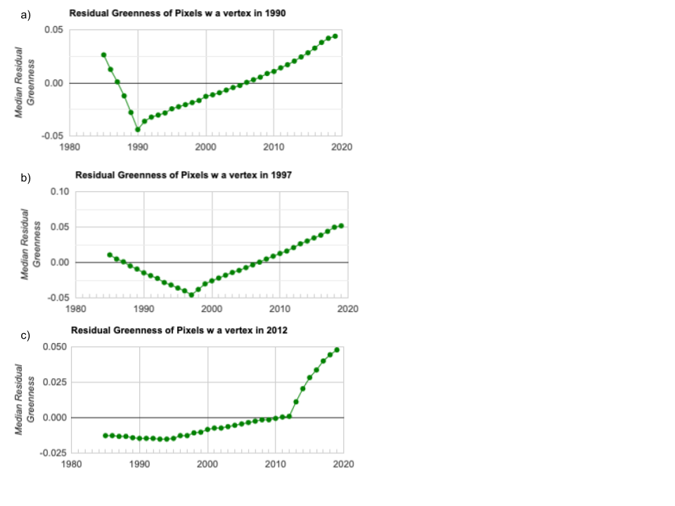
The plots shown in Fig. A3.8.15 show the median value for each year across all pixels that had a vertex in that year. But it is also possible that a single pixel has more than one vertex in its history (i.e., that it changed trajectory more than once) (Fig. A3.8.2), so there may be some overlap between pixels with a vertex in 1990 and those with a vertex in 1997, or in other years. We are going to use all of the information on the changes across all years to determine the different types of change that have occurred.
We are going to employ an unsupervised classification approach to clustering these data, as we do not have ground truth or pre-classified training data that we are trying to replicate. Rather, we are interested in finding out what kinds of inherent patterns might exist across the pixels in our AOI, based on similarities in the shape of their trajectories. Different trajectories in the time series of greenness might be due to things like starting conditions, as well as different kinds of management or environmental stress.
We will start by creating some naive training data from our multiband image of Boolean layers.
// Create training data. |
Now, set the maximum number of allowable clusters to 10, train the clusterer and apply it to the vertex data.
var maxclus=10; |
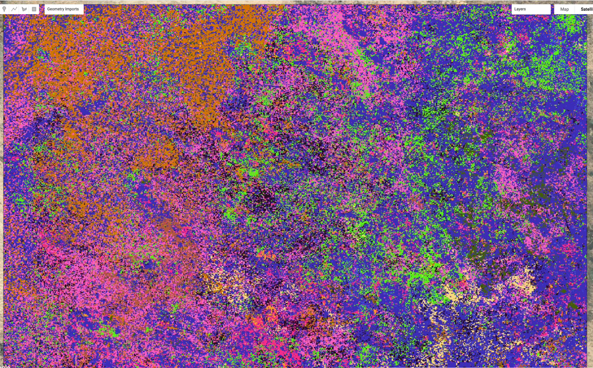
The default indexing in Java starts at zero, so the first class assigned by the clusterer is labeled with the value 0. This can pose problems if you want to mask out the results to view only one cluster at a time, so we will quickly remap the 0 value to be a 10. Then, we’ll add the results as a new layer to quickly visualize the classified raster (Fig. A3.8.16).
// Remap result_totalChange so that class 0 is class 10 |
Turn on the satellite basemap and move the opacity slider for the classified raster layer 10_clusters. (The colors assigned to classes in your map may differ.) Some classes seem to align somewhat with observable features in the landscape, but many of them do not. This indicates that there is some similarity in the history of these pixels that is not immediately obvious from their current cover.
Code Checkpoint A38d. The book’s repository contains a script that shows what your code should look like at this point.
Fig. A3.8.16 Random-color visualization of unsupervised clusters |
Section 5. Explore the Characteristics of the New Classes
We have now generated a classified raster based on similarities in the trajectory of the greenness in each pixel. In order to understand what these classes actually mean and what particular trajectories these classes represent, we will create summaries of the median greenness of the pixels in each class and compare them.
We will use the ImageCollection of observed greenness that we used in Sect. 2, and also a collection of the fitted residuals generated by LandTrendr in Sect. 3. Our first step will be to add a band with the cluster number to those collections.
// GOAL: Find Median Greenness for each cluster per year in the image |
Next, we need to select and mask out the class we are interested in exploring. We’ll just start with the first class.
//---Select and mask pixels by cluster number |
Next, you will utilize the ui.Chart.image functionality, combined with a Reducer, to plot the median value of observed greenness for each year for the focal class.
var chartClusterMedian=ui.Chart.image.seriesByRegion({ |
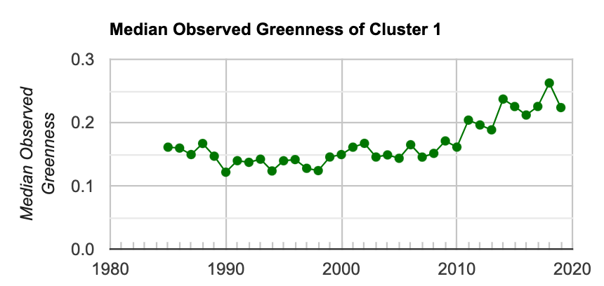
Fig. A3.8.17 Median value of the observed greenness value for all pixels in the AOI that are identified in Cluster 1 |
Now we will do the same, but for the fitted residual greenness values predicted from LandTrendr.
var fittedresidColl=ee.ImageCollection( |
From the Console, expand each of the two plots to a new tab, then download the data as a .csv file and rename it something like “observed_green_Class1.csv.” Repeat the steps above for each of the classes.
Fig. A3.8.18 provides an example of the outputs for a few of the classes that you have generated. When viewed side by side, it is easier to see how pixels in some parts of the AOI have experienced different trajectories of vegetation cover over time, and that the exact time and nature of the shifts in their trajectories are also different. This may be due to differences in underlying vegetation, land use, and management activity.
Fig. A3.8.18 Example outputs for three of the clusters identified in the data. The top row is the median greenness value for all pixels in the cluster. The middle row is the residual greenness value predicted by the fitted LandTrendr model. The bottom row is the location of all pixels in the AOI within that class; cluster 1 is more common in the southeast, Cluster 3 is aggregated in the northwestern region and Cluster 4 has patches throughout the AOI. |

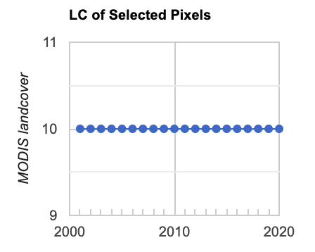
In a final step, we will compare the classes you generated by clustering the time series data to how the same locations are classified over time by the MODIS land cover data. We will do this by picking a few points within the AOI and plotting the land cover type number for each year of the MODIS data (see Table A3.8.1 to link the value to the descriptions of the class types).
Use the Inspector tool to select a pixel in a region that interests you. Copy the code chunk below to your script. In the Inspector window, expand the information for the Point by clicking on the triangle next to Point and copy the longitude and latitude values and replace the values you copied into the script.
// Generate a point geometry. |
The second line in the code chunk above converts the point to a Feature. Now you can run a Reducer over that point to extract values and plot them to a Chart (Fig. A3.8.19).
// Create a time series chart of MODIS Classification: |
Fig. A3.8.19 Example output of the MODIS MCD12Q1 landcover class values over time for a single point in the AOI. Class 10 is “Grasslands: dominated by herbaceous annuals (<2m)”. |
Repeat the steps above for a few points of interest to you and save screenshots of the plots.
Code Checkpoint A38e. The book’s repository contains a script that shows what your code should look like at this point.
Synthesis
Assignment 1. Combine all of your downloaded data files to create a single plot (in Excel or Google Sheets, for example) of the trajectory of median observed greenness for each of the classes. Compare each of these to the spatial patterns of the different classes (as in Fig. A3.8.15 and in your Map view), and to the underlying satellite image view. Pick three of the classes and describe the general trend in the timeseries (how has greenness changed over time?) and the spatial distribution of the pixels in that class.
We implemented this by specifying that the clusterer should look for 10 classes in the data. In a true implementation, we would want to explore the outputs across a range of cluster numbers. We may have forced the algorithm to split the data into too many (or too few) groups. Based on your inspection of the timing of the vertices and the spatial distribution of the final classes, are there any that you think could be grouped together in a final classification? What would you estimate to be the final number of classes in these data?
How much variation over time has there been for the different points according to the MODIS data? How does this compare to the variation in greenness represented in the final class?
Conclusion
In this module, you explored a new approach to classifying land cover that is based on the temporal trajectory of individual pixels. Earth Engine is a valuable tool for this analysis, because you are able to access the historical archive of imagery and climate data, as well as the computational tools needed to process, analyze, and classify these data. You learned how to create new derived datasets to use both as inputs to the analysis and as a final classified product. By comparing the temporal trajectories of the new classes against traditional land cover data, you learned how to distinguish the pros and cons of existing datasets for meeting land cover mapping objectives. Now that you understand the basics of the challenges of detecting land cover change in rangelands and have explored a new approach to classifying different trajectories, you can apply this approach to your own areas of interest to better understand the history of response.
Feedback
To review this chapter and make suggestions or note any problems, please go now to bit.ly/EEFA-review. You can find summary statistics from past reviews at bit.ly/EEFA-reviews-stats.
References
Cloud-Based Remote Sensing with Google Earth Engine. (n.d.). CLOUD-BASED REMOTE SENSING WITH GOOGLE EARTH ENGINE. https://www.eefabook.org/
Cloud-Based Remote Sensing with Google Earth Engine. (2024). In Springer eBooks. https://doi.org/10.1007/978-3-031-26588-4
Alexandratos N, Bruinsma J (2012) World agriculture towards 2030/2050: The 2012 Revision. ESA Work Pap 12:146. https://doi.org/10.22004/ag.econ.288998
Arino O, Bicheron P, Achard F, et al (2008) GlobCover: The most detailed portrait of Earth. Eur Sp Agency Bull 2008:24–31
Asner GP, Elmore AJ, Olander LP, et al (2004) Grazing systems, ecosystem responses, and global change. Annu Rev Environ Resour 29:261–299. https://doi.org/10.1146/annurev.energy.29.062403.102142
Bontemps S, Defourny P, Van Bogaert E, et al (2011) GLOBCOVER 2009: Products description and validation report. ESA Bull 136:53
Briske DD (2017) Rangeland Systems: Processes, Management and Challenges. Springer Nature
Campbell DJ, Lusch DP, Smucker TA, Wangui EE (2005) Multiple methods in the study of driving forces of land use and land cover change: A case study of SE Kajiado District, Kenya. Hum Ecol 33:763–794. https://doi.org/10.1007/s10745-005-8210-y
Cao S, Sun G, Zhang Z, et al (2011) Greening China naturally. Ambio 40:828–831. https://doi.org/10.1007/s13280-011-0150-8
Chen J, Chen J, Liao A, et al (2015) Global land cover mapping at 30 m resolution: A POK-based operational approach. ISPRS J Photogramm Remote Sens 103:7–27. https://doi.org/10.1016/j.isprsjprs.2014.09.002
Derner JD, Hunt L, Ritten J, et al (2017) Livestock Production Systems. In: Rangeland Systems. Springer, Cham, pp 347–372
Fan P, Chen J, John R (2016) Urbanization and environmental change during the economic transition on the Mongolian Plateau: Hohhot and Ulaanbaatar. Environ Res 144:96–112. https://doi.org/10.1016/j.envres.2015.09.020
Friedl MA, McIver DK, Hodges JCF, et al (2002) Global land cover mapping from MODIS: Algorithms and early results. Remote Sens Environ 83:287–302. https://doi.org/10.1016/S0034-4257(02)00078-0
Friedl MA, Sulla-Menashe D, Tan B, et al (2010) MODIS Collection 5 global land cover: Algorithm refinements and characterization of new datasets. Remote Sens Environ 114:168–182. https://doi.org/10.1016/j.rse.2009.08.016
Fritz S, See L (2005) Comparison of land cover maps using fuzzy agreement. Int J Geogr Inf Sci 19:787–807. https://doi.org/10.1080/13658810500072020
Ganguly S, Friedl MA, Tan B, et al (2010) Land surface phenology from MODIS: Characterization of the Collection 5 global land cover dynamics product. Remote Sens Environ 114:1805–1816. https://doi.org/10.1016/j.rse.2010.04.005
García-Mora TJ, Mas JF, Hinkley EA (2012) Land cover mapping applications with MODIS: A literature review. Int J Digit Earth 5:63–87. https://doi.org/10.1080/17538947.2011.565080
Healey SP, Cohen WB, Yang Z, et al (2018) Mapping forest change using stacked generalization: An ensemble approach. Remote Sens Environ 204:717–728. https://doi.org/10.1016/j.rse.2017.09.029
Homer C, Dewitz J, Yang L, et al (2015) Completion of the 2011 national land cover database for the conterminous United States – Representing a decade of land cover change information. Photogramm Eng Remote Sensing 81:345–354.
Huang J, Yu H, Guan X, et al (2016) Accelerated dryland expansion under climate change. Nat Clim Chang 6:166–171. https://doi.org/10.1038/nclimate2837
John R, Chen J, Lu N, Wilske B (2009) Land cover/land use change in semi-arid Inner Mongolia: 1992–2004. Environ Res Lett 4:45010. https://doi.org/10.1088/1748-9326/4/4/045010
Kennedy RE, Andréfouët S, Cohen WB, et al (2014) Bringing an ecological view of change to Landsat-based remote sensing. Front Ecol Environ 12:339–346. https://doi.org/10.1890/130066
Kennedy RE, Yang Z, Cohen WB (2010) Detecting trends in forest disturbance and recovery using yearly Landsat time series: 1. LandTrendr - Temporal segmentation algorithms. Remote Sens Environ 114:2897–2910. https://doi.org/10.1016/j.rse.2010.07.008
Lambin EF, Meyfroidt P (2011) Global land use change, economic globalization, and the looming land scarcity. Proc Natl Acad Sci USA 108:3465–3472. https://doi.org/10.1073/pnas.1100480108
Lang W, Chen T, Li X (2016) A new style of urbanization in China: Transformation of urban rural communities. Habitat Int 55:1–9. https://doi.org/10.1016/j.habitatint.2015.10.009
Li WJ, Ali SH, Zhang Q (2007) Property rights and grassland degradation: A study of the Xilingol Pasture, Inner Mongolia, China. J Environ Manage 85:461–470. https://doi.org/10.1016/j.jenvman.2006.10.010
Liu M, Dries L, Heijman W, et al (2015) Tragedy of the commons or tragedy of privatisation? The impact of land tenure reform on grassland condition in Inner Mongolia, China. In: International Conference of Agricultural Economists. pp 9–14
Melillo JM, Richmond TT, Yohe G (2014) Climate change impacts in the United States. US Global Change Research Program Washington, DC
Millenium Ecosystem Assessment (2005) Ecosystems and Human Well-Being: Desertification Synthesis. Island Press Washington, DC
Prestele R, Alexander P, Rounsevell MDA, et al (2016) Hotspots of uncertainty in land-use and land-cover change projections: A global-scale model comparison. Glob Chang Biol 22:3967–3983. https://doi.org/10.1111/gcb.13337
Reid RS, Kruska RL, Muthui N, et al (2000) Land-use and land-cover dynamics in response to changes in climatic, biological and socio-political forces: The case of Southwestern Ethiopia. Landsc Ecol 15:339–355. https://doi.org/10.1023/A:1008177712995
Schneider A, Mertes CM, Tatem AJ, et al (2015) A new urban landscape in East-Southeast Asia, 2000-2010. Environ Res Lett 10:34002. https://doi.org/10.1088/1748-9326/10/3/034002
Sleeter BM, Sohl TL, Loveland TR, et al (2013) Land-cover change in the conterminous United States from 1973 to 2000. Glob Environ Chang 23:733–748. https://doi.org/10.1016/j.gloenvcha.2013.03.006
Zanaga D, Van De Kerchove R, De Keersmaecker W, et al (2021) ESA WorldCover 10 m 2020 v100. Meteosat Second Gener Evapotranspiration 1–27. https://doi.org/10.5281/zenodo.5571936