Cloud-Based Remote Sensing with Google Earth Engine
Fundamentals and Applications

Part F4: Interpreting Image Series
One of the paradigm-changing features of Earth Engine is the ability to access decades of imagery without the previous limitation of needing to download all the data to a local disk for processing. Because remote-sensing data files can be enormous, this used to limit many projects to viewing two or three images from different periods. With Earth Engine, users can access tens or hundreds of thousands of images to understand the status of places across decades.
Chapter F4.6: Fitting Functions to Time Series
Authors
Andréa Puzzi Nicolau, Karen Dyson, Biplov Bhandari, David Saah, Nicholas Clinton
Overview
The purpose of this chapter is to establish a foundation for time-series analysis of remotely sensed data, which is typically arranged as an ordered stack of images. You will be introduced to the concepts of graphing time series, using linear modeling to detrend time series, and fitting harmonic models to time-series data. At the completion of this chapter, you will be able to perform analysis of multi-temporal data for determining trend and seasonality on a per-pixel basis.
Learning Outcomes
- Graphing satellite imagery values across a time series.
- Quantifying and potentially removing linear trends in time series.
- Fitting linear and harmonic models to individual pixels in time-series data.
Assumes you know how to:
- Import images and image collections, filter, and visualize (Part F1).
- Perform basic image analysis: select bands, compute indices, create masks (Part F2).
- Create a graph using ui.Chart (Chap. F1.3).
- Use normalizedDifference to calculate vegetation indices (Chap. F2.0).
- Write a function and map it over an ImageCollection (Chap. F4.0).
- Mask cloud, cloud shadow, snow/ice, and other undesired pixels (Chap. F4.3).
Github Code link for all tutorials
This code base is collection of codes that are freely available from different authors for google earth engine.
Introduction to Theory
Many natural and man-made phenomena exhibit important annual, interannual, or longer-term trends that recur—that is, they occur at roughly regular intervals. Examples include seasonality in leaf patterns in deciduous forests and seasonal crop growth patterns. Over time, indices such as the Normalized Difference Vegetation Index (NDVI) will show regular increases (e.g., leaf-on, crop growth) and decreases (e.g., leaf-off, crop senescence), and typically have a long-term, if noisy, trend such as a gradual increase in NDVI value as an area recovers from a disturbance.
Earth Engine supports the ability to do complex linear and non-linear regressions of values in each pixel of a study area. Simple linear regressions of indices can reveal linear trends that can span multiple years. Meanwhile, harmonic terms can be used to fit a sine-wave-like curve. Once you have the ability to fit these functions to time series, you can answer many important questions. For example, you can define vegetation dynamics over multiple time scales, identify phenology and track changes year to year, and identify deviations from the expected patterns (Bradley et al. 2007, Bullock et al. 2020). There are multiple applications for these analyses. For example, algorithms to detect deviations from the expected pattern can be used to identify disturbance events, including deforestation and forest degradation (Bullock et al. 2020).
Practicum
If you have not already done so, be sure to add the book’s code repository to the Code Editor by entering https://code.earthengine.google.com/?accept_repo=projects/gee-edu/book into your browser. The book’s scripts will then be available in the script manager panel.
Section 1. Multi-Temporal Data in Earth Engine
As explained in Chaps. F4.0 and F4.1, a time series in Earth Engine is typically represented as an ImageCollection. Because of image overlaps, cloud treatments, and filtering choices, an ImageCollection can have any of the following complex characteristics:
- At each pixel, there might be a distinct number of observations taken from a unique set of dates.
- The size (length) of the time series can vary across pixels.
- Data may be missing in any pixel at any point in the sequence (e.g., due to cloud masking).
The use of multi-temporal data in Earth Engine introduces two mind-bending concepts, which we will describe below.
Per-pixel curve fitting. As you have likely encountered in many settings, a function can be fit through a series of values. In the most familiar example, a function of the form y=mx + b can represent a linear trend in data of all kinds. Fitting a straight “curve” with linear regression techniques involves estimating m and b for a set of x and y values. In a time series, x typically represents time, while y values represent observations at specific times. This chapter introduces how to estimate m and b for computed indices through time to model a potential linear trend in a time series. We then demonstrate how to fit a sinusoidal wave, which is useful for modeling rising and falling values, such as NDVI over a growing season. What can be particularly mind-bending in this setting is the fact that when Earth Engine is asked to estimate values across a large area, it will fit a function in every pixel of the study area. Each pixel, then, has its own m and b values, determined by the number of observations in that pixel, the observed values, and the dates for which they were observed.
Higher-dimension band values: array images. That more complex conception of the potential information contained in a single pixel can be represented in a higher-order Earth Engine structure: the array image. As you will encounter in this lab, it is possible for a single pixel in a single band of a single image to contain more than one value. If you choose to implement an array image, a single pixel might contain a one-dimensional vector of numbers, perhaps holding the slope and intercept values resulting from a linear regression, for example. Other examples, outside the scope of this chapter but used in the next chapter, might employ a two-dimensional matrix of values for each pixel within a single band of an image. Higher-order dimensions are available, as well as array image manipulations borrowed from the world of matrix algebra. Additionally, there are functions to move between the multidimensional array image structure and the more familiar, more easily displayed, simple Image type. Some of these array image functions were encountered in Chap. F3.1, but with less explanatory context.
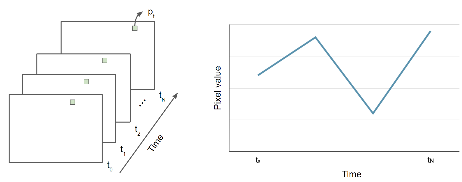
First, we will give some very basic notation (Fig. F4.6.1). A scalar pixel at time t is given by pt, and a pixel vector by pt. A variable with a “hat” represents an estimated value: in this context, p̂t is the estimated pixel value at time t. A time series is a collection of pixel values, usually sorted chronologically: {pt; t =t0...tN}, where t might be in any units, t0 is the smallest, and tN is the largest such t in the series.
Fig. F4.6.1 Time series representation of pixel p |
Section 2. Data Preparation and Preprocessing
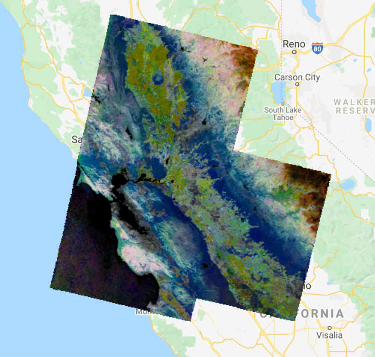
The first step in analysis of time-series data is to import data of interest and plot it at an interesting location. We will work with the USGS Landsat 8 Level 2, Collection 2, Tier 1 ImageCollection and a cloud-masking function (Chap. F4.3), scale the image values, and add variables of interest to the collection as bands. Copy and paste the code below to filter the Landsat 8 collection to a point of interest over California (variable roi) and specific dates, and to apply the defined function. The variables of interest added by the function are: (1) NDVI (Chap. F2.0), (2) a time variable that is the difference between the image’s current year and the year 1970 (a start point), and (3) a constant variable with value 1.
///////////////////// Sections 1 & 2 ///////////////////////////// |
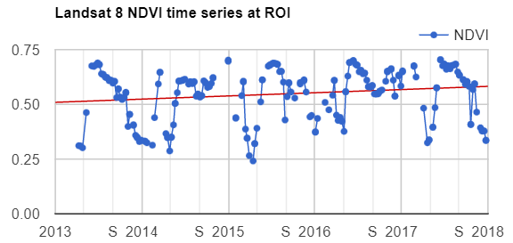
Next, to visualize the NDVI at the point of interest over time, copy and paste the code below to print a chart of the time series (Chap. F1.3) at the location of interest (Fig. F4.6.2).
// Plot a time series of NDVI at a single location. |
Fig. F4.6.2 Time series representation of pixel p |

We can add a linear trend line to our chart using the trendlines parameters in the setOptions function for image series charts. Copy and paste the code below to print the same chart but with a linear trend line plotted (Fig. F4.6.3). In the next section, you will learn how to estimate linear trends over time.
// Plot a time series of NDVI with a linear trend line |
Fig. F4.6.3 Time series representation of pixel p with the trend line in red |
Now that we have plotted and visualized the data, lots of interesting analyses can be done to the time series by harnessing Earth Engine tools for fitting curves through this data. We will see a couple of examples in the following sections.
Code Checkpoint F46a. The book’s repository contains a script that shows what your code should look like at this point.
Section 3. Estimating Linear Trend Over Time
Time series datasets may contain not only trends but also seasonality, both of which may need to be removed prior to modeling. Trends and seasonality can result in a varying mean and a varying variance over time, both of which define a time series as non-stationary. Stationary datasets, on the other hand, have a stable mean and variance, and are therefore much easier to model.
Consider the following linear model, where et is a random error:
pt =β0 + β1t + et (Eq. F4.6.1)
This is the model behind the trend line added to the chart created in the previous section (Fig. F4.6.3). Identifying trends at different scales is a big topic, with many approaches being used (e.g., differencing, modeling).
Removing unwanted to uninteresting trends for a given problem is often a first step to understanding complex patterns in time series. There are several approaches to remove trends. Here, we will remove the linear trend that is evident in the data shown in Fig. F4.6.3 using Earth Engine’s built-in tools for regression modeling. This approach is a useful, straightforward way to detrend data in time series (Shumway and Stoffer 2019). Here, the goal is to discover the values of the β’s in Eq. F4.6.1 for each pixel.
Copy and paste code below into the Code Editor, adding it to the end of the script from the previous section. Running this code will fit this trend model to the Landsat-based NDVI series using ordinary least squares, using the linearRegression reducer (Chap. F3.0).
///////////////////// Section 3 ///////////////////////////// |
If you click over a point using the Inspector tab, you will see the pixel values for the array image (coefficients “t” and “constant”, and residuals) and two-band image (coefficients “t” and “constant”) (Fig. F4.6.4).
Fig. F4.6.4 Pixel values of array image and coefficients image |

Now, copy and paste the code below to use the model to detrend the original NDVI time series and plot the time series chart with the trendlines parameter (Fig. F4.6.5).
// Compute a detrended series. |
Fig. F4.6.5 Detrended NDVI time series |

Code Checkpoint F46b. The book’s repository contains a script that shows what your code should look like at this point.
Section 4. Estimating Seasonality with a Harmonic Model
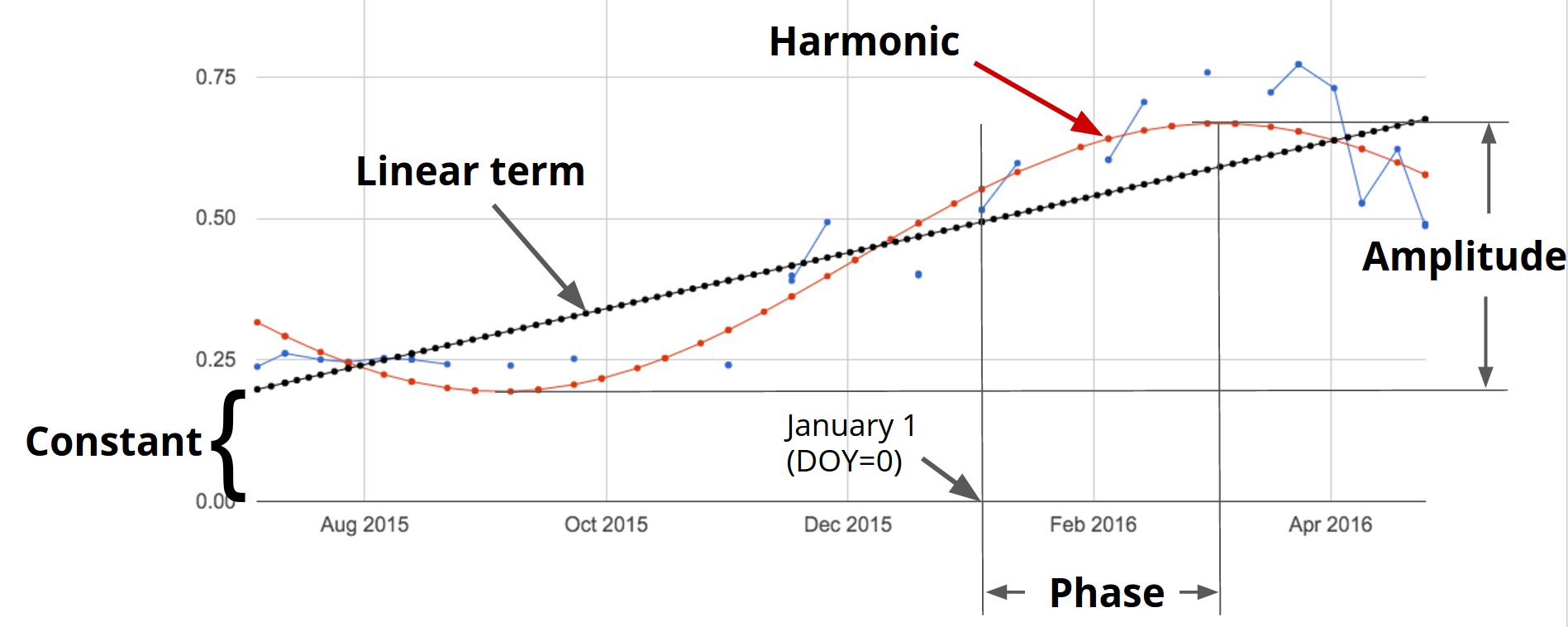
A linear trend is one of several possible types of trends in time series. Time series can also present harmonic trends, in which a value goes up and down in a predictable wave pattern. These are of particular interest and usefulness in the natural world, where harmonic changes in greenness of deciduous vegetation can occur across the spring, summer, and autumn. Now we will return to the initial time series (landsat8sr) of Fig. F4.6.2 and fit a harmonic pattern through the data. Consider the following harmonic model, where A is amplitude, ω is frequency, φ is phase, and et is a random error.
pt =β0 + β1t + Acos(2πωt - φ) + et
=β0 + β1t + β2cos(2πωt) + β3sin(2πωt) + et (Eq. F4.6.2)
Note that β2 =Acos(φ) and β3 =Asin(φ), implying A =(β22 + β32)½ and φ =atan(β3/β2) (as described in Shumway and Stoffer 2019). To fit this model to an annual time series, set ω =1 (one cycle per year) and use ordinary least squares regression.
The setup for fitting the model is to first add the harmonic variables (the third and fourth terms of Eq. F4.6.2) to the ImageCollection. Then, fit the model as with the linear trend, using the linearRegression reducer, which will yield a 4 x 1 array image.
///////////////////// Section 4 ///////////////////////////// |
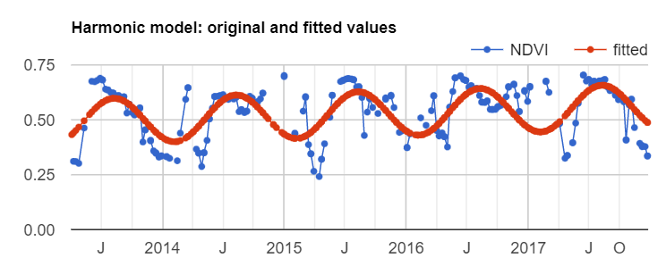
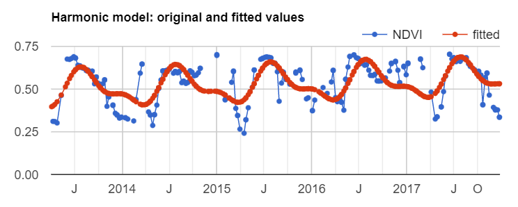
Now, copy and paste the code below to plug the coefficients into Eq. F4.6.2 in order to get a time series of fitted values and plot the harmonic model time series (Fig. F4.6.6).
// Turn the array image into a multi-band image of coefficients. |
Fig. F4.6.6 Harmonic model of NDVI time series |

Returning to the mind-bending nature of curve-fitting, it is worth remembering that the harmonic waves seen in Fig. F4.6.6 are the fit of the data to a single point across the image. Next, we will map the outcomes of millions of these fits, pixel by pixel, across the entire study area.
We’ll compute and map the phase and amplitude of the estimated harmonic model for each pixel. Phase and amplitude (Fig. F4.6.7) can give us additional information to facilitate remote sensing applications such as agricultural mapping and land use and land cover monitoring. Agricultural crops with different phenological cycles can be distinguished with phase and amplitude information, something that perhaps would not be possible with spectral information alone.
Fig. F4.6.7 Example of phase and amplitude in harmonic model |
Copy and paste the code below to compute phase and amplitude from the coefficients and add this image to the map (Fig. F4.6.8).
// Compute phase and amplitude. |
Fig. F4.6.8 Phase, amplitude, and NDVI concatenated image |
The code uses the HSV to RGB transformation hsvToRgb for visualization purposes (Chap. F3.1). We use this transformation to separate color components from intensity for a better visualization. Without this transformation, we would visualize a very colorful image that would not look as intuitive as the image with the transformation. With this transformation, phase, amplitude, and mean NDVI are displayed in terms of hue (color), saturation (difference from white), and value (difference from black), respectively. Therefore, darker pixels are areas with low NDVI. For example, water bodies will appear as black, since NDVI values are zero or negative. The different colors are distinct phase values, and the saturation of the color refers to the amplitude: whiter colors mean amplitude closer to zero (e.g., forested areas), and the more vivid the colors, the higher the amplitude (e.g., croplands). Note that if you use the Inspector tool to analyze the values of a pixel, you will not get values of phase, amplitude, and NDVI, but the transformed values into values of blue, green, and red colors.
Code Checkpoint F46c. The book’s repository contains a script that shows what your code should look like at this point.
Section 5. An Application of Curve Fitting
The rich data about the curve fits can be viewed in a multitude of different ways. Add the code below to your script to produce the view in Fig. 4.6.9. The image will be a close-up of the area around Modesto, California.
///////////////////// Section 5 ///////////////////////////// |
Fig. F4.6.9 Two views of the harmonic fits for NDVI for the Modesto, California area |
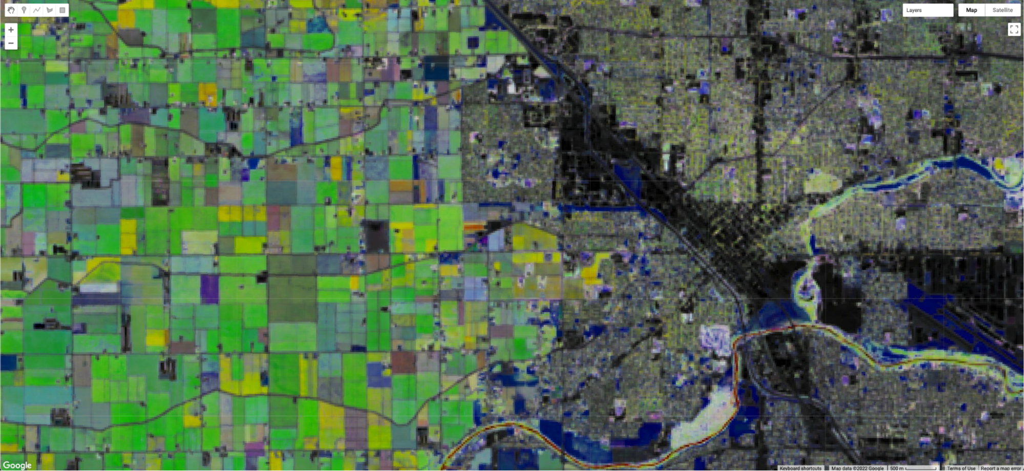
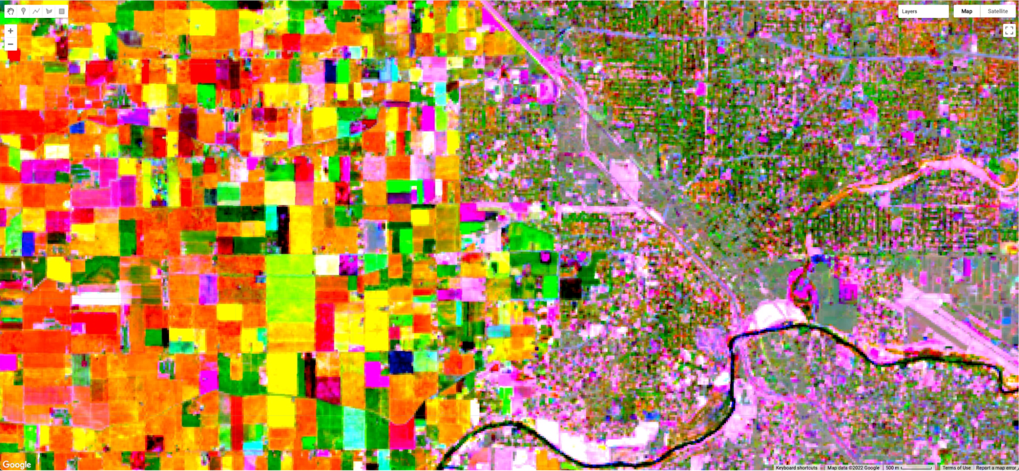
The upper image in Fig. F4.6.9 is a closer view of Fig. F4.6.8, showing an image that transforms the sine and cosine coefficient values, and incorporates information from the mean NDVI. The lower image draws the sine and cosine in the red and blue bands, and extracts the slope of the linear trend that you calculated earlier in the chapter, placing that in the green band. The two views of the fit are similarly structured in their spatial pattern—both show fields to the west and the city to the east. But the pixel-by-pixel variability emphasizes a key point of this chapter: that a fit to the NDVI data is done independently in each pixel in the image. Using different elements of the fit, these two views, like other combinations of the data you might imagine, can reveal the rich variability of the landscape around Modesto.
Code Checkpoint F46d. The book’s repository contains a script that shows what your code should look like at this point.
Section 6: Higher-Order Harmonic Models
Harmonic models are not limited to fitting a single wave through a set of points. In some situations, there may be more than one cycle within a given year—for example, when an agricultural field is double-cropped. Modeling multiple waves within a given year can be done by adding more harmonic terms to Eq. F4.6.2. The code at the following checkpoint allows the fitting of any number of cycles through a given point.
Code Checkpoint F46e. The book’s repository contains a script to use to begin this section. You will need to start with that script and edit the code to produce the charts in this section.
Beginning with the repository script, changing the value of the harmonics variable will change the complexity of the harmonic curve fit by superimposing more or fewer harmonic waves on each other. While fitting higher-order functions improves the goodness-of-fit of the model to a given set of data, many of the coefficients may be close to zero at higher numbers or harmonic terms. Fig. F4.6.10 shows the fit through the example point using one, two, and three harmonic curves.
Fig. F4.6.10 Fit with harmonic curves of increasing complexity, fitted for data at a given point |

Synthesis
Assignment 1. Fit two NDVI harmonic models for a point close to Manaus, Brazil: one prior to a disturbance event and one after the disturbance event (Fig. F4.6.11). You can start with the code checkpoint below, which gives you the point coordinates and defines the initial functions needed. The disturbance event happened in mid-December 2014, so set filter dates for the first ImageCollection to '2013-01-01','2014-12-12', and set the filter dates for the second ImageCollection to '2014-12-13','2019-01-01'. Merge both fitted collections and plot both NDVI and fitted values. The result should look like Fig. F4.6.12.
Code Checkpoint F46s1. The book’s repository contains a script that shows what your code should look like at this point.
Fig. F4.6.11 Landsat 8 images showing the land cover change at a point in Manaus, Brazil; (left) July, 6, 2014, (right) August 8, 2015 |
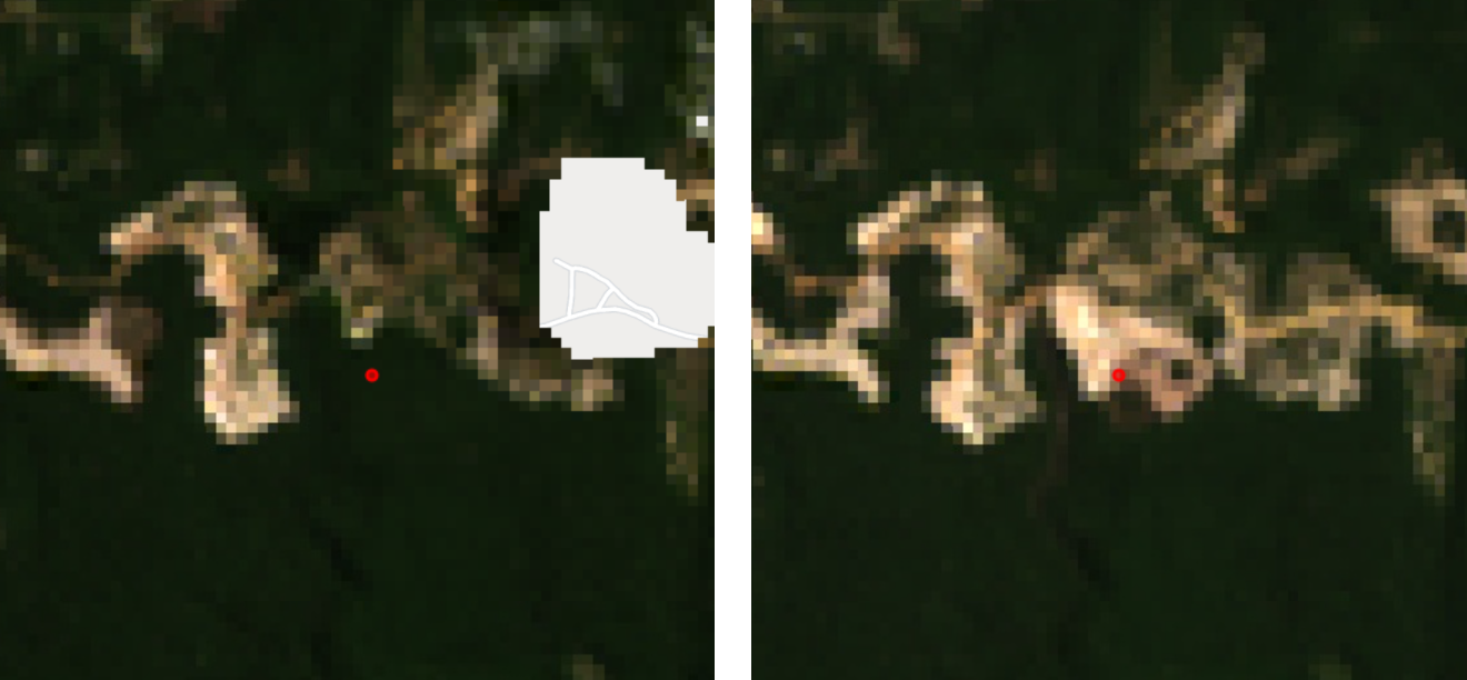
Fig. F4.6.12 Fitted harmonic models before and after disturbance events to a given point in the Brazilian Amazon |
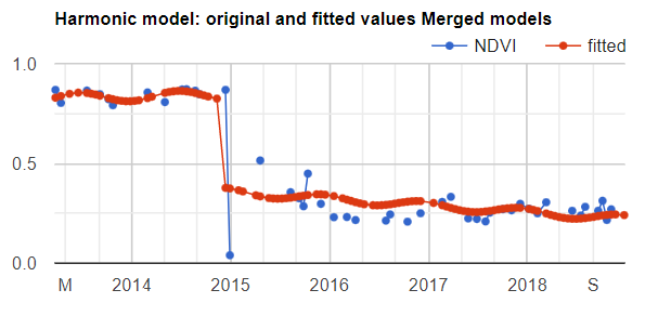
What do you notice? Think about how the harmonic model would look if you tried to fit the entire period. In this example, you were given the date of the breakpoint between the two conditions of the land surface within the time series. State-of-the-art land cover change algorithms work by assessing the difference between the modeled and observed pixel values. These algorithms look for breakpoints in the model, typically flagging changes after a predefined number of consecutive observations.
Code Checkpoint F46s2. The book’s repository contains a script that shows what your code should look like at this point.
Conclusion
In this chapter, we learned how to graph and fit both linear and harmonic functions to time series of remotely sensed data. These skills underpin important tools such as Continuous Change Detection and Classification (CCDC, Chap. F4.7) and Continuous Degradation Detection (CODED, Chap. A3.4). These approaches are used by many organizations to detect forest degradation and deforestation (e.g., Tang et al. 2019, Bullock et al. 2020). These approaches can also be used to identify crops (Chap. A1.1) with high degrees of accuracy (Ghazaryan et al. 2018).
Feedback
To review this chapter and make suggestions or note any problems, please go now to bit.ly/EEFA-review. You can find summary statistics from past reviews at bit.ly/EEFA-reviews-stats.
References
Cloud-Based Remote Sensing with Google Earth Engine. (n.d.). CLOUD-BASED REMOTE SENSING WITH GOOGLE EARTH ENGINE. https://www.eefabook.org/
Cloud-Based Remote Sensing with Google Earth Engine. (2024). In Springer eBooks. https://doi.org/10.1007/978-3-031-26588-4
Bradley BA, Jacob RW, Hermance JF, Mustard JF (2007) A curve fitting procedure to derive inter-annual phenologies from time series of noisy satellite NDVI data. Remote Sens Environ 106:137–145. https://doi.org/10.1016/j.rse.2006.08.002
Bullock EL, Woodcock CE, Olofsson P (2020) Monitoring tropical forest degradation using spectral unmixing and Landsat time series analysis. Remote Sens Environ 238:110968. https://doi.org/10.1016/j.rse.2018.11.011
Ghazaryan G, Dubovyk O, Löw F, et al (2018) A rule-based approach for crop identification using multi-temporal and multi-sensor phenological metrics. Eur J Remote Sens 51:511–524. https://doi.org/10.1080/22797254.2018.1455540
Shumway RH, Stoffer DS (2019) Time Series: A Data Analysis Approach Using R. Chapman and Hall/CRC
Tang X, Bullock EL, Olofsson P, et al (2019) Near real-time monitoring of tropical forest disturbance: New algorithms and assessment framework. Remote Sens Environ 224:202–218. https://doi.org/10.1016/j.rse.2019.02.003