Cloud-Based Remote Sensing with Google Earth Engine
Fundamentals and Applications

Part F1: Programming and Remote Sensing Basics
In order to use Earth Engine well, you will need to develop basic skills in remote sensing and programming. The language of this book is JavaScript, and you will begin by learning how to manipulate variables using it. With that base, you’ll learn about viewing individual satellite images, viewing collections of images in Earth Engine, and how common remote sensing terms are referenced and used in Earth Engine.
Chapter F1.1: Exploring Images
Author
Jeff Howarth
Overview
Satellite images are at the heart of Google Earth Engine’s power. This chapter teaches you how to inspect and visualize data stored in image bands. We first visualize individual bands as separate map layers and then explore a method to visualize three different bands in a single composite layer. We compare different kinds of composites for satellite bands that measure electromagnetic radiation in the visible and non-visible spectrum. We then explore images that represent more abstract attributes of locations, and create a composite layer to visualize change over time.
Learning Outcomes
- Using the Code Editor to load an image
- Using code to select image bands and visualize them as map layers
- Understanding true- and false-color composites of images
- Constructing new multiband images.
- Understanding how additive color works and how to interpret RGB composites.
Assumes you know how to:
- Sign up for an Earth Engine account, open the Code Editor, and save your script (Chap. F1.0).
Github Code link for all tutorials
This code base is collection of codes that are freely available from different authors for google earth engine.
Practicum
Section 1. Accessing an Image
If you have not already done so, be sure to add the book’s code repository to the Code Editor by entering https://code.earthengine.google.com/?accept_repo=projects/gee-edu/book into your browser. The book’s scripts will then be available in the script manager panel. If you have trouble finding the repo, you can visit this link for help.
To begin, you will construct an image with the Code Editor. In the sections that follow, you will see code in a distinct font and with shaded background. As you encounter code, paste it into the center panel of the Code Editor and click Run.
First, copy and paste the following:
var first_image=ee.Image( |
When you click Run, Earth Engine will load an image captured by the Landsat 5 satellite on June 6, 2000. You will not yet see any output.
You can explore the image in several ways. To start, you can retrieve metadata (descriptive data about the image) by printing the image to the Code Editor’s Console panel:
print(first_image); |
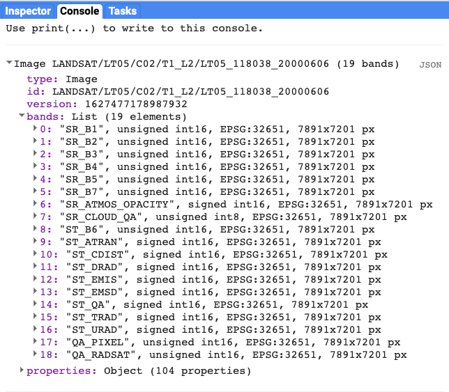
In the Console panel, you may need to click the expander arrows to show the information. You should be able to read that this image consists of 19 different bands. For each band, the metadata lists four properties, but for now let’s simply note that the first property is a name or label for the band enclosed in quotation marks. For example, the name of the first band is “SR_B1” (Fig. F1.1.1).
Fig. F1.1.1 Image metadata printed to Console panel |
A satellite sensor like Landsat 5 measures the magnitude of radiation in different portions of the electromagnetic spectrum. The first six bands in our image ("SR_B1" through "SR_B7") contain measurements for six different portions of the spectrum. The first three bands measure visible portions of the spectrum, or quantities of blue, green, and red light. The other three bands measure infrared portions of the spectrum that are not visible to the human eye.
An image band is an example of a raster data model, a method of storing geographic data in a two-dimensional grid of pixels, or picture elements. In remote sensing, the value stored by each pixel is often called a Digital Number or DN. Depending on the sensor, the pixel value or DN can represent a range of possible data values.
Some of this information, like the names of the bands and their dimensions (number of pixels wide by number of pixels tall), we can see in the metadata. Other pieces of information, like the portions of the spectrum measured in each band and the range of possible data values, can be found through the Earth Engine Data Catalog (which is described in the next two chapters) or with other Earth Engine methods. These will be described in more detail later in the book.
Section 2. Visualizing an Image
Now let’s add one of the bands to the map as a layer so that we can see it.
Map.addLayer( |
The code here uses the addLayer method of the map in the Code Editor. There are four important components of the command above:
- first_image: This is the dataset to display on the map.
- bands: These are the particular bands from the dataset to display on the map. In our example, we displayed a single band named "SR_B1".
- min, max: These represent the lower and upper bounds of values from "SR_B1" to display on the screen. By default, the minimum value provided (8000) is mapped to black, and the maximum value provided (17000) is mapped to white. The values between the minimum and maximum are mapped linearly to grayscale between black and white. Values below 8000 are drawn as black. Values above 17000 are drawn as white. Together, the bands, min, and max parameters define visualization parameters, or instructions for data display.
- 'Layer 1': This is a label for the map layer to display in the Layer Manager. This label appears in the dropdown menu of layers in the upper right of the map.
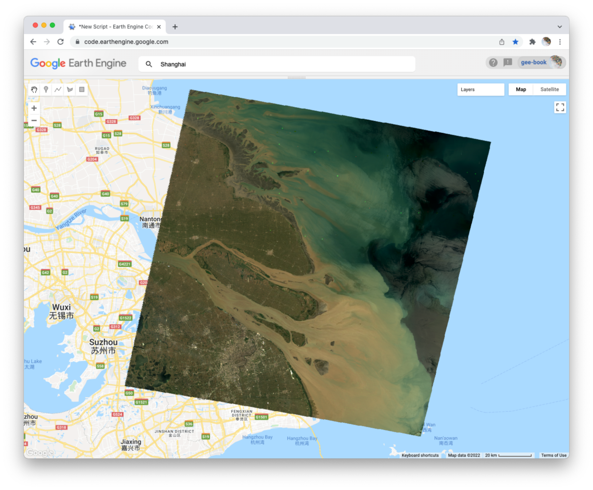
When you run the code, you might not notice the image displayed unless you pan around and look for it. To do this, click and drag the map towards Shanghai, China. (You can also jump there by typing “Shanghai” into the Search panel at the top of the Code Editor, where the prompt says Search places and datasets…) Over Shanghai, you should see a small, dark, slightly angled square. Use the zoom tool (the + sign, upper left of map) to increase the zoom level and make the square appear larger.
Can you recognize any features in the image? By comparing it to the standard Google map that appears under the image (as the base layer), you should be able to distinguish the coastline. The water near the shore generally appears a little lighter than the land, except perhaps for a large, light-colored blob on the land in the bottom of the image.
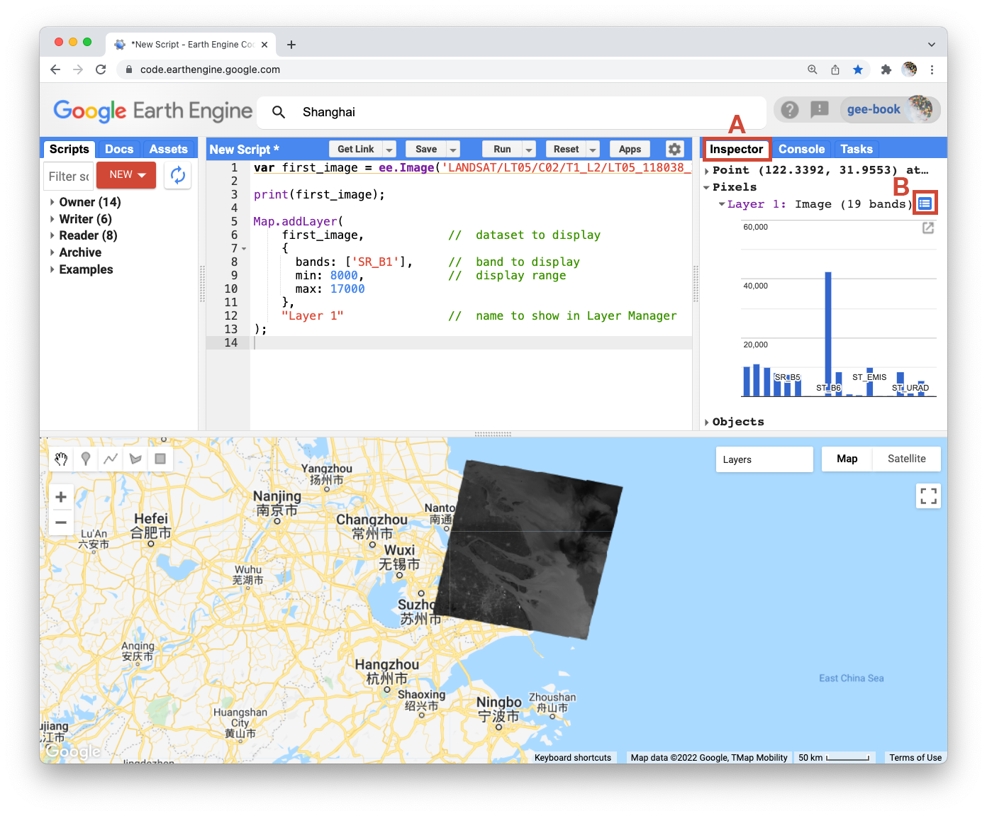
Let’s explore this image with the Inspector tool. When you click on the Inspector tab on the right side of the Code Editor (Fig. F1.1.2, area A), your cursor should now look like crosshairs. When you click on a location in the image, the Inspector panel will report data for that location under three categories as follows:
Fig. F1.1.2 Image data reported through the Inspector panel |
- Point: data about the location on the map. This includes the geographic location (longitude and latitude) and some data about the map display (zoom level and scale).
- Pixels: data about the pixel in the layer. If you expand this, you will see the name of the map layer, a description of the data source, and a bar chart. In our example, we see “Layer 1” is drawn from an image dataset that contains 19 bands. Under the layer name, the chart displays the pixel value at the location that you clicked for each band in the dataset. When you hover your cursor over a bar, a panel will pop up to display the band name and “band value” (pixel value). To find the pixel value for “SR_B1”, hover the cursor over the first bar on the left. Alternatively, by clicking on the little blue icon to the right of “Layer 1” (Fig. F1.1.2, area B), you will change the display from a bar chart to a dictionary that reports the pixel value for each band.
- Objects: data about the source dataset. Here you will find metadata about the image that looks very similar to what you retrieved earlier when you directed Earth Engine to print the image to the Console.
Let’s add two more bands to the map.
Map.addLayer( |
In the code above, notice that we included two additional parameters to the Map.addLayer call. One parameter controls whether or not the layer is shown on the screen when the layer is drawn. It may be either 1 (shown) or 0 (not shown). The other parameter defines the opacity of the layer, or your ability to “see through” the map layer. The opacity value can range between 0 (transparent) and 1 (opaque).
Fig. F1.1.3 Three bands from the Landsat image, drawn as three different grayscale layers |
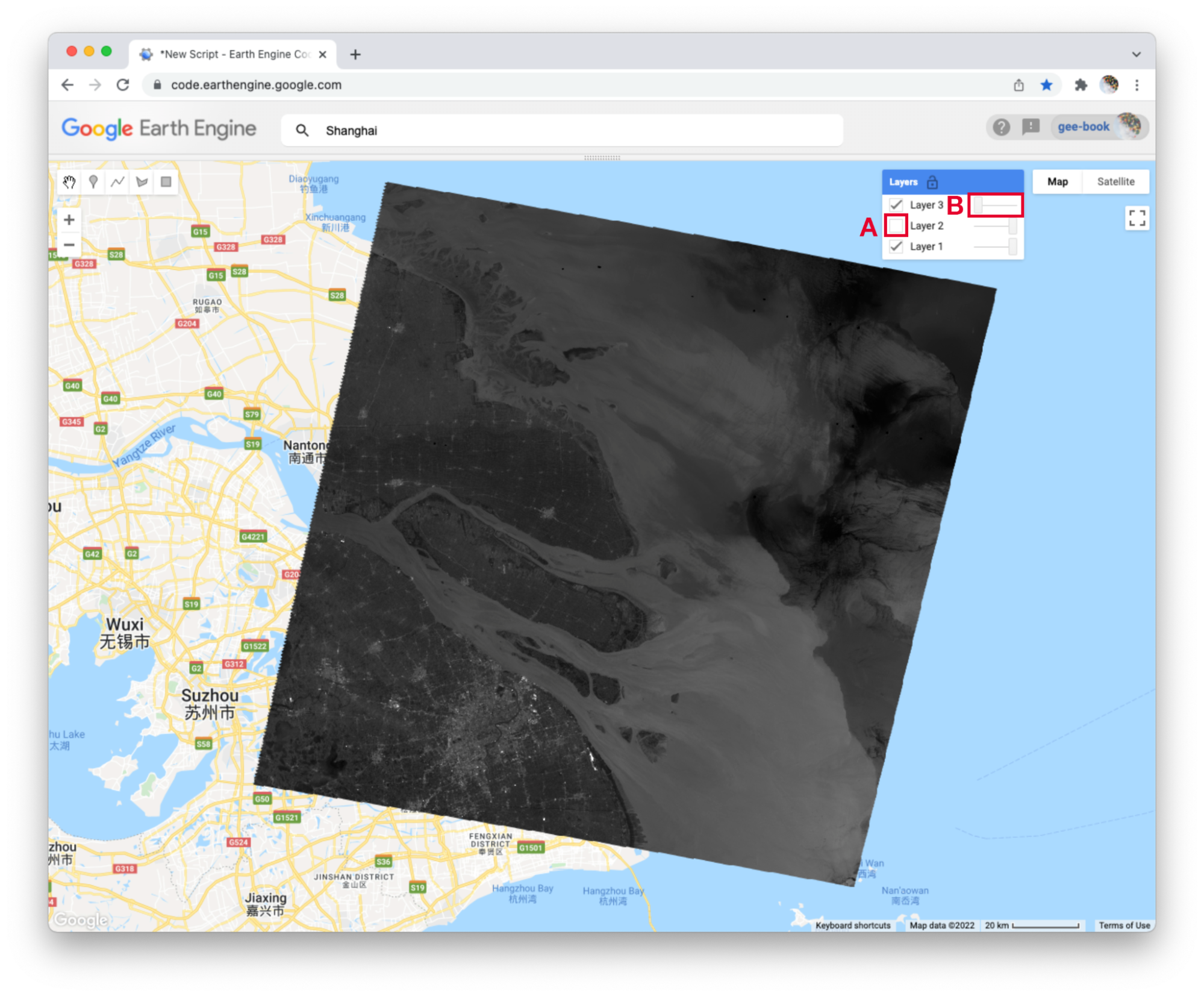
Do you see how these new parameters influence the map layer displays (Fig. F1.1.3)? For Layer 2, we set the shown parameter as 0. For Layer 3, we set the opacity parameter as 0. As a result, neither layer is visible to us when we first run the code. We can make each layer visible with controls in the Layers manager checklist on the map (at top right). Expand this list and you should see the names that we gave each layer when we added them to the map. Each name sits between a checkbox and an opacity slider. To make Layer 2 visible, click the checkbox (Fig. F1.1.3, area A). To make Layer 3 visible, move the opacity slider to the right (Fig. F1.1.3, area B).
By manipulating these controls, you should notice that these layers are displayed as a stack, meaning one on top of the other. For example, set the opacity for each layer to be 1 by pushing the opacity sliders all the way to the right. Then make sure each box is checked next to each layer so that all the layers are shown. Now you can identify which layer is on top of the stack by checking and unchecking each layer. If a layer is on top of another, unchecking the top layer will reveal the layer underneath. If a layer is under another layer in the stack, then unchecking the bottom layer will not alter the display (because the top layer will remain visible). If you try this on our stack, you should see that the list order reflects the stack order, meaning that the layer at the top of the layer list appears on the top of the stack. Now compare the order of the layers in the list to the sequence of operations in your script. What layer did your script add first and where does this appear in the layering order on the map?
Code Checkpoint F11a. The book’s repository contains a script that shows what your code should look like at this point.
Section 3. True-Color Composites
Using the controls in the Layers manager, explore these layers and examine how the pixel values in each band differ. Does Layer 2 (displaying pixel values from the “SR_B2” band) appear generally brighter than Layer 1 (the “SR_B1” band)? Compared with Layer 2, do the ocean waters in Layer 3 (the “SR_B3” band) appear a little darker in the north, but a little lighter in the south?
We can use color to compare these visual differences in the pixel values of each band layer all at once as an RGB composite. This method uses the three primary colors (red, green, and blue) to display each pixel’s values across three bands.
To try this, add this code and run it.
Map.addLayer( |
The result (Fig. F1.1.4) looks like the world we see, and is referred to as a natural-color composite, because it naturally pairs the spectral ranges of the image bands to display colors. Also called a true-color composite, this image shows the red spectral band with shades of red, the green band with shades of green, and the blue band with shades of blue. We specified the pairing simply through the order of the bands in the list: B3, B2, B1. Because bands 3, 2, and 1 of Landsat 5 correspond to the real-world colors of red, green, and blue, the image resembles the world that we would see outside the window of a plane or with a low-flying drone.
Fig. F1.1.4 True-color composite |
Section 4. False-Color Composites
As you saw when you printed the band list (Fig. F1.1.1), a Landsat image contains many more bands than just the three true-color bands. We can make RGB composites to show combinations of any of the bands—even those outside what the human eye can see. For example, band 4 represents the near-infrared band, just outside the range of human vision. Because of its value in distinguishing environmental conditions, this band was included on even the earliest 1970s Landsats. It has different values in coniferous and deciduous forests, for example, and can indicate crop health. To see an example of this, add this code to your script and run it.
Map.addLayer( |
In this false-color composite (Fig. F1.1.5), the display colors no longer pair naturally with the bands. This particular example, which is more precisely referred to as a color-infrared composite, is a scene that we could not observe with our eyes, but that you can learn to read and interpret. Its meaning can be deciphered logically by thinking through what is passed to the red, green, and blue color channels.
Fig. F1.1.5 Color-infrared image (a false-color composite) |

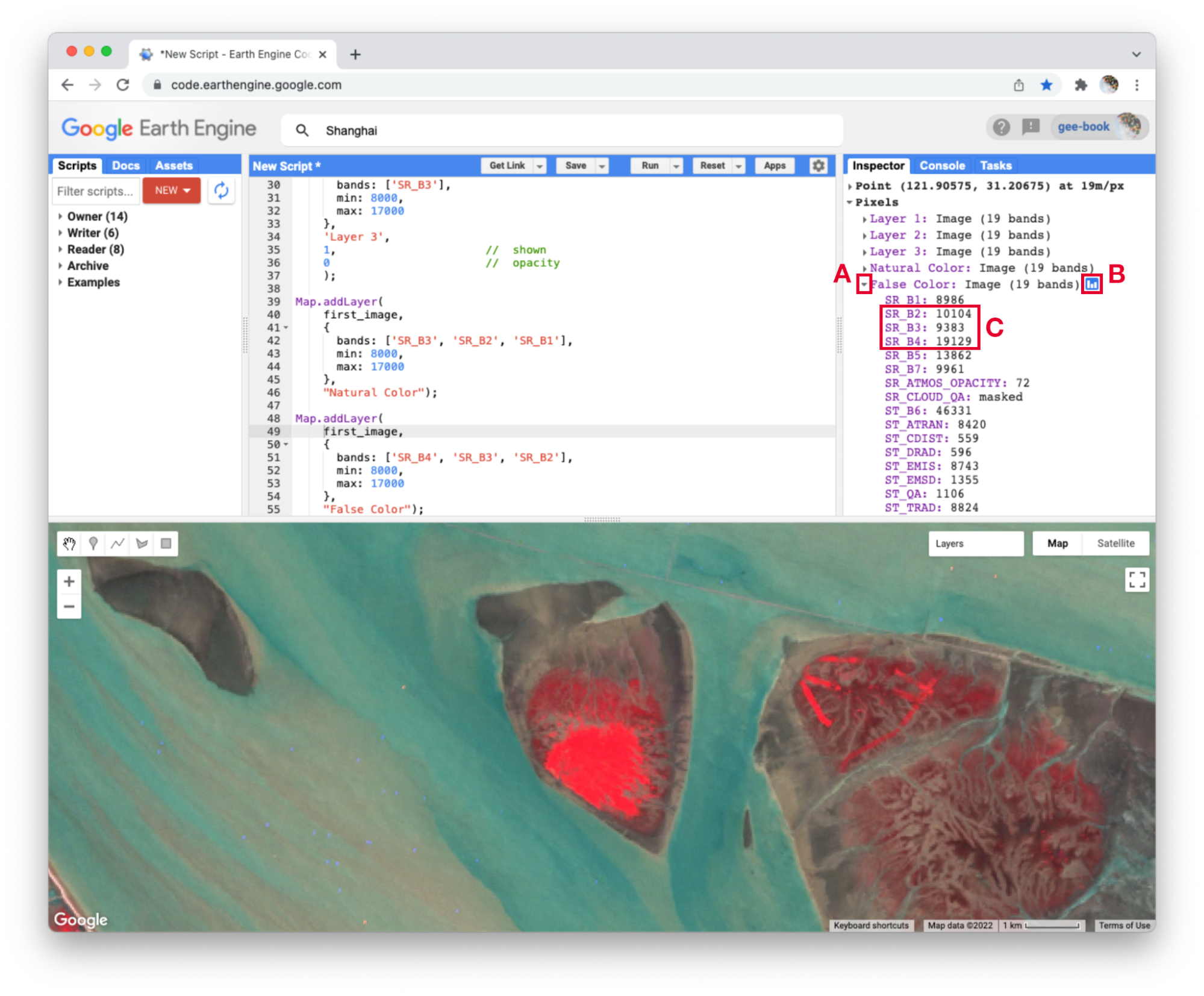
Notice how the land on the northern peninsula appears bright red (Fig. F1.1.5, area A). This is because for that area, the pixel value of the first band (which is drawing the near-infrared brightness) is much higher relative to the pixel value of the other two bands. You can check this by using the Inspector tool. Try zooming into a part of the image with a red patch (Fig. F1.1.5, area B) and clicking on a pixel that appears red. Then expand the “False Color” layer in the Inspector panel (Fig. F1.1.6, area A), click the blue icon next to the layer name (Fig. F1.1.6, area B), and read the pixel value for the three bands of the composite (Fig. F1.1.6, area C). The pixel value for B4 should be much greater than for B3 or B2.
Fig. F1.1.6 Values of B4, B3, B2 bands for a pixel that appears bright red |
In the bottom left corner of the image (Fig. F1.1.5, area C), rivers and lakes appear very dark, which means that the pixel value in all three bands is low. However, sediment plumes fanning from the river into the sea appear with blue and cyan tints (Fig. F1.1.5, area D). If they look like primary blue, then the pixel value for the second band (B3) is likely higher than the first (B4) and third (B2) bands. If they appear more like cyan, an additive color, it means that the pixel values of the second and third bands are both greater than the first.
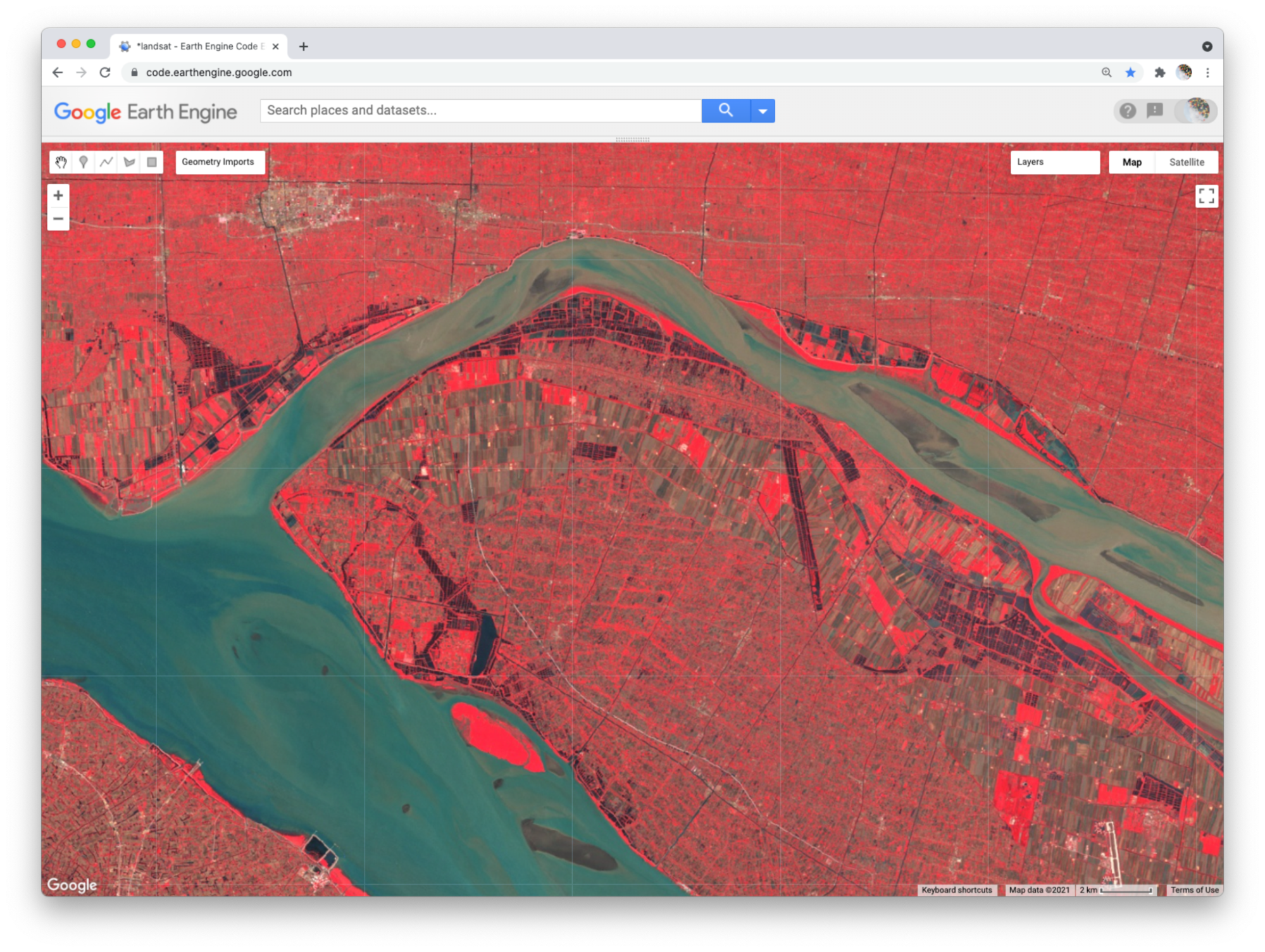
In total, the false-color composite provides more contrast than the true-color image for understanding differences across the scene. This suggests that other bands might contain more useful information as well. We saw earlier that our satellite image consisted of 19 bands. Six of these represent different portions of the electromagnetic spectrum, including three beyond the visible spectrum, that can be used to make different false-color composites. Use the code below to explore a composite that shows shortwave infrared, near infrared, and visible green (Fig. F1.1.7).
Map.addLayer( |
Fig. F1.1.7 Shortwave infrared false-color composite |

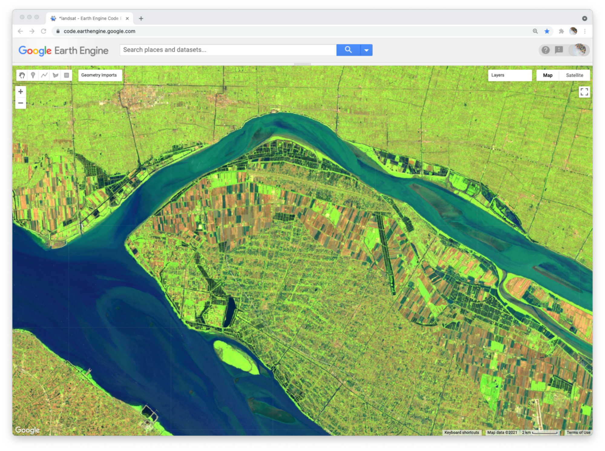
To compare the two false-color composites, zoom into the area shown in the two pictures of Fig. F1.1.8. You should notice that bright red locations in the left composite appear bright green in the right composite. Why do you think that is? Does the image on the right show new distinctions not seen in the image on the left? If so, what do you think they are?
Fig. F1.1.8 Near-infrared versus shortwave infrared false-color composites |
Code Checkpoint F11b. The book’s repository contains a script that shows what your code should look like at this point.
Section 5. Additive Color System
Thus far, we have used RGB composites to make a true-color image, in which the colors on the screen match the colors in our everyday world. We also used the same principles to draw two false-color combinations of optical bands collected by the satellite. To be able to read and interpret information from composite images generally, it is useful to understand the additive color system. Views of data in Earth Engine, and indeed everything drawn on a computer screen, use three channels for display (red, green, and blue). The order of the bands in a composite layer determines the color channel used to display the DN of pixels. When the DN is higher in one band relative to the other two bands, the pixel will appear tinted with the color channel used to display that band. For example, when the first band is higher relative to the other two bands, the pixel will appear reddish. The intensity of the pixel color will express the magnitude of difference between the DN quantities.
Fig. F1.1.9 Additive color system |
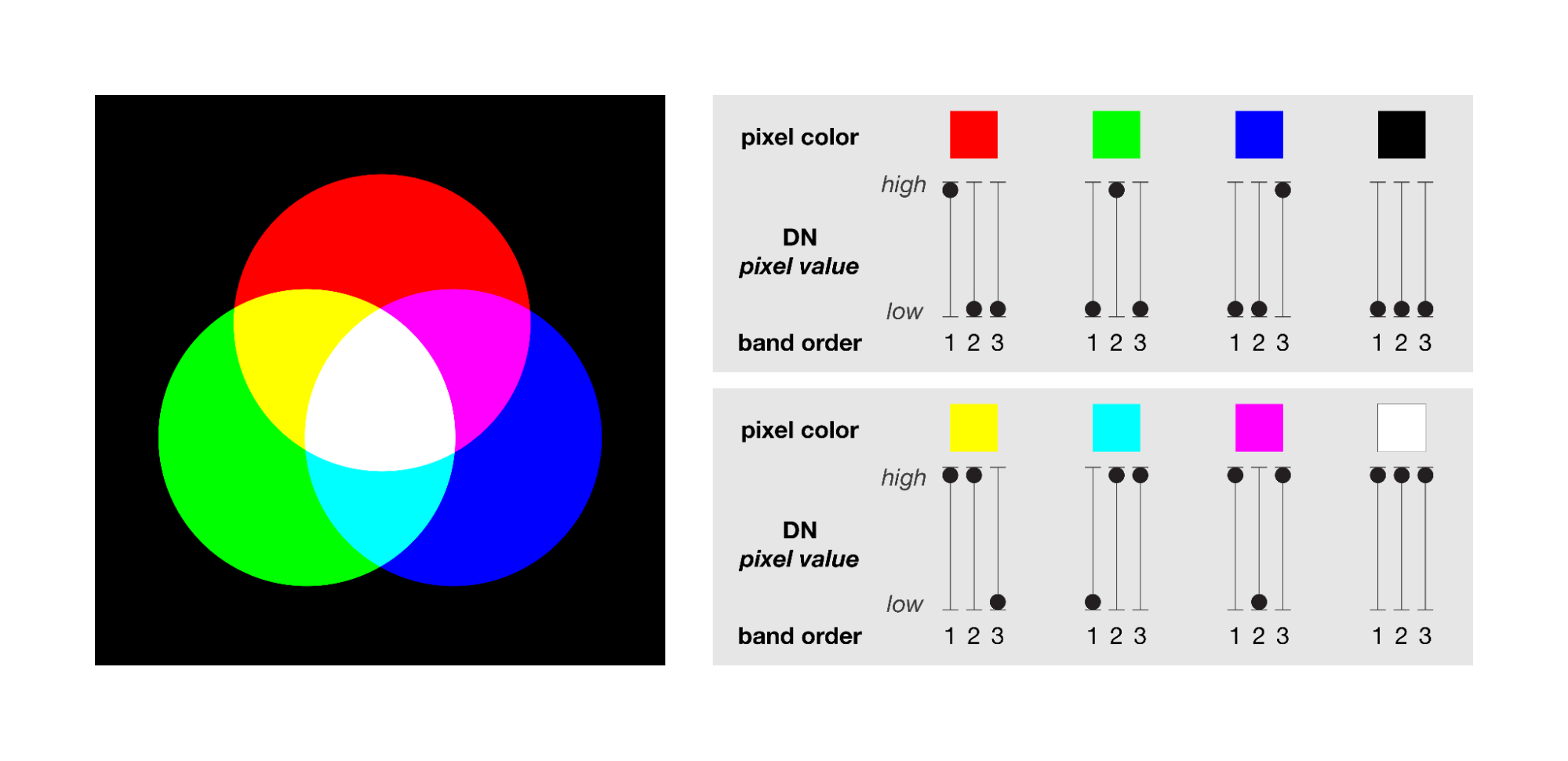
The way that primary colors combine to make new colors in an additive color system can be confusing at first, especially if you learned how to mix colors by painting or printing. When using an additive color system, red combined with green makes yellow, green combined with blue makes cyan, and red combined with blue makes magenta (Fig. F1.1.9). Combining all three primary colors makes white. The absence of all primary colors makes black. For RGB composites, this means that if the pixel value of two bands are greater than that of the third band, the pixel color will appear tinted as a combined color. For example, when the pixel value of the first and second bands of a composite are higher than that of the third band, the pixel will appear yellowish.
Section 6. Attributes of Locations
So far, we have explored bands as a method for storing data about slices of the electromagnetic spectrum that can be measured by satellites. Now we will work towards applying the additive color system to bands that store non-optical and more abstract attributes of geographic locations.
To begin, add this code to your script and run it.
var lights93=ee.Image('NOAA/DMSP-OLS/NIGHTTIME_LIGHTS/F101993'); |
This code loads an image of global nighttime lights and adds a new layer to the map. Please look at the metadata that we printed to the Console panel. You should see that the image consists of four bands. The code selects the “stable_lights” band to display as a layer to the map. The range of values for display (0–63) represent the minimum and maximum pixel values in this image. As mentioned earlier, you can find this range in the Earth Engine Data Datalog or with other Earth Engine methods. These will be described in more detail in the next few chapters.
The global nighttime lights image represents the average brightness of nighttime lights at each pixel for a calendar year. For those of us who have sat by a window in an airplane as it descends to a destination at night, the scene may look vaguely familiar. But the image is very much an abstraction. It provides us a view of the planet that we would never be able to see from an airplane or even from space. Night blankets the entire planet in darkness. There are no clouds. In the “stable lights” band, there are no ephemeral sources of light. Lightning strikes, wildfires, and other transient lights have been removed. It is a layer that aims to answer one question about our planet at one point in time: In 1993, how bright were Earth’s stable, artificial sources of light?
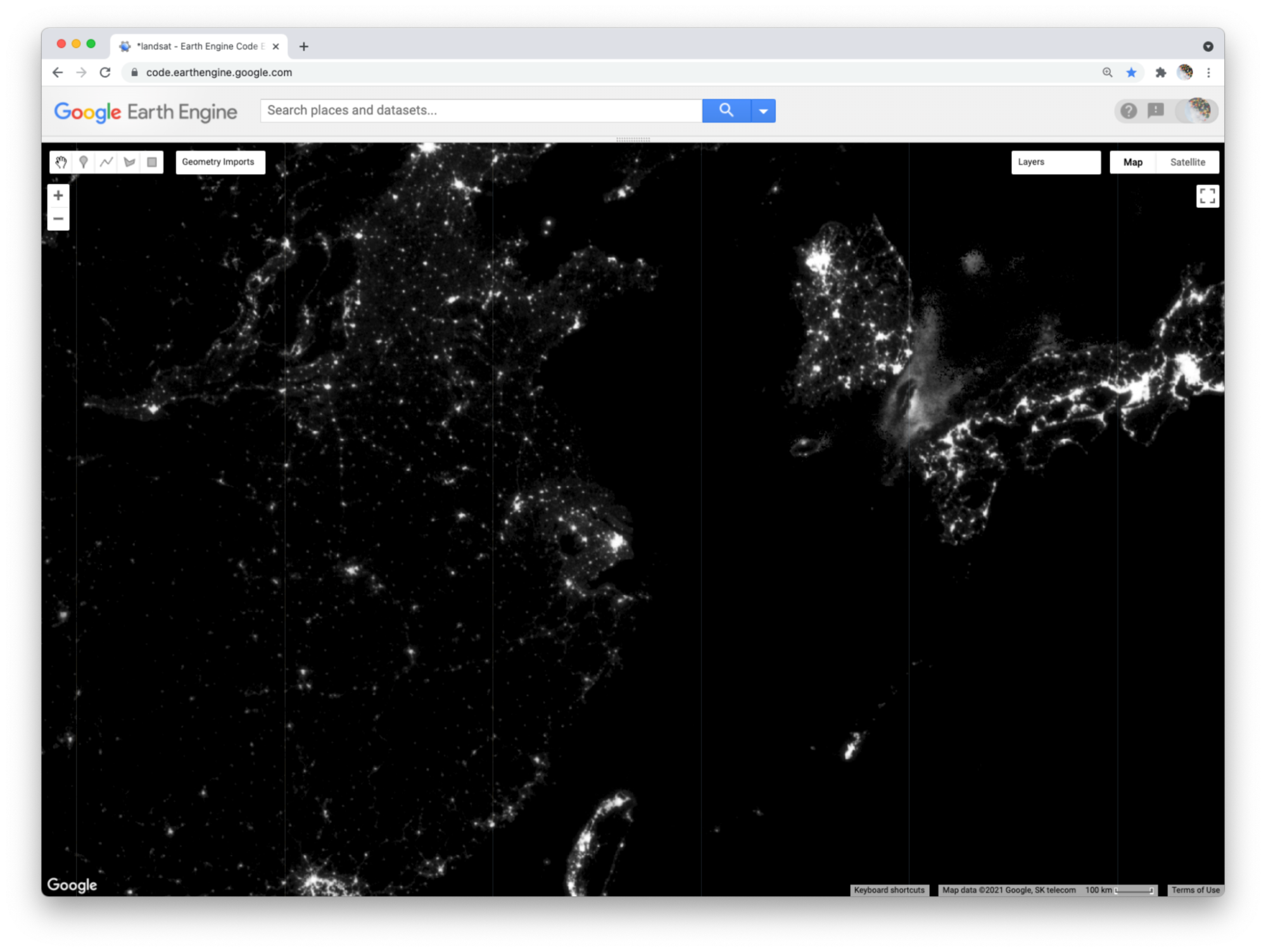
With the zoom controls on the map, you can zoom out to see the bright spot of Shanghai, the large blob of Seoul to the north and east, the darkness of North Korea except for the small dot of Pyongyang, and the dense strips of lights of Japan and the west coast of Taiwan (Fig. F1.1.10).
Fig. F1.1.10 Stable nighttime lights in 1993 |
Section 7. Abstract RGB Composites
Now we can use the additive color system to make an RGB composite that compares stable nighttime lights at three different slices of time. Add the code below to your script and run it.
var lights03=ee.Image('NOAA/DMSP-OLS/NIGHTTIME_LIGHTS/F152003') |
This code does a few things. First, it creates two new images, each representing a different slice of time. For both, we use the select method to select a band (“stable_lights”) and the rename method to change the band name to indicate the year it represents.
Next, the code uses the addBands method to create a new, three-band image that we name “changeImage”. It does this by taking one image (lights13) as the first band, using another image (lights03) as the second band, and the lights93 image seen earlier as the third band. The third band is given the name “1993” as it is placed into the image.
Finally, the code prints metadata to the Console and adds the layer to the map as an RGB composite using Map.addLayer. If you look at the printed metadata, you should see under the label “change image” that our image is composed of three bands, with each band named after a year. You should also notice the order of the bands in the image: 2013, 2003, 1993. This order determines the color channels used to represent each slice of time in the composite: 2013 as red, 2003 as green, and 1993 as blue (Fig. F1.1.11).
Fig. F1.1.11 RGB composite of stable nighttime lights (2013, 2003, 1993) |
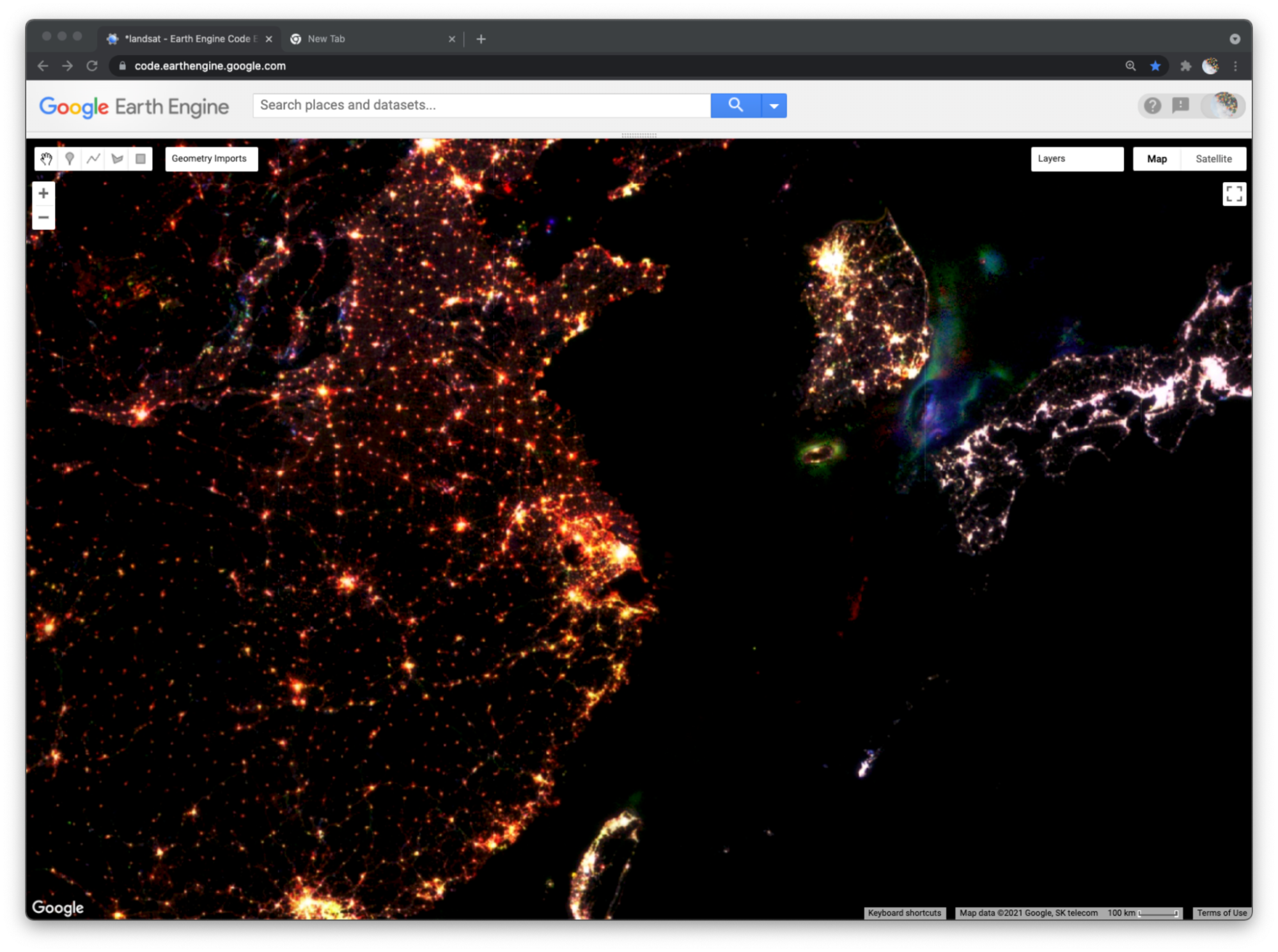
We can now read the colors displayed on the layer to interpret different kinds of changes in nighttime lights across the planet over two decades. Pixels that appear white have high brightness in all three years. You can use the Inspector panel to confirm this. Click on the Inspector panel to change the cursor to a crosshair and then click on a pixel that appears white. Look under the Pixel category of the Inspector panel for the “Change composite” layer. The pixel value for each band should be high (at or near 63).
Many clumps of white pixels represent urban cores. If you zoom into Shanghai, you will notice that the periphery of the white-colored core appears yellowish and the terminal edges appear reddish. Yellow represents locations that were bright in 2013 and 2003 but dark in 1993. Red represents locations that appear bright in 2013 but dark in 2003 and 1993. If you zoom out, you will see this gradient of white core to yellow periphery to red edge occurs around many cities across the planet, and shows the global pattern of urban sprawl over the 20-year period.
When you zoom out from Shanghai, you will likely notice that each map layer redraws every time you change the zoom level. In order to explore the change composite layer more efficiently, use the Layer manager panel to not show (uncheck) all of the layers except for “Change composite.” Now the map will respond faster when you zoom and pan because it will only refresh the single displayed shown layer.
In addition to urban change, the layer also shows changes in resource extraction activities that produce bright lights. Often, these activities produce lights that are stable over the span of a year (and therefore included in the “stable lights” band), but are not sustained over the span of a decade or more. For example, in the Korea Strait (between South Korea and Japan), you can see geographic shifts of fishing fleets that use bright halogen lights to attract squid and other sea creatures towards the water surface and into their nets. Bluish pixels were likely fished more heavily in 1993 and became used less frequently by 2003, while greenish pixels were likely fished more heavily in 2003 and less frequently by 2013 (Fig. F1.1.11).
Fig. F1.1.12 Large red blobs in North Dakota and Texas from fossil fuel extraction in specific years |

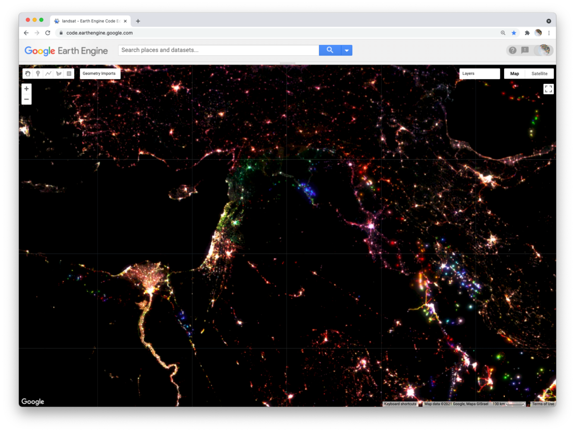
Similarly, fossil fuel extraction produces nighttime lights through gas flaring. If you pan to North America (Fig. F1.1.12), red blobs in Alberta and North Dakota and a red swath in southeastern Texas all represent places where oil and gas extraction were absent in 1993 and 2003 but booming by 2013. Pan over to the Persian Gulf and you will see changes that look like holiday lights with dots of white, red, green, and blue appearing near each other; these distinguish stable and shifting locations of oil production. Blue lights in Syria near the border with Iraq signify the abandonment of oil fields after 1993 (Fig. F1.1.13). Pan further north and you will see another “holiday lights” display from oil and gas extraction around Surgut, Russia. In many of these places, you can check for oil and gas infrastructure by zooming in to a colored spot, making the lights layer not visible, and selecting the Satellite base layer (upper right).
Fig. F1.1.13 Nighttime light changes in the Middle East |
As you explore this image, remember to check your interpretations with the Inspector panel by clicking on a pixel and reading the pixel value for each band. Refer back to the additive color figure to remember how the color system works. If you practice this, you should be able to read any RGB composite by knowing how colors relate to the relative pixel value of each band. This will empower you to employ false-color composites as a flexible and powerful method to explore and interpret geographic patterns and changes on Earth’s surface.
Code Checkpoint F11c. The book’s repository contains a script that shows what your code should look like at this point.
Synthesis
Assignment 1. Compare and contrast the changes in nighttime lights around Damascus, Syria versus Amman, Jordan. How are the colors for the two cities similar and different? How do you interpret the differences?
Assignment 2. Look at the changes in nighttime lights in the region of Port Harcourt, Nigeria. What kinds of changes do you think these colors signify? What clues in the satellite basemap can you see to confirm your interpretation?
Assignment 3. In the nighttime lights change composite, we did not specify the three bands to use for our RGB composite. How do you think Earth Engine chose the three bands to display? How do you think Earth Engine determined which band should be shown with the red, green, and blue channels?
Assignment 4. Create a new script to make three composites (natural color, near infrared false color, and shortwave infrared false-color composites) for this image:
'LANDSAT/LT05/C02/T1_L2/LT05_022039_20050907' |
What environmental event do you think the images show? Compare and contrast the natural and false-color composites. What do the false-color composites help you see that is more difficult to decipher in the natural color composite?
Assignment 5. Create a new script and run this code to view this image over Shanghai:
var image=ee.Image('LANDSAT/LT05/C02/T1_L2/LT05_118038_20000606'); |
Inspect Layer 1 and Layer 2 with the Inspector panel. Describe how the two layers differ and explain why they differ.
Conclusion
In this chapter, we looked at how an image is composed of one or more bands, where each band stores data about geographic locations as pixel values. We explored different ways of visualizing these pixel values as map layers, including a grayscale display of single bands and RGB composites of three bands. We created natural and false-color composites that use additive color to display information in visible and non-visible portions of the spectrum. We examined additive color as a general system for visualizing pixel values across multiple bands. We then explored how bands and RGB composites can be used to represent more abstract phenomena, including different kinds of change over time.
Feedback
To review this chapter and make suggestions or note any problems, please go now to bit.ly/EEFA-review. You can find summary statistics from past reviews at bit.ly/EEFA-reviews-stats.
References
Cloud-Based Remote Sensing with Google Earth Engine. (n.d.). CLOUD-BASED REMOTE SENSING WITH GOOGLE EARTH ENGINE. https://www.eefabook.org/
Cloud-Based Remote Sensing with Google Earth Engine. (2024). In Springer eBooks. https://doi.org/10.1007/978-3-031-26588-4