Cloud-Based Remote Sensing with Google Earth Engine

Fundamentals and Applications

Part A1: Human Applications
This Part covers some of the many Human Applications of Earth Engine. It includes demonstrations of how Earth Engine can be used in agricultural and urban settings, including for sensing the built environment and the effects it has on air composition and temperature. This Part also covers the complex topics of human health, illicit deforestation activity, and humanitarian actions.
Chapter A1.1: Agricultural Environments
Authors
Sherrie Wang and George Azzari
Overview
The purpose of this chapter is to introduce how datasets and functions available in Earth Engine can be used to map agriculture at scale. We will walk through an example of mapping crop types in the US Midwest, which is one of the main breadbaskets of the world. The skills learned in this chapter will equip you to go on to map other agricultural characteristics, such as yields and management practices.
Learning Outcomes
- Classifying crop type in a county in the US Midwest using the Cropland Data Layer (CDL) as labels.
- Using ee.Reducer.linearRegression to fit a second-order harmonic regression to a crop time series and extract harmonic coefficients.
- Using the Green Chlorophyll Vegetation Index (GCVI) for crop type classification.
- Training a random forest to classify crop type from harmonic coefficients.
- Applying the trained random forest classifier to the study region and assessing its performance.
Helps if you know how to:
- Import images and image collections, filter, and visualize (Part F1).
- Create a graph using ui.Chart (Chap. F1.3).
- Perform basic image analysis: select bands, compute indices, create masks, classify images (Part F2).
- Obtain accuracy metrics from classifications (Chap. F2.2)
- Recognize similarities and differences among satellite spectral bands (Part F1, Part F2, Part F3).
- Write a function and map it over an ImageCollection (Chap. F4.0).
- Mask cloud, cloud shadow, snow/ice, and other undesired pixels (Chap. F4.3).
- Fit linear and nonlinear functions with regression in an ImageCollection time series (Chap. F4.6).
- Filter a FeatureCollection to obtain a subset (Chap. F5.0, Chap. F5.1).
Github Code link for all tutorials
This code base is collection of codes that are freely available from different authors for google earth engine.
Introduction to Theory
Agriculture is one of the primary ways in which humans have altered the surface of our planet. Globally, about five billion hectares, or 38% of Earth’s land surface, is devoted to agriculture (FAO 2020). About one-third of this is used to grow crops, while the other two-thirds are used to graze livestock.
In the face of a growing human population and changing climate, it is more important than ever to manage land resources effectively in order to grow enough food for all people while minimizing damage to the environment. Toward this end, remote sensing offers a critical source of data for monitoring agriculture. Since most agriculture occurs outdoors, sensors on satellites and airplanes can capture many crop characteristics. Research has shown that crops’ spectral reflectance over time can be used to classify crop types (Wang et al. 2019), predict yield (Burke and Lobell 2017), detect crop stress (Ihuoma and Madramootoo 2017), identify irrigation (Deines et al. 2017), quantify species diversity (Duro et al. 2014), and pinpoint sowing and harvest dates (Jain et al. 2016). Remotely sensed imagery has also been key to the rise of precision agriculture, where management practices are varied at fine scales to respond to differences in crop needs within a field (Azzari et al. 2019, Jin et al. 2017, Seifert et al. 2018). Ultimately, the goal of measuring agricultural practices and outcomes is to improve yields and reduce environmental degradation.
Practicum
In this practicum, we will use Earth Engine to pull Landsat imagery and classify crop types in the US Midwest. The US is the world’s largest producer of corn and second-largest producer of soybeans; therefore, maintaining high yields in the US is vital for global food security and price stability. Crop type mapping is an important prerequisite to using satellite imagery to estimate agricultural production. We will show how to obtain features from a time series by fitting a harmonic regression and extracting the coefficients. Then we will use a random forest to classify crop type, where the “ground truth” labels will come from the Cropland Data Layer (CDL) from the US Department of Agriculture. CDL is itself a product of a classifier using satellite imagery as input and survey-based ground truth as training labels (USDA 2021). We demo crop type classification in the US Midwest because CDL allows us to validate our predictions. While using satellite imagery to map crop types is already operational in the US, mapping crop types remains an open challenge in much of the world.
Section 1. Pull All Landsat Imagery for the Study Area
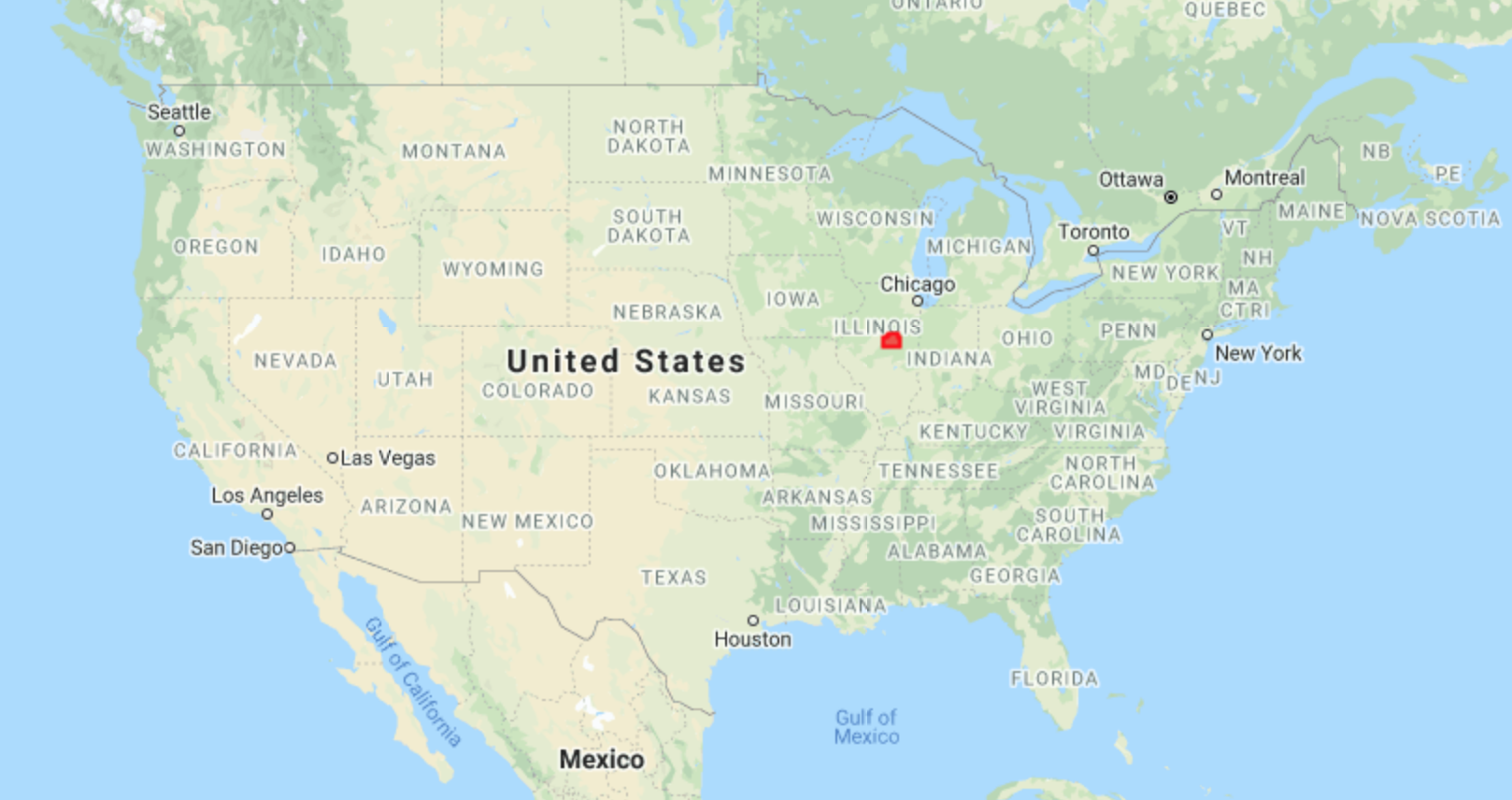
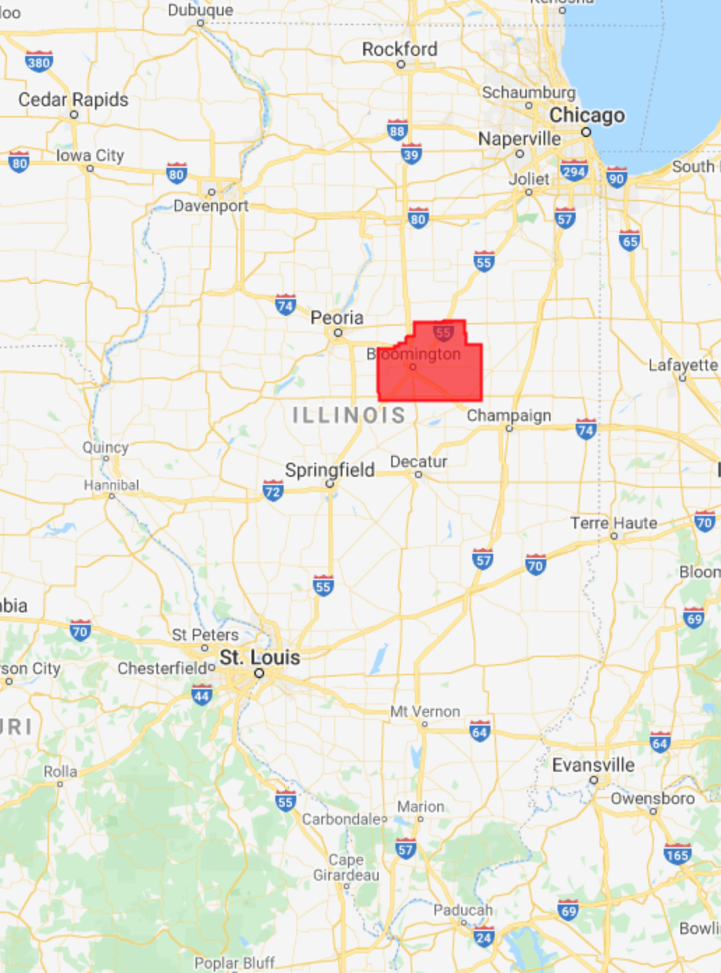
In the Midwest, corn and soybeans dominate the landscape. We will map crop types in McLean County, Illinois. This is the county that produces the most corn and soybeans in the United States, at 62.9 and 19.3 million bushels, respectively. Let’s start by defining the study area and visualizing it (Fig. A1.1.1). We obtain county boundaries from the United States Census Bureau’s TIGER dataset, which can be found in the Earth Engine Data Catalog. We extract the McLean County feature from TIGER by name and by using Illinois’ FIPS code of 17.
// Define study area. |
Fig. A1.1.1 Location and borders of McLean County, Illinois | |
Next, we import Landsat 7 and 8 imagery, as presented in Part 1. In particular, we use Level-2 data, which contains atmospherically corrected surface reflectance and land surface temperature. While top-of-atmosphere data will also yield good results for many agricultural applications, we prefer data that has been corrected for atmospheric conditions when available, since atmospheric variation is just one more source of noise in the inputs.
// Import Landsat imagery. |
We define a few functions that will make it easier to work with Landsat data. The first two functions, renameL7 and renameL8, rename the bands of either a Landsat 7 or Landsat 8 image to more intuitive names. For example, instead of calling the first band of a Landsat 7 image 'B1', we rename it to 'BLUE', since band 1 captures light in the blue portion of the visible spectrum. Renaming also makes it easier to work with Landsat 7 and 8 images together, since the band numbering of their sensors (ETM+ and OLI) is different.
// Functions to rename Landsat 7 and 8 images. |
The Landsat 7 Level-2 product has seven surface reflectance and temperature bands, while the Landsat 8 Level-2 product has eight. Both have a number of other bands for image quality, atmospheric conditions, etc. For this chapter, we will mostly be concerned with the near-infrared (NIR), short-wave infrared (SWIR1 and SWIR2), and pixel quality (QA_PIXEL) bands. Many differences among vegetation types can be seen in the NIR, SWIR1, and SWIR2 bands of the electromagnetic spectrum. The pixel quality band is important for masking out clouds when working with optical imagery (Chap. F4.3). Below, we define two functions: the addMask function to turn the QA_PIXEL bitmask into multiple masking layers, and the maskQAClear function to remove all non-clear pixels from each image.
// Functions to mask out clouds, shadows, and other unwanted features. |
In addition to the raw bands sensed by ETM+ and OLI, vegetation indices (VI) can also help distinguish different vegetation types. Prior work has found the Green Chlorophyll Vegetation Index (GCVI) particularly useful for distinguishing corn from soybeans in the Midwest (Wang et al. 2019). We will add it as a band to each Landsat image.
// Function to add GCVI as a band. |
Now we are ready to pull Landsat 7 and 8 imagery for our study area and apply the above functions. We will access all images from January 1 to December 31, 2020, that intersect with McLean County. Because different crops have different growth characteristics, it is valuable to obtain a time series of images to distinguish when crops grow, senesce, and are harvested. Differences in spectral reflectance at individual points in time can also be informative.
// Define study time period. |
Next, we merge the Landsat 7 and Landsat 8 collections, mask out clouds, and add GCVI as a band.
// Merge Landsat 7 and 8 collections. |
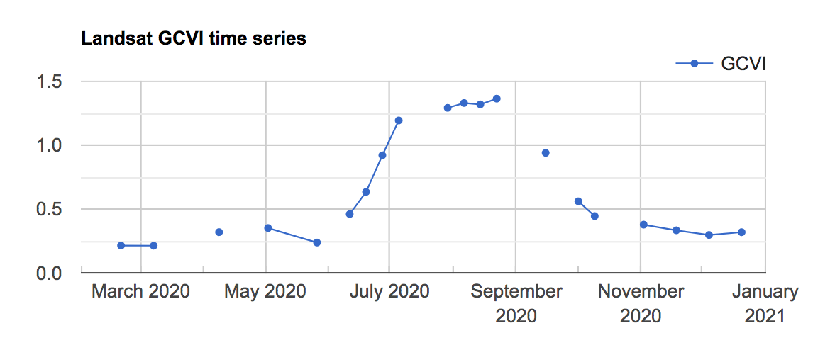
We can use a ui.Chart object to visualize the combined Landsat GCVI time series at a particular point, which in this case falls in a corn field, according to CDL.
// Visualize GCVI time series at one location. |
You should see the chart shown in Fig. A1.1.2 in the Earth Engine Console.
Fig. A1.1.2 The Landsat GCVI time series visualized at a corn point in McLean County, Illinois. A higher GCVI corresponds to greater leaf chlorophyll content; the crop can be seen greening up in June and senescing in September. |
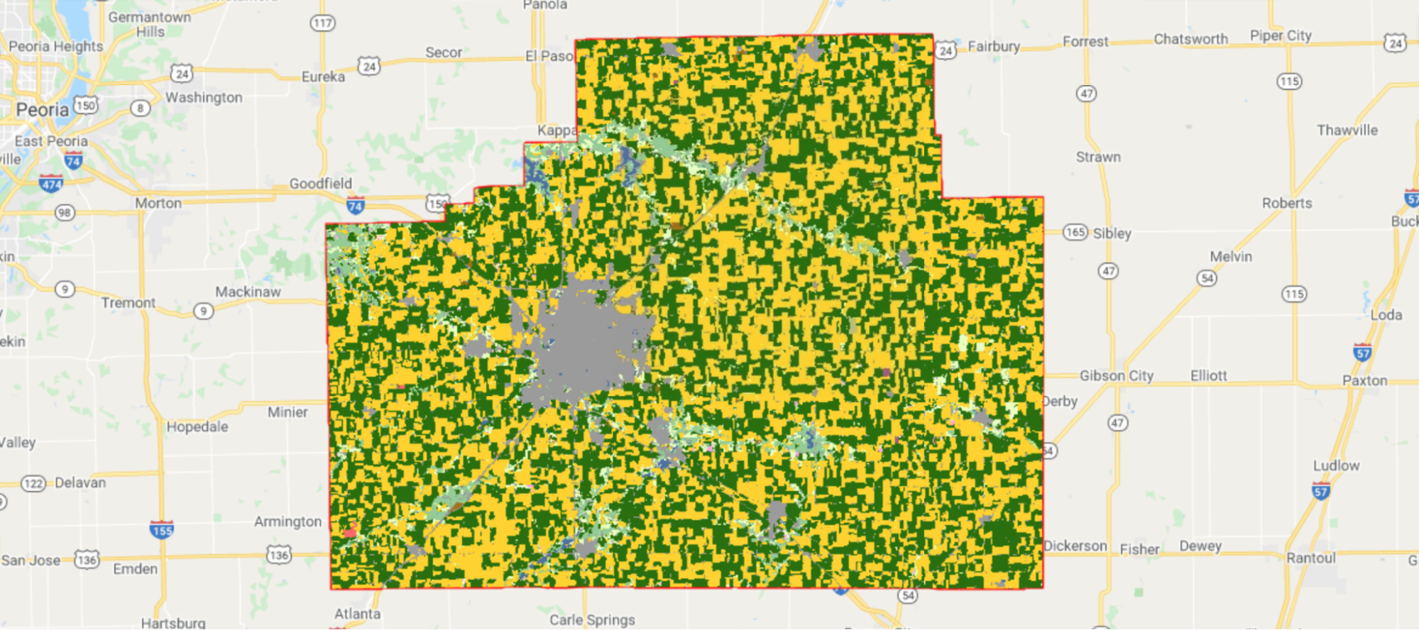
Finally, let’s also take a look at the crop type dataset that we will be using to train and evaluate our classifier. We load the CDL image for 2020 and select the layer that contains crop type information.
// Get crop type dataset. |
Corn fields are visualized in yellow and soybean fields in green in CDL (Fig. A1.1.3).
Fig. A1.1.3 The CDL visualized over McLean County, Illinois. Corn fields are shown in yellow, while soybean fields are shown in dark green. Other land cover types include urban areas in gray, deciduous forest in teal, and water in blue. |
Code Checkpoint A11a. The book’s repository contains a script that shows what your code should look like at this point.
Question 1. How many images were taken by Landsat 7 and Landsat 8 over McLean County in 2020?
Question 2. By using ui.Chart, can you qualitatively spot any difference between the time series of corn fields and soybean fields?
Section 2. Add Bands to Landsat Images for Harmonic Regression
Now that we have a collection that combines all available Landsat imagery over McLean County in 2020, we can extract features from the time series for crop type classification. Harmonic regression is one way to extract features by fitting sine and cosine functions to a time series (Chap. F4.6). Also known as a Fourier transform, the harmonic regression is especially well suited for data patterns that reappear at regular intervals.
In particular, we fit a second-order harmonic regression, which takes the form:
 (A1.1.1)
Here, t is the time variable; f(t) is the observed variable to be fit; a, b, and c are coefficients found through regression; and ω is a hyperparameter that controls the periodicity of the harmonic basis. For this exercise, we will use ω=1.
To prepare the collection, we define two functions that add a harmonic basis and intercept to the ImageCollection. The first function adds the acquisition time of each image as a band to the image in units of years. The function takes an image and a reference date as arguments; the new time band is computed relative to this reference date.
// Function that adds time band to an image. |
The second function calls addTimeUnit, then takes the sine and cosine of each image’s acquisition time and adds them as new bands to each image. We are fitting a second-order harmonic regression, so we will add two sine and two cosine terms as bands, along with a constant term. The function also allows you to use any value of ω (omega). Note that, to create the 'constant' band, we divide the time band by itself; this results in a band with value 1 and the same mask as the time band.
// Function that adds harmonic basis to an image. |
We have all the tools we need to add the sine and cosine terms to each image—we just use map to apply addHarmonics to each image in the collection. We use the start_date of January 1, 2020, as the reference date.
// Apply addHarmonics to Landsat image collection. |
When we print the new ImageCollection, the Console tab should display a collection of images with bands that now include cos, sin, cos2, sin2, and constant—the terms we just added.
Code Checkpoint A11b. The book’s repository contains a script that shows what your code should look like at this point.
Question 3. What assumption are we making about crop spectral reflectance when we fit a harmonic regression to a variable like GCVI using ω=1? What types of time series might be better suited for a smaller value of ω? A larger ω?
Question 4. What happens to the harmonic fit if you change the reference date by a quarter of a year? By half of a year? By a full year?
Section 3. Fit a Harmonic Regression at Each Landsat Pixel
In the previous section, we added the harmonic basis (cosine, sine, and constant terms) to each image in our Landsat collection. Now we can run a linear regression using this basis as the independent variables, and Landsat bands and GCVI as the dependent variables. This section defines several functions that will help us complete this regression.
The key step is linear regression performed by the ee.Reducer.linearRegression reducer. This reducer takes in two parameters: the number of independent variables and the number of dependent variables. When applied to an ImageCollection, it expects each image in the collection to be composed of its independent variable bands followed by a dependent variable band or bands. The reducer returns an array image whose first band is an array of regression coefficients computed through linear least squares and whose second band is the regression residual.
The first function we define is called arrayimgHarmonicRegr and helps us apply the linear regression reducer to each image.
// Function to run linear regression on an image. |
Next, we want to transform the returned array image into an image with each coefficient as its own band (Chap. F3.1). Furthermore, since we will be running harmonic regressions for multiple Landsat bands, we want to rename the harmonic coefficients returned by our regression to match their corresponding band. The second function, imageHarmonicRegr, performs these operations. The array image is transformed into a multiband image using the functions arrayProject and arrayFlatten, and the coefficients for the cosine, sine, and constant terms are renamed by adding the band name as a prefix (e.g., the first cosine coefficient for the NIR band becomes NIR_cos).
// Function to extract and rename regression coefficients. |
Finally, the third function is called getHarmonicCoeffs and performs the harmonic regression for all dependent bands by mapping the imageHarmonicRegr function over each band. It then creates a multiband image comprised of the regression coefficients.
// Function to apply imageHarmonicRegr and create a multi-band image. |
Now that we have defined all the helper functions, we are ready to apply them to our Landsat ImageCollection with the harmonic basis. We are using GCVI, NIR, SWIR1, and SWIR2 as the bands for crop type mapping. For each band, we have five coefficients from the regression corresponding to the cos, sin, cos2, sin2, and constant terms. In total, then, we will end up with 4 x 5=20 harmonic coefficients. After applying getHarmonicCoeffs, we clip the coefficients to the study area and apply a transformation to change the coefficients from a 64-bit double data type to a 32-bit integer. This last step allows us to save space on storage.
// Apply getHarmonicCoeffs to ImageCollection. |
Let’s take a look at the harmonics that we’ve fit. Following the same logic as in Chap. F4.6, we can compute the fitted values by multiplying the regression coefficients with the independent variables. We’ll do this just for GCVI, as we did in Sect. 1 above.
// Compute fitted values. |
Now we can plot the fitted values along with the original Landsat GCVI time series in one chart (Fig. A1.1.4).
// Visualize the fitted harmonics in a chart. |
Fig. A1.1.4 The Landsat GCVI time series (blue line) and fitted harmonic regression (red line) curve visualized at a corn point in McLean County, Illinois. While the fit is not perfect, the fitted harmonic captures the general characteristics of crop green-up and senescence. |

Before we move on to classifying crop type, we will add CDL as a band to the harmonics and export the final image as an asset. Recall that CDL will be the source of crop type labels for model training; adding this band now is not necessary but makes the labels more accessible at training time.
// Add CDL as a band to the harmonics. |
We are ready to export the harmonics we’ve computed to an asset. Exporting to an asset is an optional step but can make it easier in the next step to train a model. For a larger study area, the operations may time out without the export step because computing harmonics is computationally intensive. You should replace 'your_asset_path_here/' and filename below with the place you want to save your harmonics.
// Export image to asset. |
We visualized the fitted harmonics at one point in the study area; let’s also take a look at the coefficients over the entire study area using Map.addLayer. Since we can only visualize three bands at a time, we will have to pick three and visualize them in false color. Sometimes, it takes a bit of tweaking to visualize regression coefficients in false color; below, we transform three fitted GCVI bands via division and addition by constants (obtained through trial and error) to obtain a nice image for visualization.
// Visualize harmonic coefficients on map. |
Fig. A1.1.5 False-color image of harmonic coefficients fitted to GCVI time series in McLean County, Illinois |

These harmonic features allow us to see differences between urban land cover, water, and what we are currently interested in, crop types. Looking closely at the false-color image shown in Fig. A1.1.5, we can also see striping unrelated to land cover throughout the image. This striping, most visible in the bottom right of the image, is due to the failure of Landsat 7’s Scan Line Corrector in 2003, which resulted in data gaps that occur in a striped pattern across Landsat 7 images. It is worth noting that these artifacts can affect classification performance, but exactly how much depends on the task.
Code Checkpoint A11c. The book’s repository contains a script that shows what your code should look like at this point.
Question 5. What color do forested areas appear as in Fig. A1.1.5? Urban areas? Water?
Question 6. Comparing the map layers in Fig. A1.1.5 and Fig. A1.1.3, can you tell whether the GCVI cosine, sine, and constant terms capture differences between corn and soybean time series? What color do corn fields appear as in the false-color visualization? What about soybean fields?
Section 4. Train and Evaluate a Random Forest Classifier
We have our features, and we are ready to train a random forest in McLean County to classify crop types. As explained in Chap. F2.1, random forests are a classifier available in Earth Engine that can achieve high accuracies while being computationally efficient. We define a ee.Classifier object with 100 trees and a minimum leaf population of 10.
// Define a random forest classifier. |
The bands that we will use as features in the classification are the harmonic coefficients fitted to the NIR, SWIR1, SWIR2, and GCVI time series at each pixel. This may be different from previous classification examples you have seen, where band values at one time step are used as dependent variables. Using harmonic coefficients is one way to provide information from the temporal dimension to a classifier. Temporal information is very useful for distinguishing crop types.
We can obtain the band names by calling bandNames on the harmonics image and removing the CDL band and the system:index band.
// Get harmonic coefficient band names. |
To prepare the CDL band to be the output of classification, we remap the crop-type values in CDL (corn=1, soybeans=5, and over a hundred other crop types) to corn taking on a value of 1, soybeans a value of 2, and everything else a value of 0. We focus on classifying corn and soybeans for this exercise.
// Transform CDL into a 3-class band and add to harmonics. |
Next, we sample 100 points from McLean County to serve as the training sample for our model. The classifier will learn to differentiate among corn, soybeans, and everything else using this set of points.
// Sample training points. |
Training the model is as simple as calling train on the classifier and feeding it the training points, the name of the label band, and the names of the input bands. To assess model performance on the training set, we can then compute the confusion matrix (Chap. F.2.2) by calling confusionMatrix on the model object. Finally, we can compute the accuracy by calling accuracy on the confusion matrix object.
// Train the model! |
You should see the confusion matrix shown in Table A1.1.1 on the training set.
Table A1.1.1 The confusion matrix obtained for the training set
Predicted crop type | ||||
Other (class 0) | Corn (class 1) | Soy (class 2) | ||
Actual crop type | Other (class 0) | 27 | 1 | 1 |
Corn (class 1) | 2 | 34 | 0 | |
Soy (class 2) | 3 | 4 | 28 | |
Table A1.1.1 tells us that the classifier is achieving 89% accuracy on the training set. Given that the model is successful on the training set, we next want to explore how well it will generalize to the entire study region. To estimate generalization performance, we can sample a test set (also called a “validation set”) and apply the model to that feature collection using classify(model). To keep the amount of computation manageable and avoid exceeding Earth Engine’s memory quota, we sample 50 test points.
// Sample test points and apply the model to them. |
Next, we can compute the confusion matrix and accuracy on the test set by calling errorMatrix('cropland', 'classification') followed by accuracy on the classified points. The 'classification' argument refers to the property where the model predictions are stored.
// Compute the confusion matrix and accuracy on the test set. |
You should see a test set confusion matrix matching (or perhaps almost matching) Table A1.1.2.
Table A1.1.2 The confusion matrix obtained for the test set
Predicted crop type | ||||
Other (class 0) | Corn (class 1) | Soy (class 2) | ||
Actual crop type | Other (class 0) | 12 | 1 | 0 |
Corn (class 1) | 1 | 15 | 2 | |
Soy (class 2) | 1 | 5 | 13 | |
The test set accuracy of the model is lower than the training set accuracy, which is indicative of some overfitting and is common when the model is expressive. We also see from Table A1.1.2 that most of the error comes from confusing corn pixels with soybean pixels and vice versa. Understanding the errors in your classifier can help you build better models in the next iteration.
Beyond estimating the generalization error, we can actually apply the model to the entire study region and see how well the model performs across space. We do this by calling classify(model) again on the harmonic image for McLean County. We add it to the map to visualize our predictions (Fig. A1.1.6).
// Apply the model to the entire study region. |
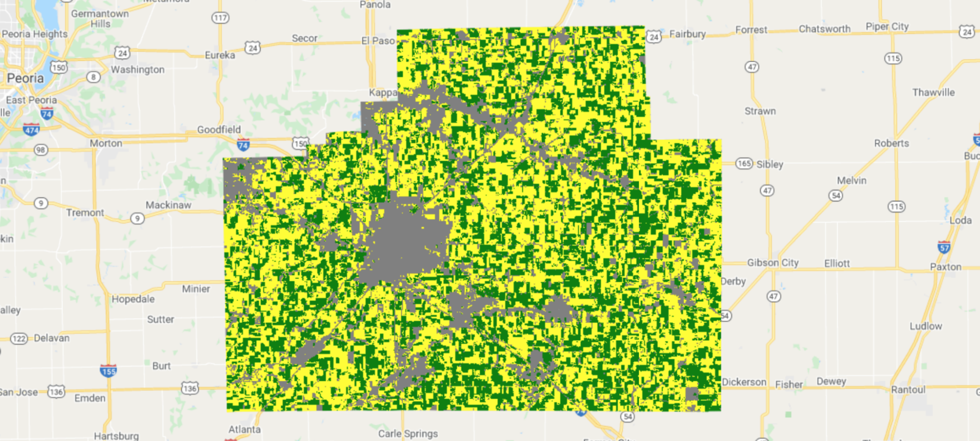
Fig. A1.1.6 Model predictions of crop type in McLean County, Illinois. Yellow is corn, green is soybeans, and gray is other land cover. |
How do our model predictions compare to the CDL labels? We can see where the two are equal and where they differ by calling eq on the two images.
// Visualize agreements/disagreements between prediction and CDL. |
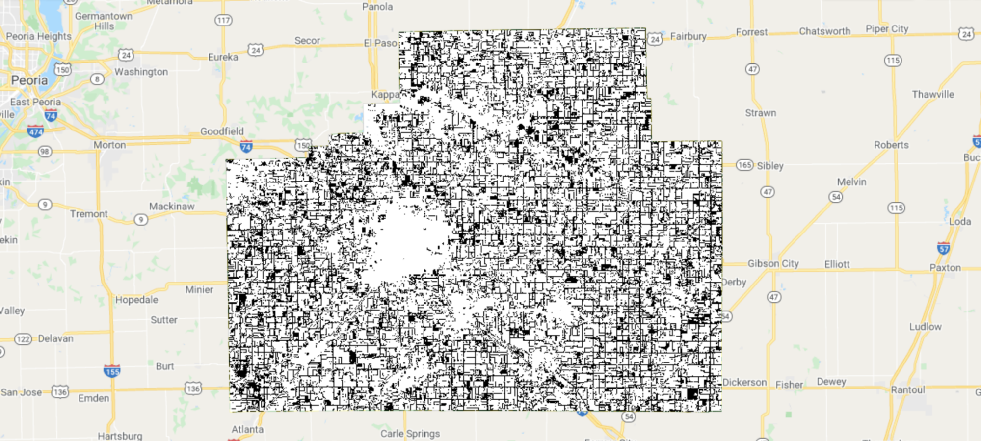
Fig. A1.1.7 shows agreement between our predictions and CDL labels. When visualized this way, some patterns become clear: Many errors occur along field boundaries, and sometimes entire fields are misclassified.
Fig. A1.1.7 Prediction agreement with CDL as ground truth labels. White pixels are where our predictions and CDL agree; black pixels are where they disagree. Errors happen on field boundaries and sometimes inside fields as well. |
Code Checkpoint A11d. The book’s repository contains a script that shows what your code should look like at this point.
Question 7. As important as accuracy is for summarizing a classifier’s overall performance, we often want to know class-specific performance as well. What are the producer’s and user’s accuracies (Chap. F2.2) for the corn class? For the soybean class? For the “other” class?
Question 8. Investigate the labels of field boundaries. What class is our model classifying them as, and what class does CDL classify them as? Now investigate the GCVI time series and fitted harmonic regressions at field boundaries (Fig. A1.1.4). Do they look different from time series inside fields? Why do you think our model is having a hard time classifying field boundaries as the CDL class?
Synthesis
When we trained the above classifier to identify crop types, we made many choices, such as which type of classifier to use (random forest), which Landsat 7 bands to use (NIR, SWIR1, SWIR2, GCVI), how to extract features (harmonic regression), and how to sample training points (100 uniformly random points). In practice, any machine learning task will involve choices like these, and it is important to understand how these choices affect the performance of the classifier we end up with. To gain an understanding of how some of these choices affect crop classification accuracy, try the following:
Assignment 1. Instead of using only three Landsat bands plus GCVI, add the blue, green, and red bands as well. You should end up with 35 harmonic coefficients per pixel instead of 20. What happens to the out-of-sample classification accuracy when you add these three additional bands as features?
Assignment 2. Instead of a second-order harmonic regression, try a third-order harmonic regression. You should end up with 28 harmonic coefficients per pixel instead of 20. What happens to the out-of-sample classification accuracy?
Assignment 3. Using the original set of features (20 harmonic coefficients), train a random forest using 10, 20, 50, 200, 500, and 1000 training points. How does the out-of-sample classification accuracy change as the training set size increases?
Assignment 4. Extra challenge: Instead of using Landsat 7 and 8 as the input imagery, perform the same crop type classification using Sentinel-2 data and report the out-of-sample classification accuracy.
Conclusion
In this chapter, we showed how to use datasets and functions available in Earth Engine to classify crop types in the US Midwest. In particular, we used Landsat 7 and 8 time series as inputs, extracted features from the time series using harmonic regression, obtained labels from the CDL, and predicted crop type with a random forest classifier. Remote sensing data can be used to understand many more aspects of agriculture beyond crop type, such as crop yields, field boundaries, irrigation, tillage, cover cropping, soil moisture, biodiversity, and pest pressure. While the exact imagery source, classifier type, and classification task can all differ, the general workflow is often similar to what has been laid out in this chapter. Since farming sustainably while feeding 11 billion people by 2100 is one of the great challenges of this century, we encourage you to continue exploring how Earth Engine and remote sensing data can help us understand agricultural environments around the world.
Feedback
To review this chapter and make suggestions or note any problems, please go now to bit.ly/EEFA-review. You can find summary statistics from past reviews at bit.ly/EEFA-reviews-stats.
References
Cloud-Based Remote Sensing with Google Earth Engine. (n.d.). CLOUD-BASED REMOTE SENSING WITH GOOGLE EARTH ENGINE. https://www.eefabook.org/
Cloud-Based Remote Sensing with Google Earth Engine. (2024). In Springer eBooks. https://doi.org/10.1007/978-3-031-26588-4
Azzari G, Grassini P, Edreira JIR, et al (2019) Satellite mapping of tillage practices in the North Central US region from 2005 to 2016. Remote Sens Environ 221:417–429. https://doi.org/10.1016/j.rse.2018.11.010
Burke M, Lobell DB (2017) Satellite-based assessment of yield variation and its determinants in smallholder African systems. Proc Natl Acad Sci USA 114:2189–2194. https://doi.org/10.1073/pnas.1616919114
Deines JM, Kendall AD, Hyndman DW (2017) Annual irrigation dynamics in the U.S. Northern High Plains derived from Landsat satellite data. Geophys Res Lett 44:9350–9360. https://doi.org/10.1002/2017GL074071
Duro DC, Girard J, King DJ, et al (2014) Predicting species diversity in agricultural environments using Landsat TM imagery. Remote Sens Environ 144:214–225. https://doi.org/10.1016/j.rse.2014.01.001
Food and Agriculture Organization of the United Nations (2020) Land use in agriculture by the numbers. In: Sustain. Food Agric. https://www.fao.org/sustainability/news/detail/en/c/1274219/. Accessed 11 Nov 2021
Ihuoma SO, Madramootoo CA (2017) Recent advances in crop water stress detection. Comput Electron Agric 141:267–275. https://doi.org/10.1016/j.compag.2017.07.026
Jain M, Srivastava AK, Balwinder-Singh, et al (2016) Mapping smallholder wheat yields and sowing dates using micro-satellite data. Remote Sens 8:860. https://doi.org/10.3390/rs8100860
Jin Z, Prasad R, Shriver J, Zhuang Q (2017) Crop model- and satellite imagery-based recommendation tool for variable rate N fertilizer application for the US Corn system. Precis Agric 18:779–800. https://doi.org/10.1007/s11119-016-9488-z
Seifert CA, Azzari G, Lobell DB (2018) Satellite detection of cover crops and their effects on crop yield in the Midwestern United States. Environ Res Lett 13:64033 https://doi.org/10.1088/1748-9326/aaf933
USDA (2022) CropScape - Cropland Data Layer. In: Crop. - NASS CDL Progr. https://nassgeodata.gmu.edu/CropScape/. Accessed 12 Nov 2021
Wang S, Azzari G, Lobell DB (2019) Crop type mapping without field-level labels: Random forest transfer and unsupervised clustering techniques. Remote Sens Environ 222:303–317. https://doi.org/10.1016/j.rse.2018.12.026