Cloud-Based Remote Sensing with Google Earth Engine

Fundamentals and Applications

Part A1: Human Applications
This Part covers some of the many Human Applications of Earth Engine. It includes demonstrations of how Earth Engine can be used in agricultural and urban settings, including for sensing the built environment and the effects it has on air composition and temperature. This Part also covers the complex topics of human health, illicit deforestation activity, and humanitarian actions.
Chapter A1.7: Humanitarian Applications
Authors
Jamon Van Den Hoek and Hannah K. Friedrich
Overview
The global refugee population has never been as large as it is today, with at least 26 million refugees living in more than 100 countries. Refugees are international migrants who have been forcibly displaced from their home countries due to violence or persecution and who cross an international border and settle elsewhere, most often in a neighboring country. Remote sensing can help refugee leaders, humanitarian agencies, and refugee-hosting countries gain new insights into refugee settlement, population, and land cover change dynamics (Maystadt et al. 2020, Van Den Hoek et al. 2021). In this chapter, we will examine the value of using satellite imagery and satellite-derived data to map a refugee settlement in Uganda, estimate its population, and gauge land cover changes in and around the settlement.
Learning Outcomes
- Using a range of techniques—maps, videos, and charts—to visualize and measure land cover changes before and after the establishment of a refugee settlement.
- Understanding the considerations and limitations involved in automated detection of refugee settlement boundaries using unsupervised classification.
- Becoming familiar with satellite-derived human settlement and population datasets and their application in a refugee settlement context.
Helps if you know how to:
- Import images and image collections, filter, and visualize (Part F1).
- Perform basic image analysis: select bands, compute indices, create masks, classify images (Part F2).
- Create a graph using ui.Chart (Chap. F1.3).
- Use normalizedDifference to calculate vegetation indices (Chap. F2.0).
- Perform pixel-based supervised or unsupervised classification (Chap. F2.1).
- Use ee.Reducer functions to summarize pixels over an area (Chap. F3.0, Chap. F3.1).
- Perform image morphological operations (Chap. F3.2).
- Write a function and map it over an ImageCollection (Chap. F4.0).
- Use reduceRegions to summarize an image with zonal statistics in irregular shapes (Chap. F5.0, Chap. F5.2).
- Converting from a vector to a raster representation with reduceToImage (Chap. F5.1).
- Write a function and map it over a FeatureCollection (Chap. F5.1, Chap. F5.2).
Github Code link for all tutorials
This code base is collection of codes that are freely available from different authors for google earth engine.
Introduction to Theory
In a humanitarian context, remote sensing data and analysis have become essential tools for monitoring refugee settlement dynamics both immediately after refugee arrival and over the long term. Nonetheless, there remain important challenges to characterizing refugee settlement conditions. First, dwellings, roadways, and agricultural plots tend to be small in size within refugee settlements and generally difficult to detect without the use of very high resolution satellite imagery. Second, dwellings and other structures within refugee settlements may be diffusely distributed and intermixed with vegetation and bare earth. Third, data on settlement features, boundaries, and refugee populations are often out of date or otherwise inappropriate for detailed geospatial analysis. In this chapter, we will examine these challenges and do our best to document refugee settlement dynamics through analysis of multi-date Landsat imagery.
Practicum
The study area for this chapter is Pagirinya Refugee Settlement in northwestern Uganda (Fig. A1.7.1a). As of 2020, Uganda was home to 1.4 million refugees, the fourth-largest refugee population in the world and the largest in Africa (UNHCR 2021). Refugees living in Uganda primarily fled violence in South Sudan and the Democratic Republic of the Congo, and most live in rural refugee settlements. Pagirinya in particular is home to 36,000 South Sudanese refugees and was established in mid-2016.
In this practicum, we will visualize and document the land cover changes that have taken place in Pagirinya (Fig. A1.7.1b and c), use satellite data to estimate the settlement’s boundary and compare it to the official boundary laid out by the United Nations High Commissioner for Refugees (UNHCR), and use satellite-derived demographic products to estimate the refugee population within Pagirinya.
Fig. A1.7.1 Maps of a) UNHCR refugee settlements in Uganda, b) OpenStreetMap features, roadways, and the UNHCR settlement boundary for Pagirinya, and c) European Space Agency 2020 WorldCover land cover at Pagirinya |

Section 1. Seeing Refugee Settlements from Above
In preparation for the arrival of refugees, humanitarian actors and refugee settlement planners are often interested in analyzing local land cover conditions before a refugee settlement is established. The goal of this first section is to use Landsat satellite imagery to characterize initial land cover conditions and land cover changes at Pagirinya Refugee Settlement in the years before and following the settlement’s establishment in 2016.
Let’s begin by adding the refugee settlement’s boundary to the Map by loading the FeatureCollection of refugee settlement boundaries in Uganda and filtering to Pagirinya Refugee Settlement. We’ll also initialize the Map to center on Pagirinya and default to showing the satellite basemap for visual reference.
Map.setOptions('SATELLITE'); |
Next, let’s create annual Landsat composites using the Landsat 8 surface reflectance ImageCollection. We’ll spatially filter the ImageCollection to a buffered settlement boundary and temporally filter to 2015–2020, which includes the full year before the settlement was established and the four years that followed. We’ll also apply a cloud filter of less than or equal to 40% to help ensure that our annual composites are cloud free.
For better legibility, we’ll rename the Landsat bands and add three new spectral index bands to each image in the ImageCollection using the addIndices function, which calculates the Normalized Difference Vegetation Index (NDVI), Normalized Difference Building Index (NDBI), and Normalized Burn Ratio (NBR) using normalizedDifference. Each of these metrics offers a different approach to characterizing land cover conditions and change over time. NDVI is commonly used for monitoring vegetation health; NDBI helps to characterize impervious and built-up surfaces; and NBR helps to identify land that has been cleared with fire, a common practice in our study region. Note that other spectral metrics or remote sensing platforms may be better suited for identifying refugee settlements in other regions.
// Create buffered settlement boundary geometry. |
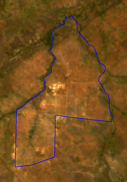
To build annual composites from before and after Pagirinya’s establishment in 2016, let’s create two temporal subsets of the ImageCollection—one from 2015 and one from 2017—and use the median function to composite images for each time frame (Fig. A1.7.2). We’ll also clip our image collections to the buffered region around Pagirinya. To visualize the NDVI composites, we’ll use true-color and false-color visualizations and color palettes, which should help us identify and interpret features within and surrounding the settlement boundary.
// Make annual pre- and post-establishment composites. // Create an empty byte Image into which we'll paint the settlement boundary. |
|
Fig. A1.7.2 Pre-establishment (left) and post-establishment (right) true-color composites with Pagirinya Refugee Settlement boundary overlaid in blue |

Now that we have pre- and post-establishment composites to support a visual qualitative assessment, let’s make a complementary quantitative assessment by measuring pre- and post-establishment differences in median NDVI and plotting the distribution of NDVI from both periods.
// Compare pre- and post-establishment differences in NDVI. |
In addition to the pre- and post-establishment annual composites, let’s create an annotated video time series of the full 2015–2020 Landsat 8 surface reflectance ImageCollection. We’ll be able to use this video to view changes at our study refugee settlement image by image.
// Import package to support text annotation. |
Code Checkpoint A17a. The book’s repository contains a script that shows what your code should look like at this point.
Question 1. How would you describe the land cover type in the area in 2015, before the establishment of the refugee settlement? Is the land cover consistent within the settlement’s boundary in the pre-establishment period? Does the settlement boundary conform to land cover type or condition in any meaningful way?
Question 2. What features (dwellings, roadways, agricultural plots, etc.) present the greatest visual difference between the pre- and post-establishment periods? Comparing the visual differences in true color, false color, and NDVI with the satellite image basemap may be helpful here.
Question 3. Which of the annual composite visualizations (true color, false color, or NDVI) do you prefer for distinguishing the refugee settlement in the post-establishment period, and why?
Question 4. How do the range and mode of NDVI values change from pre- to post-establishment? How might the changes in NDVI distribution correlate to overall changes in land cover type in the post-establishment period?
Question 5. Beyond the rapid establishment of the settlement’s dwellings and roads, what changes do you observe in the time-series video? Do these changes occur within or outside the settlement boundary? What kinds of changes do you see in the imagery from 2019 or 2020, well after the settlement was established in 2016?
Section 2. Mapping Features Within the Refugee Settlement
In Sect. 1, we used Landsat data to gauge changes in land cover conditions and types, but we can also draw upon data products derived from satellite imagery. For instance, satellite-derived building footprints, which represent geometries of individual structures and dwellings, are often used to estimate human populations and population density in humanitarian contexts and to support the planning and delivery of food and other kinds of aid. In this section, we’ll identify different features within Pagirinya, which we’ll use to create a satellite image-based settlement boundary map in Sect. 3.
Let’s add to our script from Sect. 1 by first loading the Open Buildings V1 Polygons dataset from the Earth Engine Data Catalog. This dataset includes satellite-derived building footprints based on very high resolution (0.5 m) satellite imagery, and each footprint has a confidence score. Let’s visualize building footprints with a confidence score above 75% as orange and building footprints with a 75% or lower confidence score as purple.
// Visualize Open Buildings dataset. |
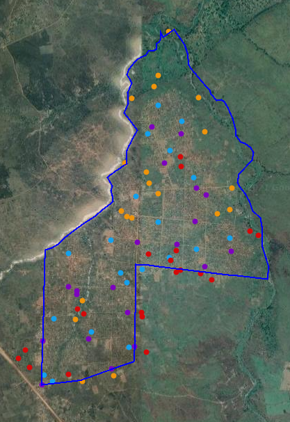
With a map of building footprints in place, let’s turn to examining other features of interest that we identified in Sect. 1. Let’s load a FeatureCollection of sample locations of infrastructure, forest, and agriculture visible on the satellite basemap as well as a sample of building footprint locations. Note in the print output that each feature has a value, which represents the feature type. Let’s write a function to use this value property to automatically assign a unique color to each feature as part of a style (Fig. A1.7.3).
// Load land cover samples. |
Fig. A1.7.3 Feature samples across Pagirinya Refugee Settlement (boundary shown in blue) |
Since we want to use these sample land cover locations to help delineate the refugee settlement boundary, these different land cover types should be spectrally distinguishable from each other. To see how the spectral values vary among different features, let’s create spectral signature plots for the post-establishment period. We first need to add the land cover class to the post-establishment composites that we made in Sect. 1 so that the class and spectral value information can be referenced together in our spectral signature plots. To do that, let’s use reduceToImage to convert our lcPts FeatureCollection to an image, lcBand, and then add that image to the post-establishment composite.
// Convert land cover sample FeatureCollection to an Image. |
Now we have a postMedian image that we can sample at specific sample locations and identify not only the spectral values but also the class type. Let’s plot the spectral values by class type. Note that since band names are sorted alphabetically on the x-axis, nir values are plotted in between green and red and are therefore out of order with respect to band wavelengths.
// Define bands that will be visualized in chart. |
Remember that we also calculated NDVI, NDBI, and NBR spectral indices in Sect. 1. Since these bands range from −1 to 1, we have to plot their values separately from the Landsat band spectral signature plots above, which use scaled reflectance values.
// Define spectral indices that will be visualized in the chart. |
Code Checkpoint A17b. The book’s repository contains a script that shows what your code should look like at this point.
Question 6. How would you describe the coverage of the footprints within the settlement? Are there sections of the settlement visible in the basemap or the post-establishment composite that are missing footprints?
Question 7. How do NDVI, NDBI, and NBR change from the pre- to post-establishment period at building footprint locations?
Question 8. Are the spectral profiles of the four feature types distinct from each other? Which profiles are the most similar overall?
Question 9. Which bands or indices provide the greatest separation between the four feature types?
Section 3. Delineating Refugee Settlement Boundaries
Now that we’ve become familiar with the different land cover types and the changes that can occur as a refugee settlement is established, let’s turn to formally delineating the refugee settlement from its surroundings by mapping a settlement boundary. Having information on refugee settlement boundaries is helpful for the basic accounting of refugee settlement extent and for confidently attributing land cover or land use changes to a specific refugee settlement (Friedrich and Van Den Hoek 2020, Van Den Hoek and Friedrich 2021). In this section, we’ll use a k-means unsupervised classifier to generate a settlement/non-settlement map that represents land that has been transformed by the refugee settlement’s establishment or subsequent use. Note that the settlement boundary that we used in Sect. 1 is a settlement planning boundary established by the UNHCR and so represents the land within the formal boundary that potentially could be accessed or used by refugees.
To start making a binary classification that separates settlement from non-settlement, let’s create a random sample of 500 NDVI values from across the post-establishment composite. Remember that the postMedian composite was clipped to the 500-meter-buffered extent of the UNHCR settlement boundary geometry, so these sample sites should be dispersed inside and outside of the UNHCR boundary’s geometry. For parameterization, we only need two values output from the classifier (numClusters =2) and can set the maximum number of iterations to a low value of 5 (maxIter =5) and the seed value to an arbitrary value of 21. Now let’s apply the classifier to the post-establishment composite, view the coverage of settlement (pixel value of 1) and non-settlement (pixel value of 0), and visually compare the result with the UNHCR settlement boundary.
// Create samples to input to a K-means classifier. |
The resulting k-means classification looks promising for separating settlement from non-settlement pixels, but it has plenty of gaps in settlement coverage as well as isolated settlement patches and pixels. To produce a single contiguous settlement coverage, let’s apply spatial morphological operations of dilation and erosion on the k-means output. Dilation incrementally expands the boundary of a raster dataset, filling gaps and connecting patches along the way. Conversely, erosion chips away at the outermost pixels, thereby removing the surplus pixels that were added during the dilation step but still maintaining the filled-in gaps.
We’ll apply these in sequence, first dilation and then erosion, using focal_max and focal_min, respectively; focal_max works as a dilation since it outputs the maximum value detected within the kernel, which will always be a settlement pixel because the settlement pixel value of 1 is always greater than the non-settlement pixel value of 0. Since we just need to do some fine-tuning on the boundary of the settlement coverage, we can use a kernel with a small radius of 3. Finally, let’s convert the output of the dilation and erosion to a polygon FeatureCollection where each contiguous patch of pixels becomes its own polygon (Fig. A1.7.4). Feel free to map the outline of Pagirinya in blue, as above, for a helpful visual reference.
// Define the kernel used for morphological operations. // Map outline of Pagirinya in blue. |
|
Fig. A1.7.4 K-means output before (left) and after (right) dilation and erosion, with Pagirinya Refugee Settlement boundary overlaid in blue |


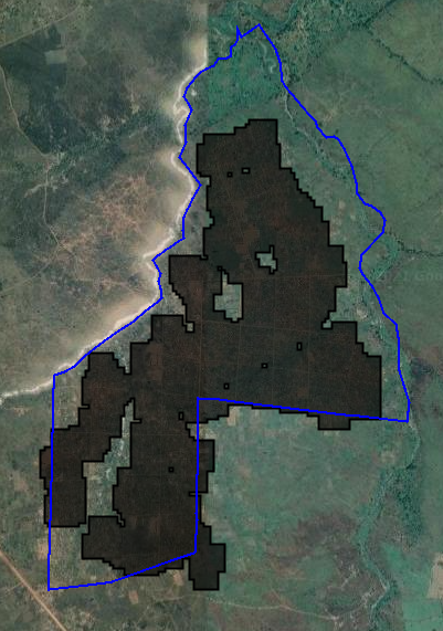
We’ve created a usable vector map of settlement and non-settlement polygons, but we are aiming for a single polygon that represents the settlement boundary. To filter these polygons to a single polygon that represents the refugee settlement’s boundary, let’s use a simple logic rule and select the polygon that has the largest overlap (i.e., intersected area) with the UNHCR boundary (Fig. A1.7.5).
// Intersect K-means polygons with UNHCR settlement boundary and |
Fig. A1.7.5 K-means settlement boundary (black) overlaid by UNHCR settlement boundary (blue) |
Code Checkpoint A17c. The book’s repository contains a script that shows what your code should look like at this point.
Question 10. In your opinion, does the k-means boundary accurately separate the settlement from its surroundings? Considering differences between the UNHCR boundary and the k-means boundary, comment on potential errors of commission (areas that are inaccurately included in the k-means boundary) and of omission (areas that are inaccurately excluded).
Question 11. Rather than just collecting samples for input to k-means based on NDVI in postMedian, adjust the script above to sample from all bands in postMedian. How does the resulting settlement polygon differ? Does increasing the amount of spectral information available to the classifier improve the result?
Question 12. Rerun the k-means classifier based on the diffMedian image from Sect. 1 rather than the postMedian image while keeping the other parameters the same. How does the resulting settlement boundary polygon differ?
Section 4. Estimating Refugee Population Within the Settlement
Thus far, we have looked at land cover conditions and land cover changes at Pagirinya and used that information to help map the extent of the settlement. Let’s turn towards using satellite-derived data to estimate the size of the refugee population living at Pagirinya. Knowing how many refugees are at a settlement is essential for gauging the need for food aid and for guiding sustainable development and disaster risk reduction efforts. Satellite-informed population estimates can be useful for these purposes, especially if no other data are available.
In this final section, we will work with several datasets used to estimate the geographic distribution of human populations, each of which is based in part on remote-sensing detection of buildings. We will analyze population estimates at Pagirinya Refugee Settlement from the Global Human Settlement Layer (GHSL), High Resolution Settlement Layer (HRSL), and WorldPop data products. To gauge the accuracy of these products, we will compare the population estimates with UNHCR-recorded refugee population data from September 2020.
HRSL and WorldPop data are from 2020, and GHSL is available for multiple years, most recently 2015. Let’s filter the GHSL ImageCollection to only the dataset. We’ll also rename all relevant bands to 'population' for consistency, and map all population maps using the same visualization approach to better support a direct comparison. Use the Inspector tool to identify the different pixel-level values for each population dataset within and around Pagirinya. These values represent the human population estimated to be present at each pixel in 2015.
Map.centerObject(pagirinya, 14); .select(['b1'], ['population']); |
You’ll notice that each dataset has a different spatial resolution (also commonly referred to as the “scale”). We’ll need to know these different spatial resolutions when we summarize each dataset’s population estimate across Pagirinya using reduceRegion. Once we have a population estimate, we’ll add it to the Pagirinya feature as a new property.
// Collect spatial resolution of each dataset. .reduceRegion({ |
Now we have three very different population estimates for Pagirinya based on the three population datasets. Let’s see how they compare to the population recorded in 2020 by UNHCR, which is also stored as a property of the Pagirinya feature.
To do so, we’ll simply subtract the UNHCR population total from each dataset’s estimated population total and store each difference as a new property. A negative difference indicates an underestimation of the UNHCR population, and a positive difference indicates an overestimation.
// Measure difference between settlement product and UNHCR-recorded population values. |
Code Checkpoint A17d. The book’s repository contains a script that shows what your code should look like at this point.
Question 13. Visually interpret the coverage of each population dataset alongside the building footprint data from Sect. 2. Which population dataset seems to better capture population density at hot spots of building footprints?
Question 14. Many buildings in Pagirinya are not household dwellings but rather administrative offices, shops, food market buildings, etc., and such differences in building use are not necessarily considered in generating the population estimates. How would the inclusion of non-dwellings in population datasets bias settlement-level population estimates?
Question 15. Note that the coverage of the WorldPop population data at Pagirinya is not wholly contained within the UNHCR settlement boundary. Is this “spillover” better captured by the k-means boundary from Sect. 3?
Synthesis
You may have noticed that we showed a 2020 land cover map from the European Space Agency (ESA) based on Sentinel-1 and Sentinel-2 data in Fig. A1.7.1c but did not make use of those land cover data in the practicum. How would your settlement boundary detection approach and results change if you used Sentinel-2 instead of Landsat data and sampled land cover sites from this ESA dataset? As a homework challenge, please complete the following assignment.
Assignment 1. Use Sentinel-2 surface reflectance data collected in 2020. Collect 20 samples of each land cover class in the ESA land cover product within Pagirinya using ee.Image.stratifiedSample. Assess the spectral separability between land cover classes. Then, run a modified k-means classifier that makes use of Sentinel-2 NDVI values collected across the ESA land cover map.
Conclusion
This chapter introduced approaches for characterizing land cover dynamics within and surrounding Pagirinya Refugee Settlement using a range of open-access satellite data and geospatial products. We saw that satellite remote sensing approaches are effective for characterizing land cover changes before and following the establishment of Pagirinya in 2016, and for delineating a refugee settlement boundary that represents land directly affected by the settlement’s establishment and use. We also noted wide disagreement and pronounced inaccuracies in Pagirinya refugee population estimates based on satellite-informed human population datasets. This chapter shows the value of remote sensing for long-term monitoring of refugee settlements as well as the need for deeper integration of humanitarian data and scenarios in remote sensing applications.
Feedback
To review this chapter and make suggestions or note any problems, please go now to bit.ly/EEFA-review. You can find summary statistics from past reviews at bit.ly/EEFA-reviews-stats.
References
Cloud-Based Remote Sensing with Google Earth Engine. (n.d.). CLOUD-BASED REMOTE SENSING WITH GOOGLE EARTH ENGINE. https://www.eefabook.org/
Cloud-Based Remote Sensing with Google Earth Engine. (2024). In Springer eBooks. https://doi.org/10.1007/978-3-031-26588-4
Friedrich HK, Van Den Hoek J (2020) Breaking ground: Automated disturbance detection with Landsat time series captures rapid refugee settlement establishment and growth in North Uganda. Comput Environ Urban Syst 82:101499. https://doi.org/10.1016/j.compenvurbsys.2020.101499
Maystadt JF, Mueller V, Van Den Hoek J, Van Weezel S (2020) Vegetation changes attributable to refugees in Africa coincide with agricultural deforestation. Environ Res Lett 15:44008. https://doi.org/10.1088/1748-9326/ab6d7c
UNHCR (2020) Global Trends: Forced Displacement in 2020
Van Den Hoek J, Friedrich HK, Wrathall D (2021) A primer on refugee-environment relationships. In: PERN Cyberseminar on Refugee and internally displaced populations, environmental impacts and climate risks
Van Den Hoek J, Friedrich HK (2021) Satellite-based human settlement datasets inadequately detect refugee settlements: A critical assessment at thirty refugee settlements in Uganda. Remote Sens 13:3574. https://doi.org/10.3390/rs13183574