Cloud-Based Remote Sensing with Google Earth Engine

Fundamentals and Applications

Part A1: Human Applications
This Part covers some of the many Human Applications of Earth Engine. It includes demonstrations of how Earth Engine can be used in agricultural and urban settings, including for sensing the built environment and the effects it has on air composition and temperature. This Part also covers the complex topics of human health, illicit deforestation activity, and humanitarian actions.
Chapter A1.4: Air Pollution and Population Exposure
Authors
Zander Venter and Sourangsu Chowdhury
Overview
After high blood pressure and smoking, air pollution is the third-largest risk factor for death globally (Murray et al. 2020). Air pollution can therefore be described as a global “pandemic” that should arguably be monitored and addressed with the same intensity with which the COVID-19 pandemic has been. Remote sensing and cloud computing technologies allow us to do so.
The purpose of this chapter is to explore and analyze gridded air pollution data from Sentinel-5P in the context of changes brought about by COVID-19 lockdowns. Practical components will include analyzing changes in nitrogen dioxide (NO2) concentrations over time and quantifying population-weighted NO2 concentrations for selected administrative units.
Learning Outcomes
- Understanding Sentinel-5P data.
- Quantifying changes in air pollutant concentrations over time.
- Generating a split-panel map to compare two time epochs.
- Calculating population-weighted air pollutant concentrations.
Helps if you know how to:
- Import images and image collections, filter, and visualize (Part F1).
- Create a graph using ui.Chart (Chap. F1.3).
- Perform basic image analysis: select bands, compute indices, create masks (Part F2).
- Use ee.Reducer functions to summarize pixels over an area (Chap. F3.0, Chap. F3.1).
- Write a function and map it over an ImageCollection (Chap. F4.0).
- Mask cloud, cloud shadow, snow/ice, and other undesired pixels (Chap. F4.3).
- Design user interfaces for an Earth Engine App (Chap. F6.3).
Github Code link for all tutorials
This code base is collection of codes that are freely available from different authors for google earth engine.
Introduction to Theory
Air pollution can be generally defined as any chemical, physical, or biological agent that alters the natural composition of the atmosphere. Pollutants that are of primary concern for public health include particulate matter with diameter less than 2.5 μm (PM2.5), carbon monoxide (CO), ozone (O3), NO2, and sulfur dioxide (SO2). Globally, chronic exposure to air pollution results in greater loss of life than HIV/AIDS, malaria, and tuberculosis combined, and more than an order of magnitude more deaths than all forms of violence (Lelieveld et al. 2020). Exposure to PM2.5 and O3 is estimated to result in ~4.7 million excess deaths annually across the globe (Murray et al. 2020), although these estimates range between 3 and 10 million excess deaths per year, based on the disease categories considered and the exposure-response function used (Burnett et al. 2018, Chowdhury et al. 2022). Exposure to NO2 may result in 4 million new pediatric asthma cases annually (Achakulwisut et al. 2019).
Knowledge about the global distribution of these air pollutants and their sources has improved over the last decade, with the expansion of networks of ground-based monitors in many countries, the evolution of satellite products, and the advancement of complex atmospheric chemistry models. Studies have found that more than 70% of the global health burden from air pollution is attributable to anthropogenic emissions (Chowdhury et al. 2022, Lelieveld et al. 2019). The main anthropogenic sources of air pollution are industries, motor vehicles, power generation, agricultural activities, and household combustion, while non-anthropogenic sources include desert dust, biogenic emissions, forest fires, and even volcanoes. The reduction in transport and industrial activity during the COVID-19 lockdowns significantly reduced global air pollution levels, thereby highlighting the significance of anthropogenic emissions (Venter et al. 2020). In fact, it is estimated that the decline in air pollution during the first five months of 2020 resulted in 49,900 avoided deaths and 89,000 fewer pediatric asthma emergency room visits (Venter et al. 2021).
Despite the recent growth in monitoring networks, the air in most regions of Earth is insufficiently monitored, limiting air quality management. Given the paucity of ground-based monitoring, alternative monitoring approaches such as satellite remote sensing are gaining popularity and becoming more accurate (e.g., Griffin et al. 2019). Over the past few decades, we have had increasing access to a range of satellite sensors that monitor the contents of Earth’s atmosphere. However, it is important to note that satellites measure pollutant concentrations in the troposphere and stratosphere, which extend for many kilometers above the Earth’s surface. As a result, satellite measurements are not necessarily representative of the concentrations humans are exposed to on the ground, and consequently, relying on satellite data alone for human health applications is not advised. However, more sophisticated methods combine information from satellite remote sensing data, complex atmospheric chemistry models, and ground-based monitors to provide ground-level concentrations of pollutants with high confidence (Dey et al. 2020, Donkelar et al. 2021).
Practicum
Section 1. Data Importing and Cleaning
There are a range of satellite-based datasets on air pollution to choose from in the Earth Engine Data Catalog. The main datasets relevant to air pollution include the Moderate Resolution Imaging Spectroradiometer and Advanced Very-High-Resolution Radiometer for monitoring aerosol optical depth (a proxy for PM2.5); the Total Ozone Mapping Spectrometer Ozone Monitoring Instrument for monitoring O3; and more recently the TROPOspheric Monitoring Instrument (TROPOMI) on board the Sentinel-5 Precursor (Sentinel-5P), which monitors a range of air pollutants. We will use Sentinel-5P in this practicum, but the methods covered here are easily transferable to the datasets mentioned above.
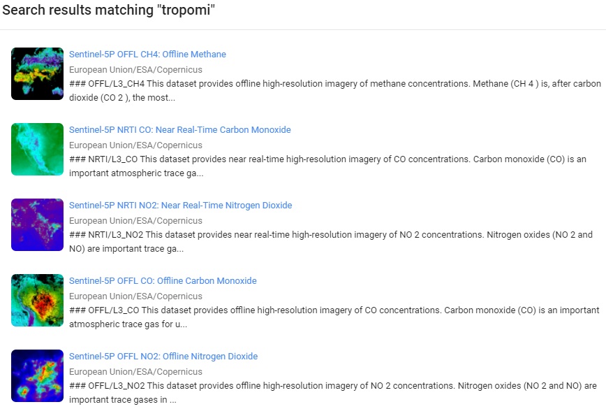
Now, let’s load the satellite data for this practicum. If you search “tropomi” in the Earth Engine Data Catalog, you will see a range of datasets from Sentinel-5P, which can all be of value in quantifying air quality (Fig. A1.4.1).
Fig. A1.4.1 Earth Engine Data Catalog results for the search term “tropomi” |
Although Sentinel-5 was launched in October 2017, the data available for analysis in Earth Engine are from July 2018 onward. TROPOMI, the sensor on board the satellite, is a spectrometer sensing ultraviolet, visible, near-infrared, and shortwave infrared wavelengths to monitor NO2, O3, aerosol, methane (CH4), formaldehyde, CO, and SO2 in the atmosphere. The swath width of TROPOMI is approximately 2,600 km on the ground, resulting in a global daily coverage with a spatial resolution of 7 x 7 km. All of the Sentinel-5P datasets, except CH4, have two versions: Near Real-Time (NRTI) and Offline (OFFL); CH4 is available as OFFL only. The NRTI assets cover a smaller area than the OFFL assets but appear more quickly after acquisition. The OFFL assets have a delayed availability, but each asset contains data from an entire orbit and is arguably easier to work with for retrospective analyses. We will use the OFFL NO2 product in this practicum.
First we need to define an area of interest. Wuhan is infamous for being the epicenter of the COVID-19 pandemic and witnessed severe lockdowns. In the next section of this practicum, we will test to see if we can detect a reduction in NO2 during the early 2020 lockdowns in the surrounding province, Hubei. To start, in the code below, we import a global dataset of administrative boundaries and filter them for intersection with an ee.Geometry.Point object, which appears under the Imports section at the top of your script. This geometry has to be drawn with the drawing tool and can be moved to a new location to rerun the analysis for that administrative boundary.
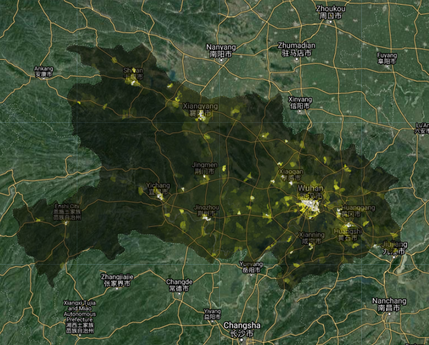
After centering the Map on Hubei Province, we will import a population dataset, which is necessary for calculating population-weighted exposures in Sect. 3 of this practicum. We will use the Gridded Population of the World dataset for 2020, which includes a total population count per ~1 x 1 km grid (Fig. A1.4.2).
// Import a global dataset of administrative units level 1. |
Question 1. There are two other datasets of gridded population in the Earth Engine Data Catalog, namely WorldPop and Global Human Settlement Layers. Use the search bar to find them and add them to the map to compare them with the Gridded Population of the World dataset. Which one looks more realistic in your opinion, and why?
Fig. A1.4.2 Population density over Hubei Province. Brighter areas have higher population counts. |
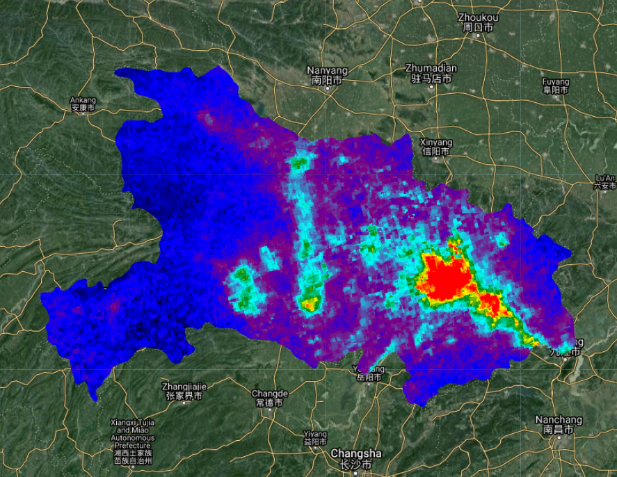
Now it is time to import the NO2 data. As with most optical satellite data, there can be things in the atmosphere that contaminate the signal from the object or chemical you want to measure. Clouds are a common issue for land surface reflectance products (Chap. F4.3), and they are also an issue when trying to measure air pollutant concentrations. In the code below, we create a function to mask out pixels with a cloud fraction above 0.3 (i.e., 30% cloud cover). You can test different masking thresholds to see what suits your use case best. After masking out cloudy pixels, we create a median composite from images during March 2021. It is important to note that we are working with the band that gives measurements for the tropospheric vertical column of NO2 and not the stratospheric or total vertical column. The troposphere is the closest we can get to ground-level measurements with Sentinel-5P. The median image for March 2021 should look like the map shown in Fig. A1.4.3.
// Import the Sentinel-5P NO2 offline product. |
Fig. A1.4.3 Tropospheric NO2 concentrations over Hubei Province. Hotter colors have higher concentrations, while cooler colors have lower concentrations. |
Code Checkpoint A14a. The book’s repository contains a script that shows what your code should look like at this point.
Section 2. Quantifying and Visualizing Changes
Next we will test to see if we can visualize a change in NO2 concentrations during the 2020 COVID-19 lockdowns. We will compare the median NO2 concentration during March 2020 (during which Hubei Province was in lockdown) with the median value during March 2019.
Weather can significantly affect air pollutant concentrations (e.g., wind causing long-range transport of smoke), and therefore differences between 2020 and 2019 could be an artifact of differences in weather. By comparing the same month in different years, we partly control for the effects of seasonal weather patterns, but not completely. If you would like to control for weather effects more thoroughly, see Venter et al. (2020) for details. In the code below, we calculate and visualize median composite images for March 2019 and March 2020. The visualization makes use of Earth Engine’s comprehensive library of user-interface widgets (see Chap. F6.3 for more details). Specifically, we use the ui.SplitPanel widget to compare the two median composites side by side (Fig. A1.4.4). This widget can be set to have a wiping effect where maps are overlaid on top of one another, or a side-by-side comparison.
// Define a lockdown NO2 median composite. |
Fig. A1.4.4 Split-panel map showing tropospheric NO2 concentrations over Hubei Province for March 2019 (left) and March 2020 (right). Hotter colors have higher concentrations, while cooler colors have lower concentrations. |
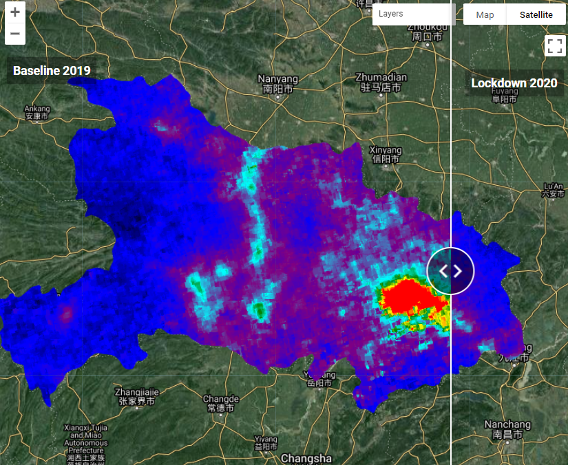
Question 2. Comparing the two maps in the split-panel map, do you find a reduction in NO2 concentrations during the lockdown? Where is the change in NO2 concentrations most significant?
Question 3. How are changes in NO2 concentrations related to population density? To help answer this question, you can (1) create a difference image by subtracting the no2Lockdown image from the no2Baseline image, (2) create a new ui.Map.Layer for the difference image and the population image created in Sect. 1, and (3) add these to the left or right map. Hint: You can change the opacity of the NO2 layers to aid interpretability.
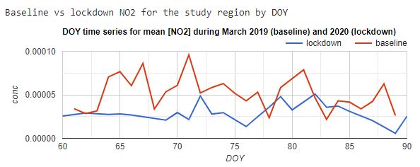
Exploring the differences in NO2 concentrations as ee.Image objects can be visually informative, but quantifying the changes for specific regions requires further work. In the code below, we calculate the mean NO2 concentrations for Hubei Province by applying a reduceRegion function to each image in the March 2019 and March 2020 collections. The resulting time series are visualized in the chart shown in Fig. A1.4.5.
// Create a function to get the mean NO2 for the study region |
Fig. A1.4.5 Time-series graph showing average NO2 concentrations for Hubei Province during March 2019 and March 2020 |
Code Checkpoint A14b. The book’s repository contains a script that shows what your code should look like at this point.
Section 3. Calculating Population-Weighted Concentrations
In Sect. 2, we used the ee.Reducer.mean reducer in the reduceRegion function to get the average NO2 concentration over Hubei Province. However, when aggregating pollutant concentrations to define population exposure, we need a different approach. Imagine there was a large concentration of NO2 in a rural area in the east of Hubei Province where very few people live. If we simply calculated the average of all pixels, this rural NO2 anomaly would skew our representation of population exposure. Using the population number dataset imported in Sect. 1, we can calculate the population-weighted exposure ( ) aggregated across
  pixels in the area of interest (in this case, Hubei Province) using Eq. A1.4.1 below, where
 is the NO2 concentration and
  is the subpopulation in pixel
  .
.
 (Eq. A1.4.1)
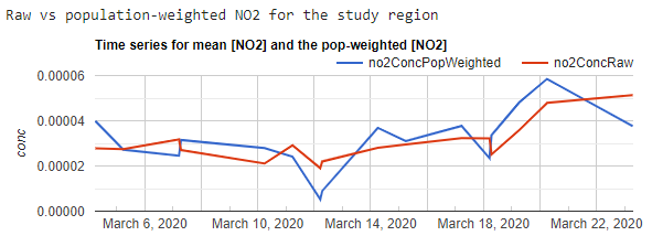
In the code below, we map a function to calculate population-weighted exposure over all the images in the NO2 ImageCollection. Remember that in Sect. 1 we masked out pixels from images that had a cloud cover value greater than 30%. Therefore, an important step in this function is to calculate the percentage of available Sentinel-5P pixels within Hubei Province per image. We need to decide what percentage pixel coverage is enough to calculate a representative average for the province. Here we choose 25% for illustrative purposes, but depending on your research question, you may want to calculate averages only when you have 100% coverage by/from Sentinel-5P that is free of clouds. The contrast between the simple average and population-weighted average is shown in Fig. A1.4.6. The difference may appear small in this case, but when aggregating over larger areas with greater variation in population density, population-weighted averages can be very different from simple averages.
// Define the spatial resolution of the population data. |
Fig. A1.4.6 Time-series graph showing average (no2ConcRaw) and population-weighted average (no2ConcPopWeighted) NO2 concentrations for Hubei Province in March 2020 |
Finally, although we can plot this data in Earth Engine, it is often easier to process with other statistical software, such as R or Python. So, to conclude, let us code for exporting time series of population-weighted averages for more than one area of interest (in this case, administrative units). In the code below, we map the function over two regions and then export the resulting table as a CSV file to Google Drive.
// Export population-weighted data for multiple regions. |
Code Checkpoint A14c. The book’s repository contains a script that shows what your code should look like at this point.
Synthesis
In this practicum, we focused on a particular pollutant (NO2), region (Hubei), and time period (March 2019 and March 2020). To reinforce your comprehension and understanding, consider the following assignments.
Assignment 1. How would you run this analysis for a different pollutant? Try substituting the NO2 collection with the Sentinel-5P NRTI SO2 collection. Hint: The main emission source for SO2 is electricity generation, for which coal is the most significant fuel. Use this information to inform your selection of a location and time period so that you can detect interesting changes.
Assignment 2. How would you run this analysis for a different geographic area? Try deleting the ee.Geometry.Point at the top of your script and using the Geometry Tools to digitize your own point on which to focus the analysis. If you are running the latter part of the script, you can also change the list of named administrative units. Hint: Add the adminUnits object from Sect. 1 of the code to the map. You can use the Inspector tab to click on polygons and get the name of the administrative unit under the ‘ADM1_NAME’ property.
Assignment 3. Finally, try changing the dates in the script so that you are comparing two different time periods. Remember that the Sentinel-5P data are available from July 2018 onward; defining dates before this will cause the script to throw an error.
Conclusion
In this chapter, we covered the basics of importing Sentinel-5P air pollution data, comparing changes over time, and calculating population-weighted averages for spatial units. Satellite detection of air pollutants is an important tool for monitoring air quality from local to global scales, but ground-station measurements and atmospheric modeling are often necessary to draw conclusions about human health risk. The fusion of ground-level and satellite data with advanced machine learning models to map and forecast air pollution is a growing research field with important societal applications (e.g., https://www.iqair.com/). Earth Engine is a well-suited and currently underutilized resource to advance this field.
Feedback
To review this chapter and make suggestions or note any problems, please go now to bit.ly/EEFA-review. You can find summary statistics from past reviews at bit.ly/EEFA-reviews-stats.
References
Cloud-Based Remote Sensing with Google Earth Engine. (n.d.). CLOUD-BASED REMOTE SENSING WITH GOOGLE EARTH ENGINE. https://www.eefabook.org/
Cloud-Based Remote Sensing with Google Earth Engine. (2024). In Springer eBooks. https://doi.org/10.1007/978-3-031-26588-4
Achakulwisut P, Brauer M, Hystad P, Anenberg SC (2019) Global, national, and urban burdens of paediatric asthma incidence attributable to ambient NO2 pollution: Estimates from global datasets. Lancet Planet Heal 3:e166–e178. https://doi.org/10.1016/S2542-5196(19)30046-4
Benedetti A, Morcrette J-J, Boucher O, et al (2009) Aerosol analysis and forecast in the European centre for medium-range weather forecasts integrated forecast system: 2. Data assimilation. J Geophys Res Atmos 114. https://doi.org/10.1029/2008JD011235.
Burnett R, Chen H, Szyszkowicz M, et al (2018) Global estimates of mortality associated with long-term exposure to outdoor fine particulate matter. Proc Natl Acad Sci USA 115:9592–9597. https://doi.org/10.1073/pnas.1803222115
Chowdhury S, Pozzer A, Haines A, et al (2022) Global health burden of ambient PM2.5 and the contribution of anthropogenic black carbon and organic aerosols. Environ Int 159:107020. https://doi.org/10.1016/j.envint.2021.107020
Dey S, Purohit B, Balyan P, et al (2020) A satellite-based high-resolution (1-km) ambient PM2.5 database for India over two decades (2000–2019): Applications for air quality management. Remote Sens 12:1–22. https://doi.org/10.3390/rs12233872
Griffin D, Zhao X, McLinden CA, et al (2019) High-resolution mapping of nitrogen dioxide with TROPOMI: First results and validation over the Canadian oil sands. Geophys Res Lett 46:1049–1060. https://doi.org/10.1029/2018GL081095
Lelieveld J, Klingmüller K, Pozzer A, et al (2019) Effects of fossil fuel and total anthropogenic emission removal on public health and climate. Proc Natl Acad Sci USA 116:7192–7197. https://doi.org/10.1073/pnas.1819989116
Lelieveld J, Pozzer A, Pöschl U, et al (2020) Loss of life expectancy from air pollution compared to other risk factors: A worldwide perspective. Cardiovasc Res 116:1910–1917. https://doi.org/10.1093/cvr/cvaa025
Murray CJL, Aravkin AY, Zheng P, et al (2020) Global burden of 87 risk factors in 204 countries and territories, 1990–2019: A systematic analysis for the Global Burden of Disease Study 2019. Lancet 396:1223–1249. https://doi.org/10.1016/S0140-6736(20)30752-2
Van Donkelaar A, Hammer MS, Bindle L, et al (2021) Monthly global estimates of fine particulate matter and their uncertainty. Environ Sci Technol 55:15287–15300. https://doi.org/10.1021/acs.est.1c05309
Venter ZS, Aunan K, Chowdhury S, Lelieveld J (2020) COVID-19 lockdowns cause global air pollution declines. Proc Natl Acad Sci USA 117:18984–18990. https://doi.org/10.1073/pnas.2006853117
Venter ZS, Aunan K, Chowdhury S, Lelieveld J (2021) Air pollution declines during COVID-19 lockdowns mitigate the global health burden. Environ Res 192:110403. https://doi.org/10.1016/j.envres.2020.110403